
NYU PhD Hub
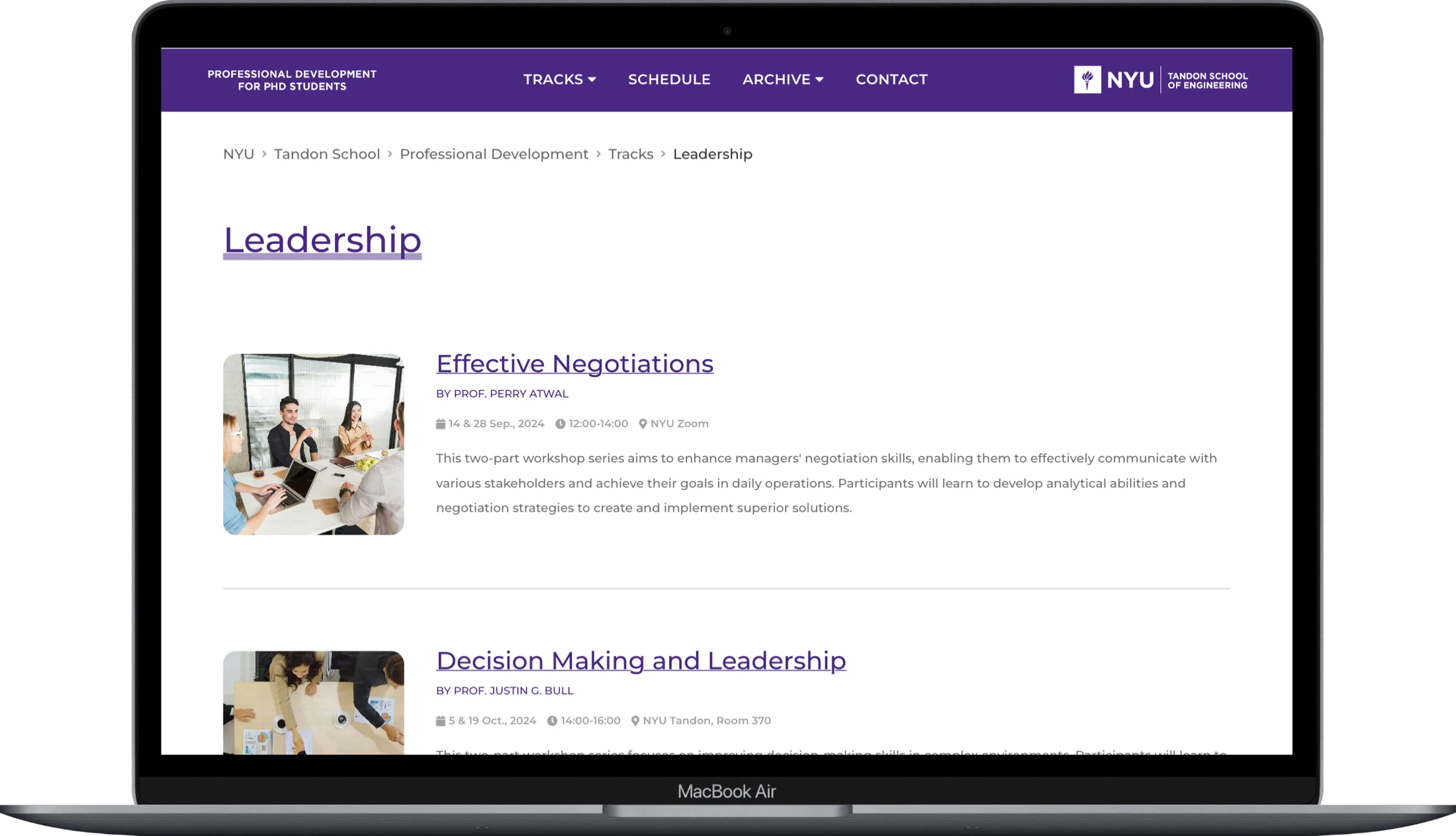 Desktop
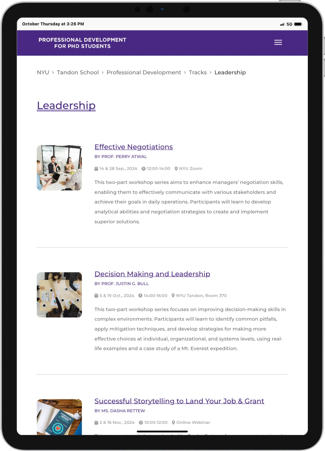 Tablet
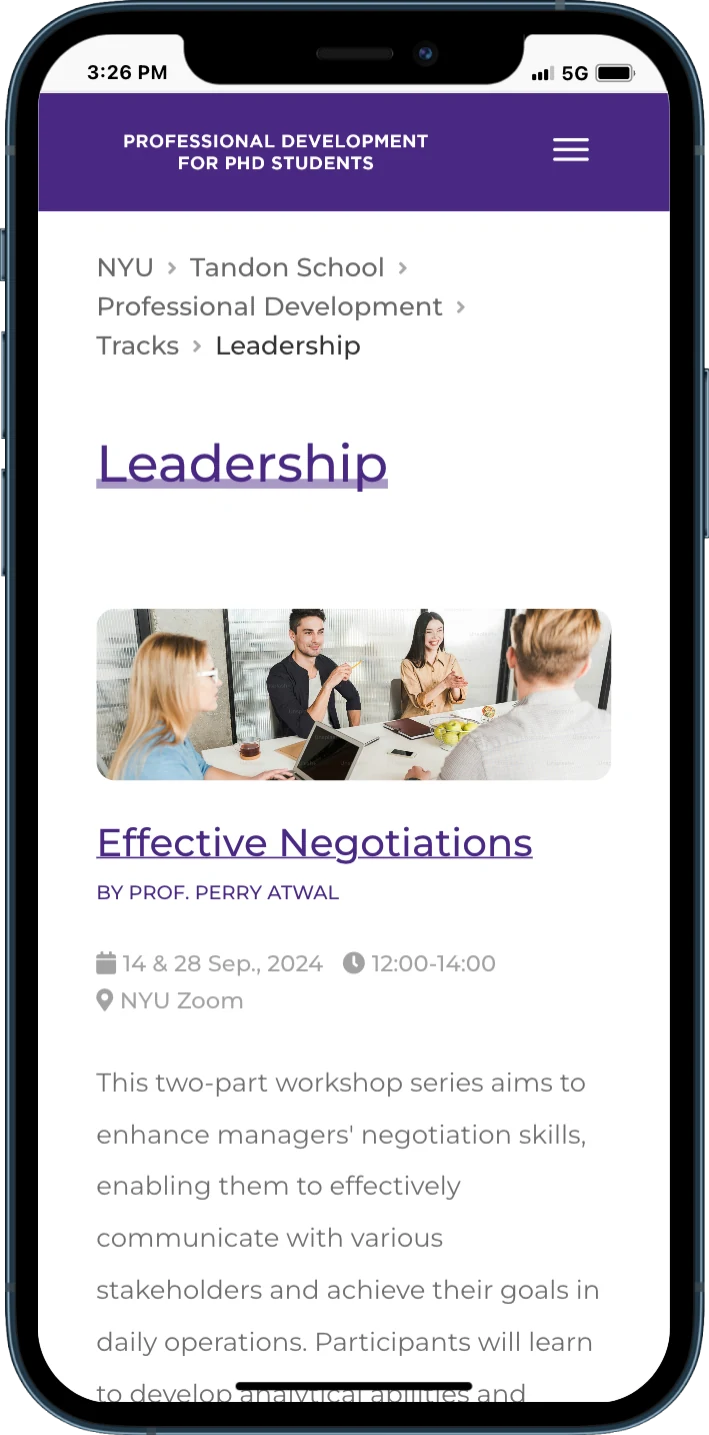 Mobile
NYU PhD Hub
Making professional development workshops easier to discover.
Overview
Making workshop discovery clearer.
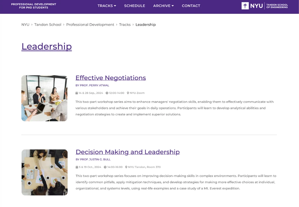
While working as a graduate assistant at NYU PhD Hub, I redesigned and developed a professional development workshop page for PhD students.
The workshops are organized into tracks. Students can register for one or more tracks and are expected to attend all workshops within their chosen tracks. The page needed to help them understand each workshop and compare their options.
From Research to Implementation
01 · Understand
Interview users and review the existing page to identify information and navigation issues.
02 · Explore
Research event-listing patterns and compare multiple design directions in Figma.
03 · Refine
Gather feedback and improve the balance of imagery, descriptions, and event details.
04 · Build
Implement the layout, responsive behavior, and keyboard navigation.
Research
Finding what people need at a glance.
Exploratory Interviews
I conducted informal interviews with two participants about their experience browsing event-listing pages. Both highlighted the importance of relevant imagery and short descriptions that do not require another click.
Images Help People Notice Events
Pictures catch attention and help users recognize the subject of a workshop.
Preview Before Clicking
A brief introduction helps users decide whether an event is relevant before opening its details.
RESEARCH LIMITATION
These participants were friends rather than the page’s target PhD student audience. Their feedback informed an initial exploration; research with target users would be needed before making broader conclusions.
Secondary Research
I reviewed event-information layouts on Behance, Dribbble, and other NYU webpages, focusing on visual hierarchy, information clarity, navigation patterns, color, and typography.
Identified Issues
Important details were getting lost.
Unclear Dropdowns
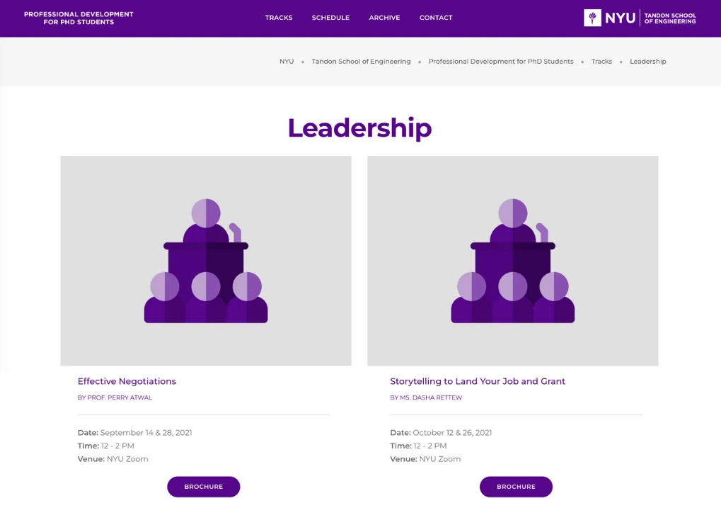
Navigation items looked the same even when some opened additional menu options.
Weak Breadcrumb Hierarchy
Bullet separators did not clearly communicate the page’s position in the site structure.
Oversized Images
Large illustrations took attention away from workshop names, dates, and locations.
Missing Event Previews
Users had to click through to understand what a workshop would cover.
Design Exploration
Choosing clarity over visual impact.
I explored four directions in Figma, refining how event images, descriptions, and logistical details could work together.
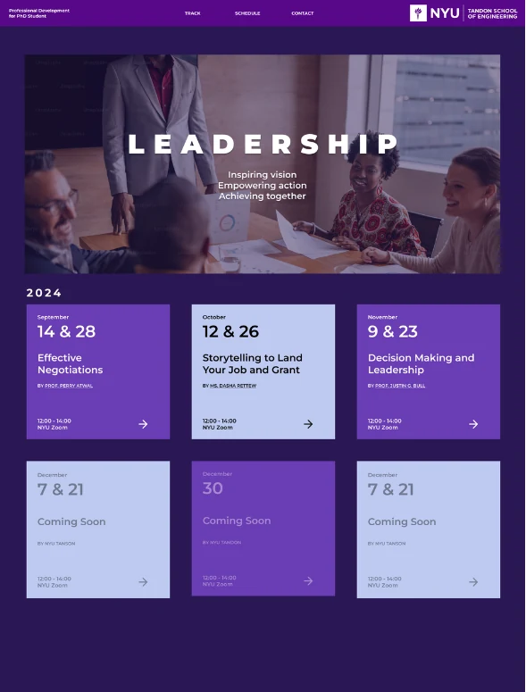
01 — Interactive Square Cards
A dark background and hover-to-flip cards created a strong visual impression.
Trade-off
Square cards limited description space, while the dark palette made information harder to scan.
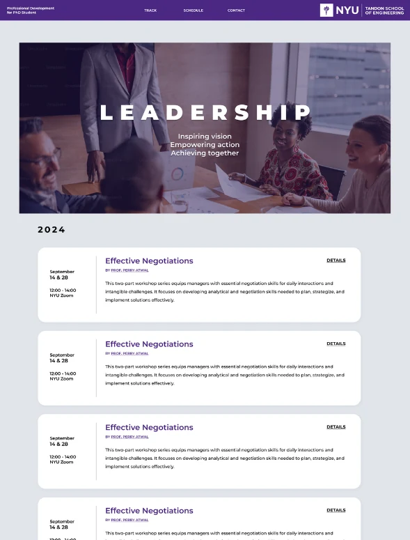
02 — Light, Horizontal Layout
Horizontal cards gave descriptions more room and improved readability.
Trade-off
Without event imagery, the page felt text-heavy and less visually engaging.
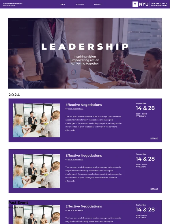
03 — Bringing Images Back
Event photos made the content more inviting and recognizable.
Trade-off
Dark card backgrounds still competed with the clarity of the information.
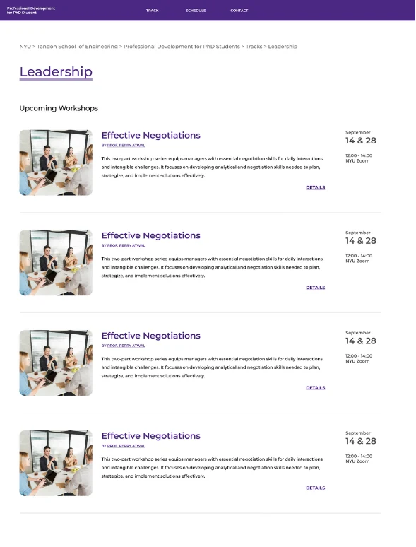
04 — Information First
A simple heading replaced the large banner, and white event rows put details closer to the content.
Trade-off
Right-aligned dates and locations needed a different arrangement on smaller screens.
The final direction prioritized readable information, relevant images, and clear navigation over large banners and visually dominant backgrounds.
Final Design
One experience, across three screen sizes.
The final page uses smaller event images, clear titles, and concise workshop descriptions. Date, time, and location remain close to each event, while dropdown arrows and breadcrumb separators make navigation easier to understand.
DesktopTabletMobileDesigned for Smaller Screens
On mobile, event images move above the text to give descriptions more room. Adjusted type size and line spacing make the content easier to read without squeezing the desktop layout into a narrow screen.
Clearer Navigation
Dropdown indicators reveal available options, and arrow separators communicate breadcrumb hierarchy.
Useful Event Previews
Smaller images and short descriptions give workshop details room to breathe.
Development
Building a maintainable event page.
I adapted the existing webpage using HTML, CSS, and JavaScript, then used PHP to centralize event data and generate the repeated event markup.
Reusable Event Rendering
Generate event rows from shared data instead of repeating the same HTML for every workshop.
Centralized Content
Keep workshop details together so future content changes are easier to manage.
Modular Structure
Organize files by responsibility to make the code easier to understand and maintain.
Working with Existing Code
The downloaded production code was longer and harder to navigate than expected. This helped me understand the difference between optimized browser-delivered code and development-ready source files, and the value of a clear structure when making changes.
Key Features
Small details that make browsing easier.
Gentle Scroll Reveals
Content appears gradually as users scroll, making the event list feel more fluid while keeping the focus on the workshops.
Visible Keyboard Focus
A clear orange focus outline helps keyboard users identify the active navigation item or link as they move through the page with Tab.
Desktop
A horizontal layout supports efficient scanning across event images and information.
Tablet
Spacing and layout adapt to retain a readable balance of imagery and text.
Mobile
Stacked content preserves room for descriptions and keeps event information readable.
Takeaway
Designing for clarity, then building it.
Let Feedback Challenge the First Idea
I initially expected bold banners and dark backgrounds to make the page more appealing. Feedback helped me recognize that quick access to clear information mattered more for this task.
Responsive Design Is More Than Scaling
Mobile required a different arrangement of images and text, rather than a smaller version of the desktop page. Designing around the content helped preserve readability at each size.
Design and Code Shape Each Other
Implementing the page made the relationship between visual decisions and maintainability tangible. Shared event data and reusable markup helped turn the design into a structure that could support future updates.