


The Problem
Problem Statement
Users of the Better Help app need a way to easily navigate the onboarding process, because when it can feel cumbersome, users will feel less inclined to finish setting up and leave out information that will be important to pair a user with the right therapist.
Current Screen Flow
38+ Screens
No break points
No clear progression

HMW Statement
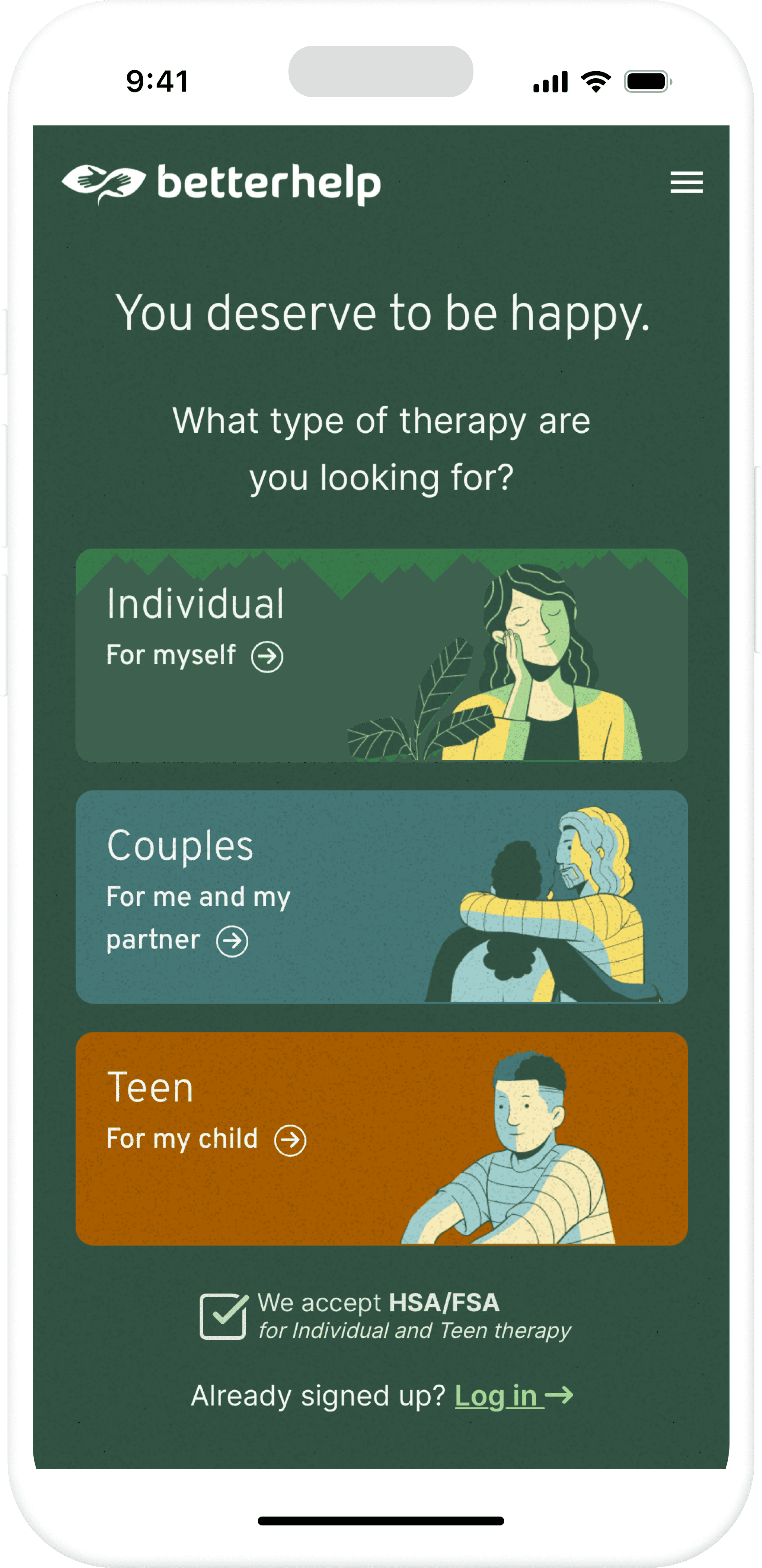
How might we make the onboarding process easier to navigate so that users feel more motivated to finish or able to jump back into it, rather than feeling overwhelmed by the length of the process?
Hypothesis
We believe that incorporating clearer stages to the onboarding process, and a way to navigate them, will encourage users. We aim to avoid cognitive overload and user frustration. We will know this is true when we observe a high onboarding completion rate.
The Users
In the user research phase, we conducted five user interviews to map out individual user journeys through the current BetterHelp onboarding experience. These conversations helped us better understand how real users perceived and interacted with the flow.
Key insights
The length of the onboarding process often felt overwhelming and mentally exhausting
Users experienced tonal whiplash, noting how the questions shifted abruptly from administrative to deeply personal topics without clear transitions
Many expressed a desire for more flexibility and clarity throughout the experience
User Archetype
These patterns led us to develop a focused user archetype, “The Stretched Parent,” to represent a key segment of our audience. We also created user stories to reflect their specific goals, frustrations, and needs.
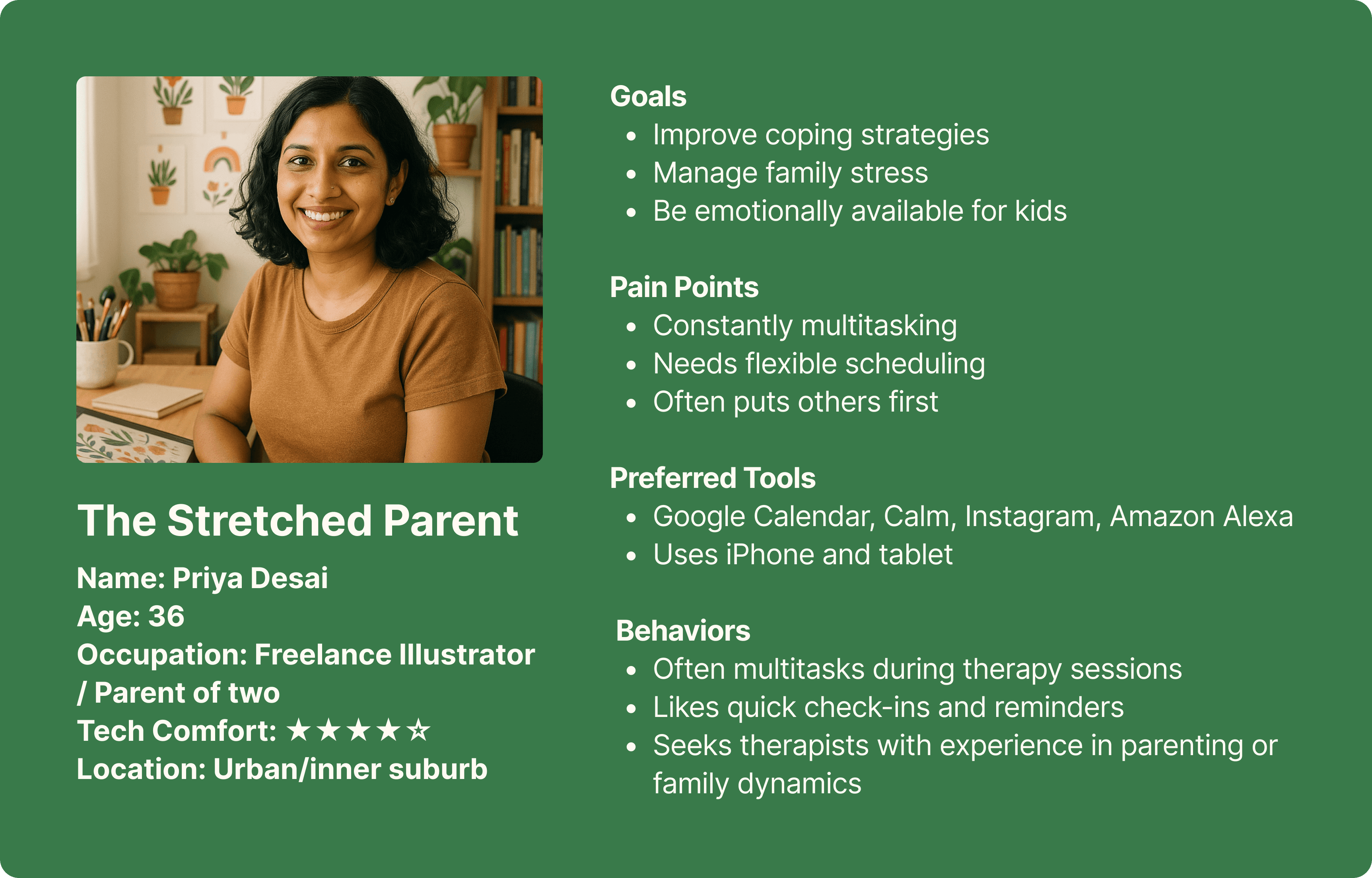
User Stories
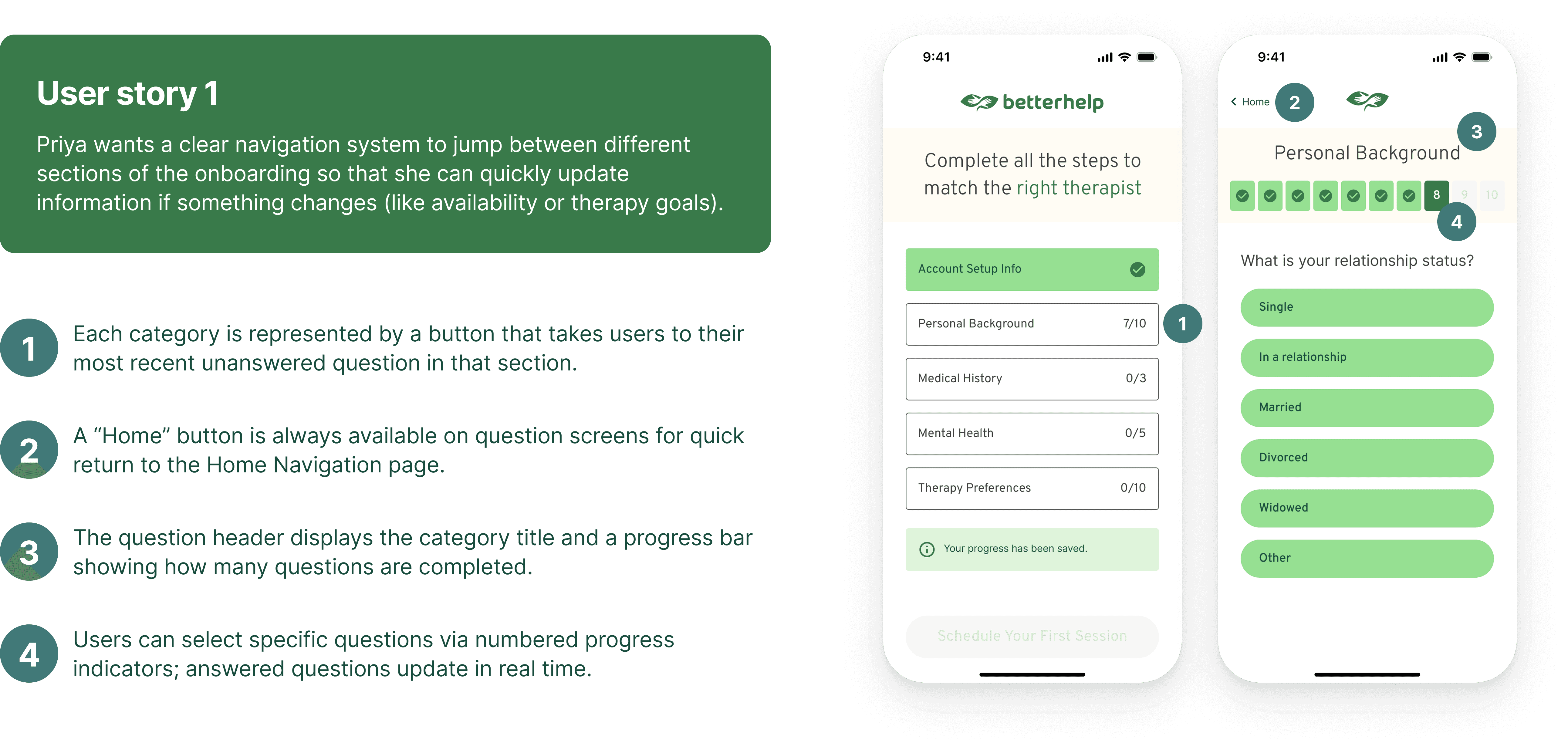
Priya wants a clear navigation system to jump between different sections of the onboarding so that she can quickly update information if something changes (like availability or therapy goals).
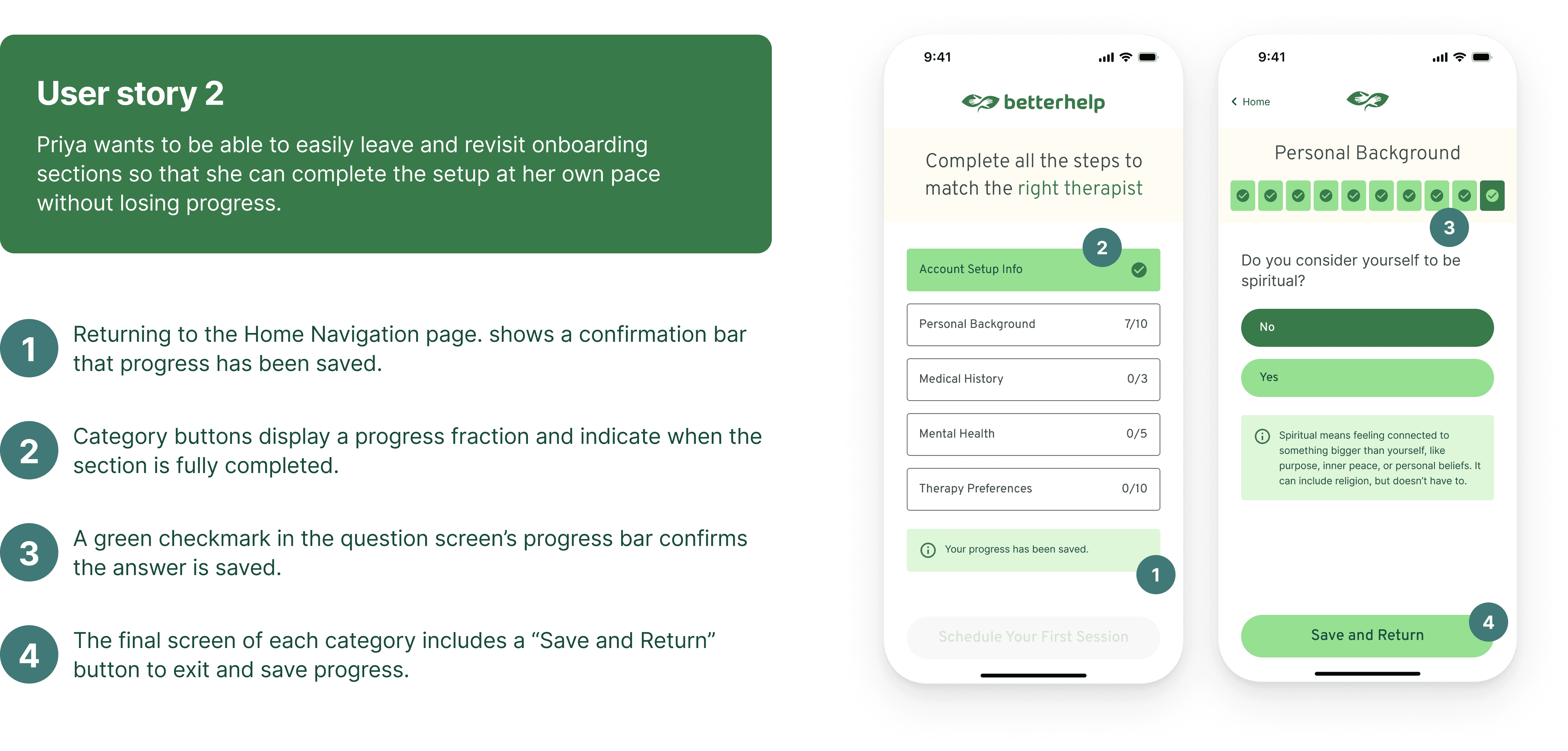
Priya wants to be able to easily leave and revisit onboarding sections so that she can complete the setup at her own pace without losing progress.
Task Analysis
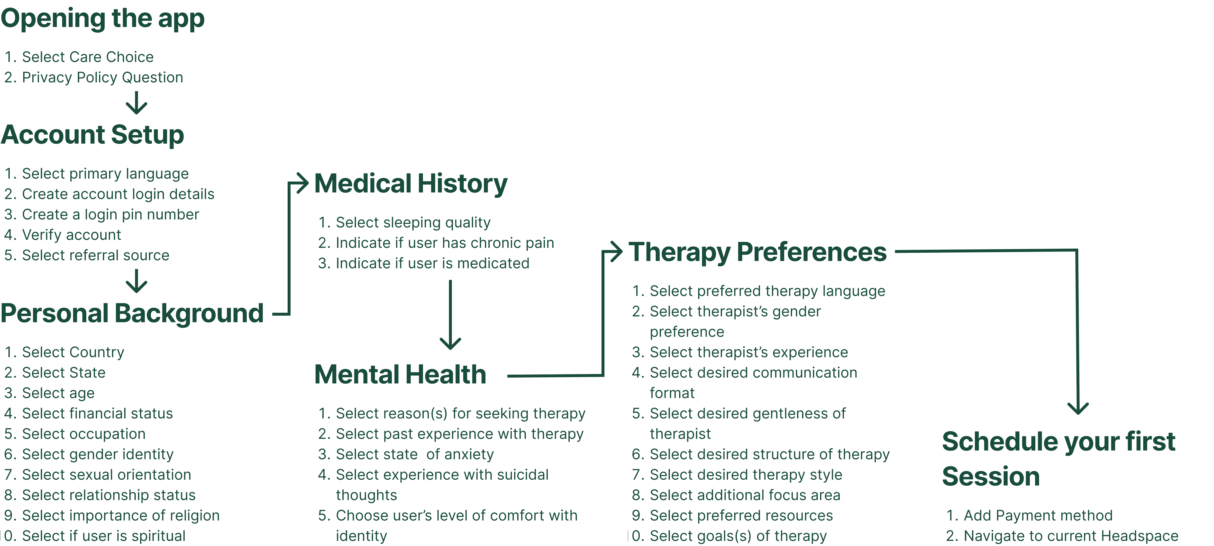
To better understand the complexity of BetterHelp’s onboarding flow, we mapped out the full task structure involved in account creation.
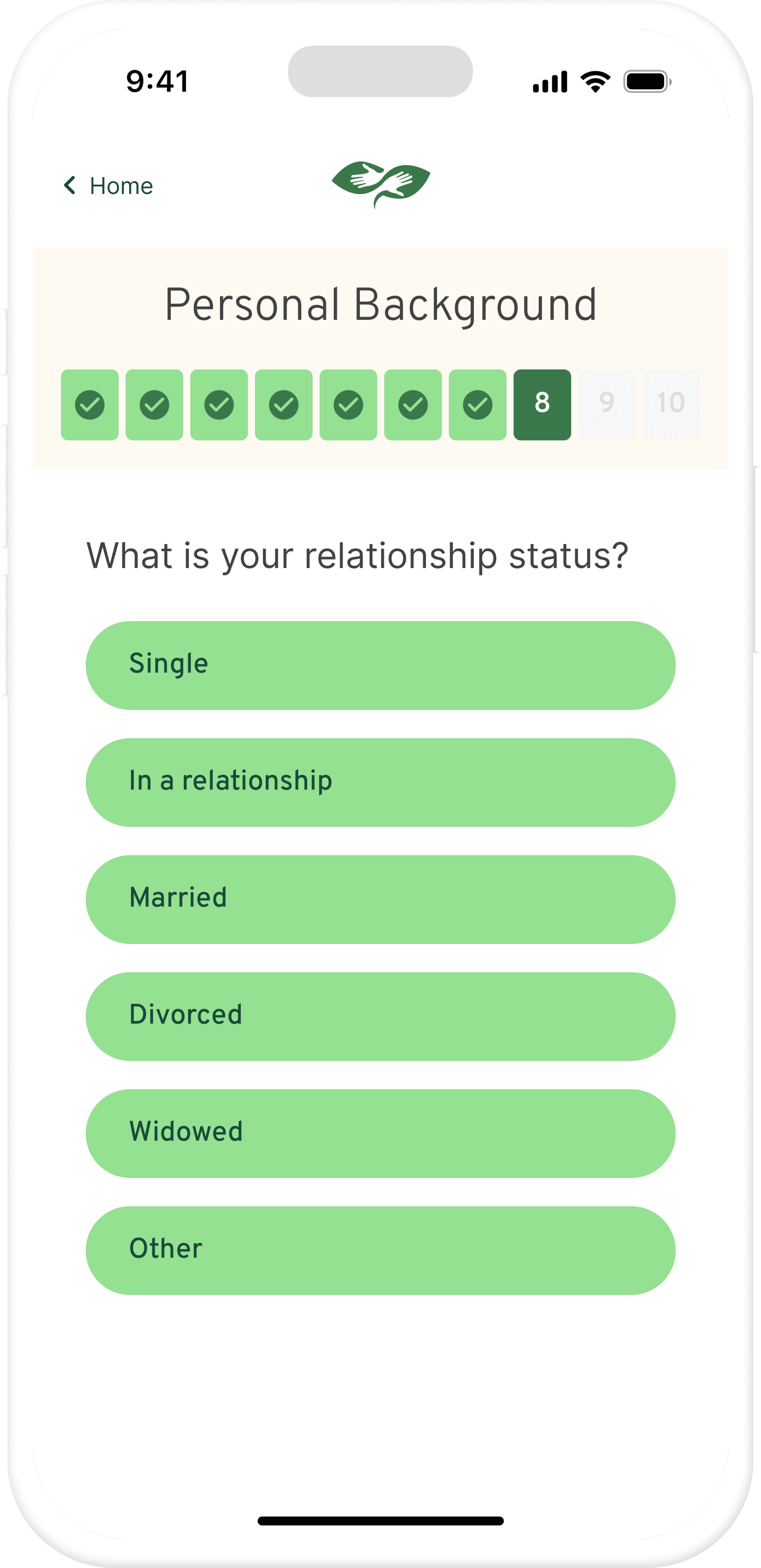
The onboarding process includes 7 distinct stages, requiring users to provide a wide range of information—ranging from demographics and therapy preferences to mental health status.
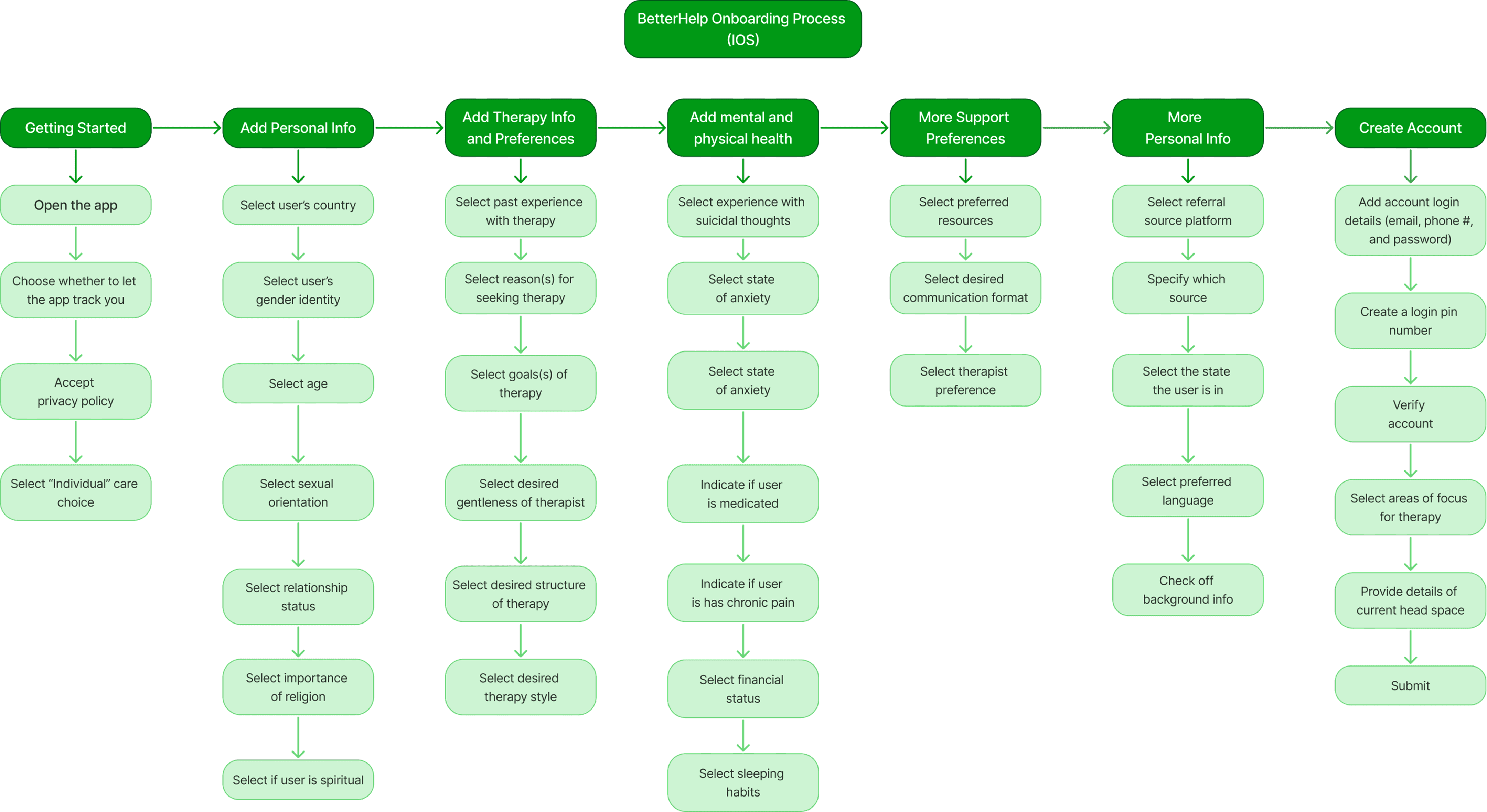
Key Observations
The flow presents over 30 decision points before account creation is complete.
Several deeply personal questions are asked without clear indication of why they’re needed.
Some question categories (e.g., therapy preferences vs. support resources) are spread across different stages, making it harder for users to follow the logic.
No obvious mechanism to review or revise previously entered responses.
These findings pointed to opportunities to simplify, better group related questions, and introduce checkpoint logic to reduce user overwhelm.
User Journey
To build on our interview insights, we mapped the onboarding experience of five participants step-by-step through the current BetterHelp iOS flow. These user journey maps highlights how friction accumulates across the process, not just through individual questions, but also through how topics are grouped and presented.
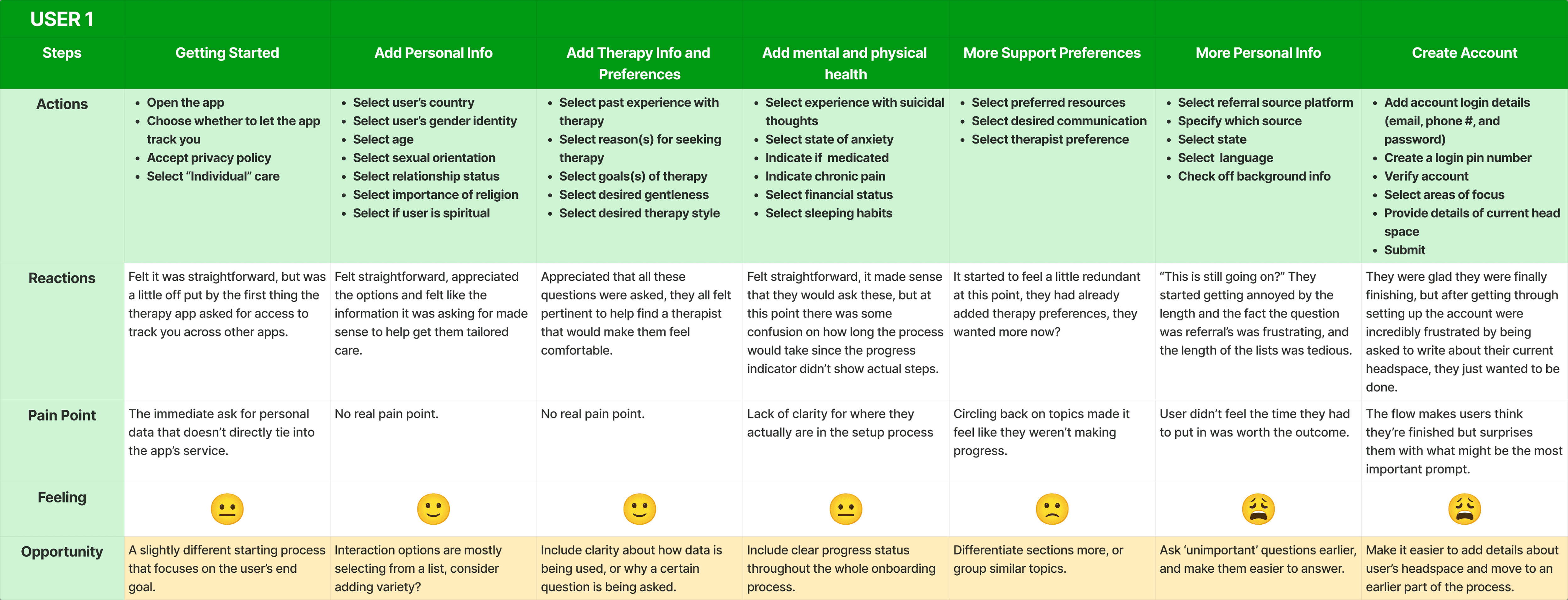
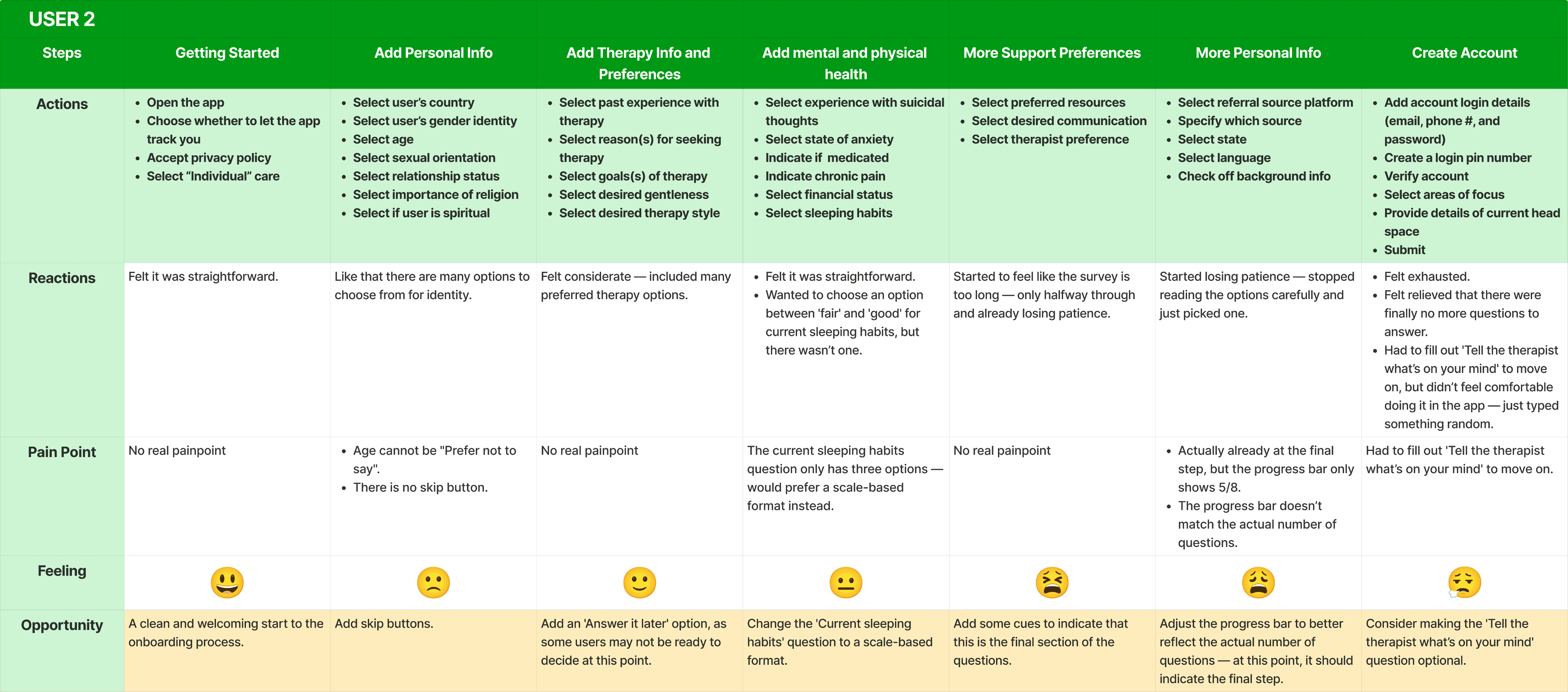
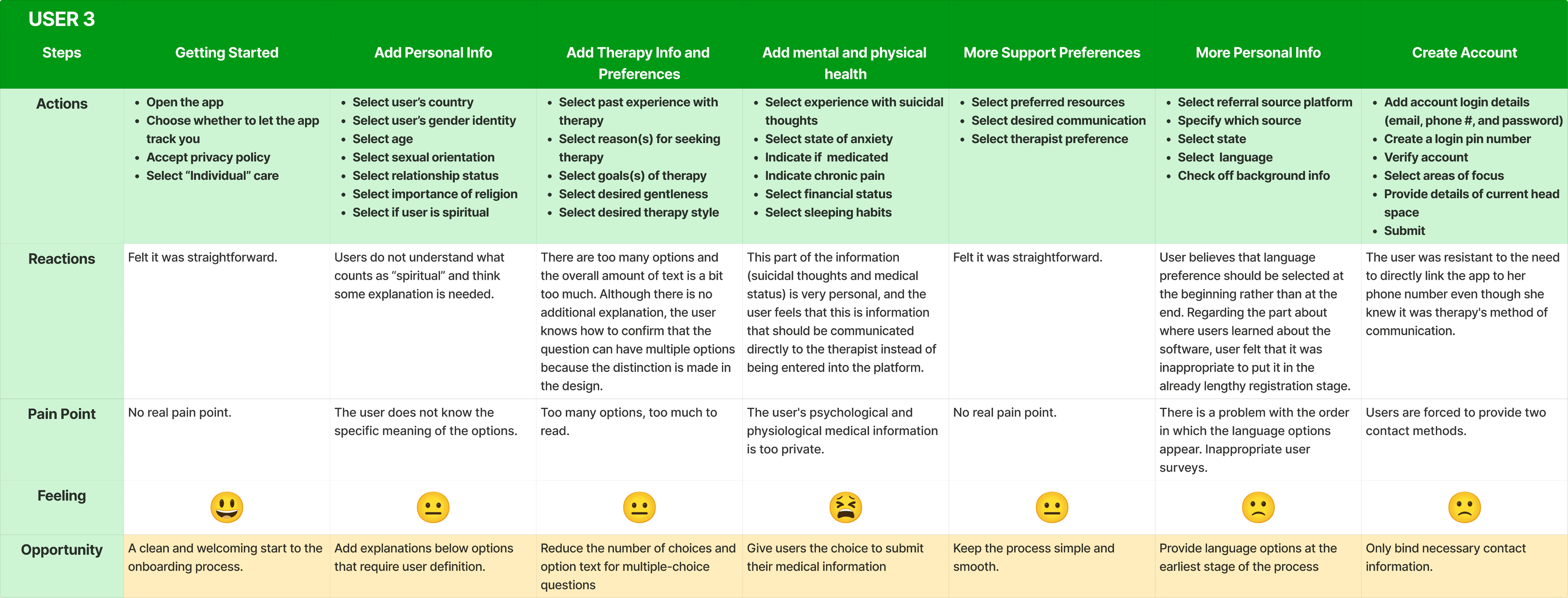
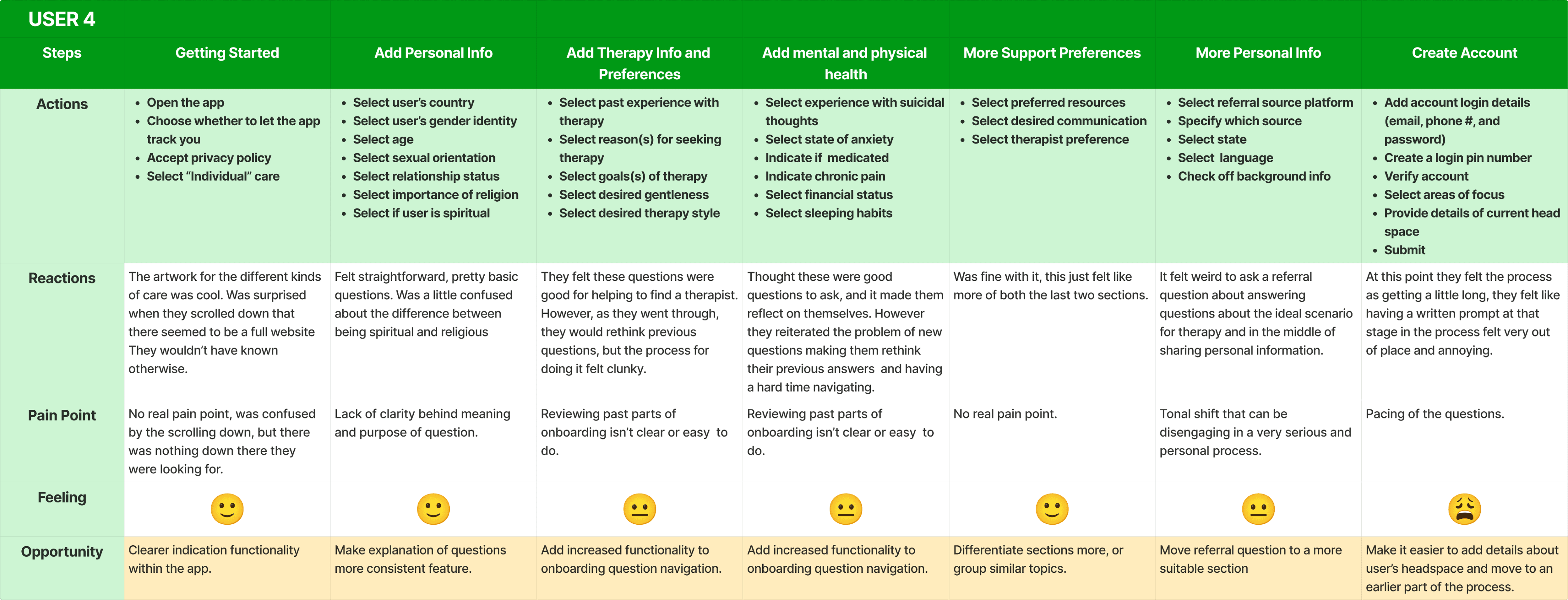
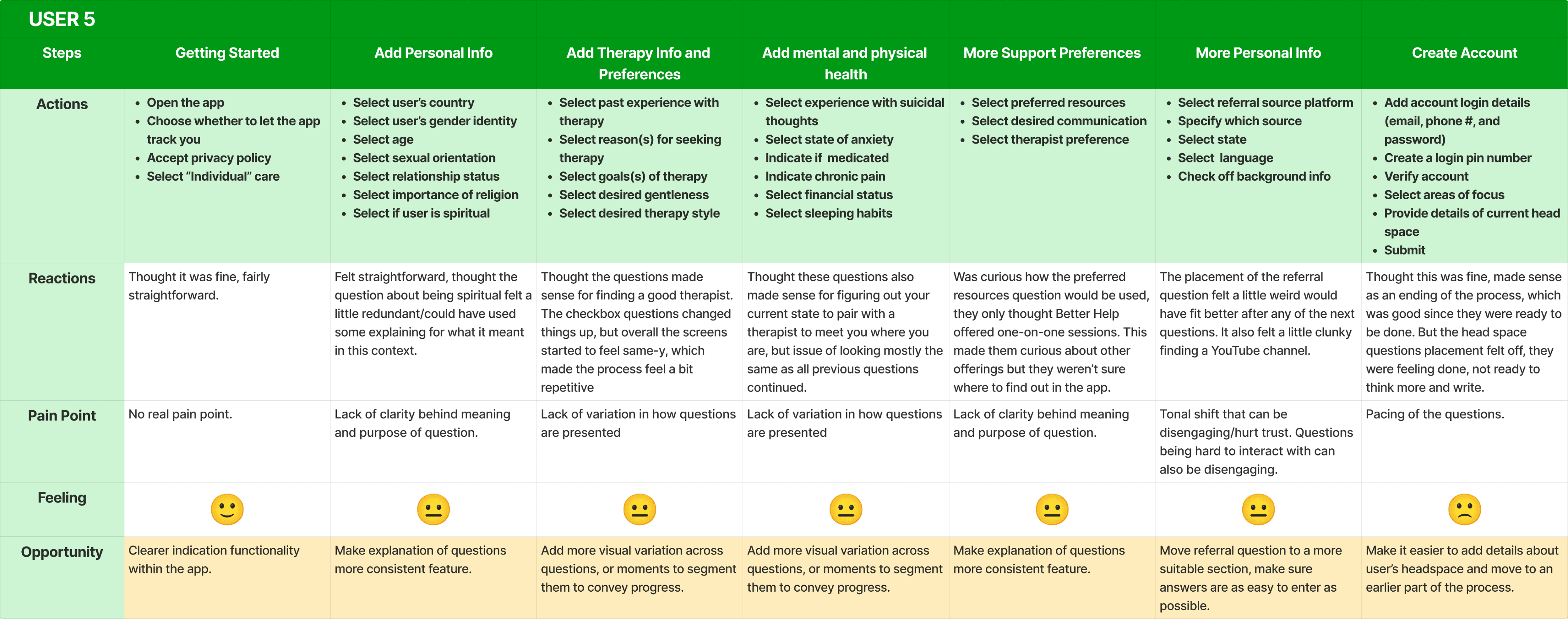
Key Takeaways
Cognitive overload builds gradually, especially as the onboarding shifts from administrative to deeply personal topics (e.g., suicidal thoughts, chronic pain).
Emotional tone changes abruptly between sections, causing discomfort and confusion. Users noted it felt odd to answer referral questions in the middle of sharing sensitive information.
Despite no major pain points in the early steps, later stages triggered mental fatigue, especially when required to reflect deeply and enter open-ended responses.
Users wanted the ability to pause, skip, or return to sections—especially when questions felt too difficult to answer in the moment.
This emotional journey confirmed that even a well-intentioned flow can backfire without clear grouping, empathetic pacing, or user control. These findings directly informed our redesign strategy to reduce friction, build flexibility, and better support users’ mental state during onboarding.
Heuristic Evaluation
To evaluate the usability of the current onboarding flow, we conducted a heuristic analysis using Jakob Nielsen’s 10 usability principles.
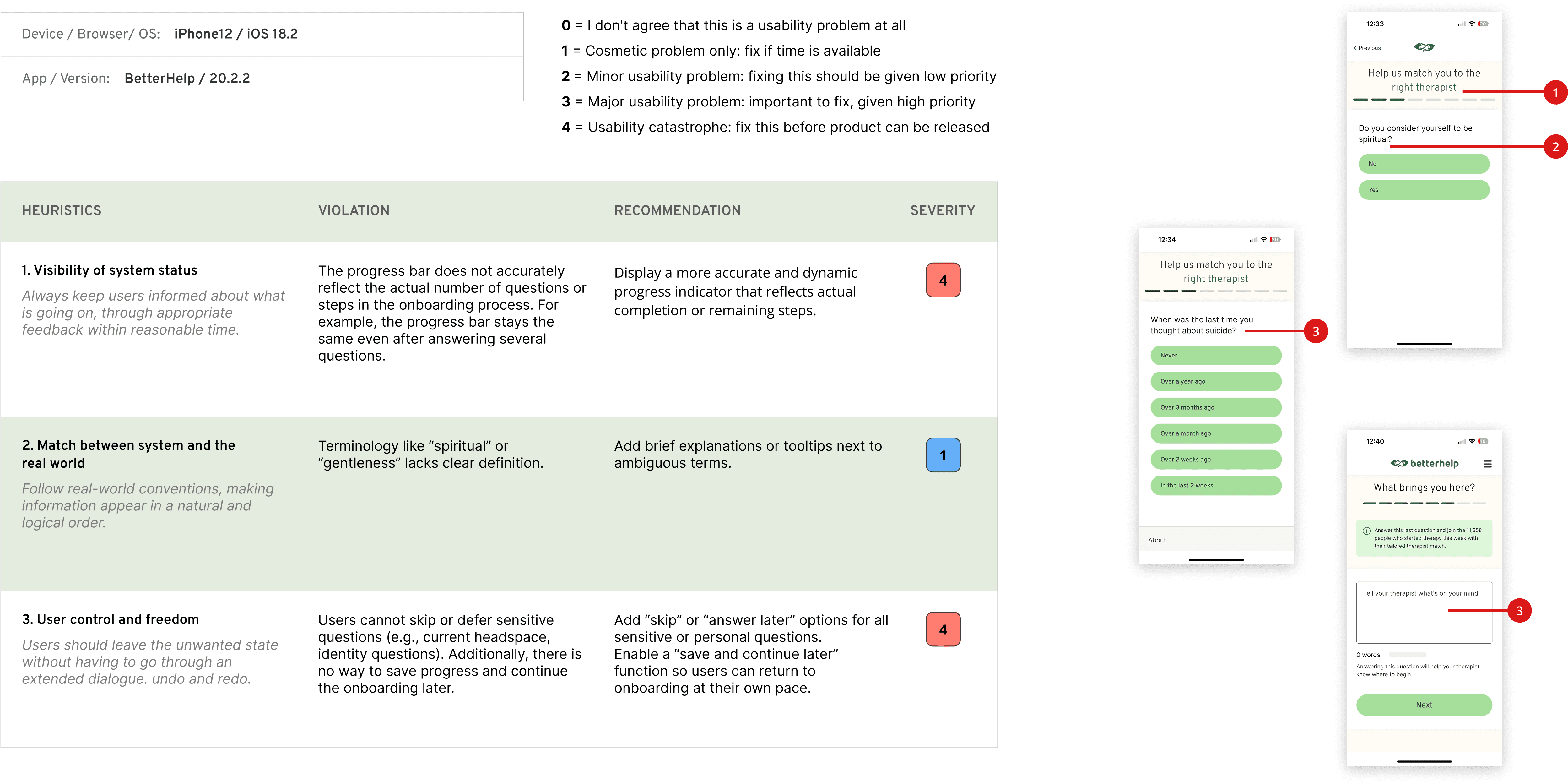
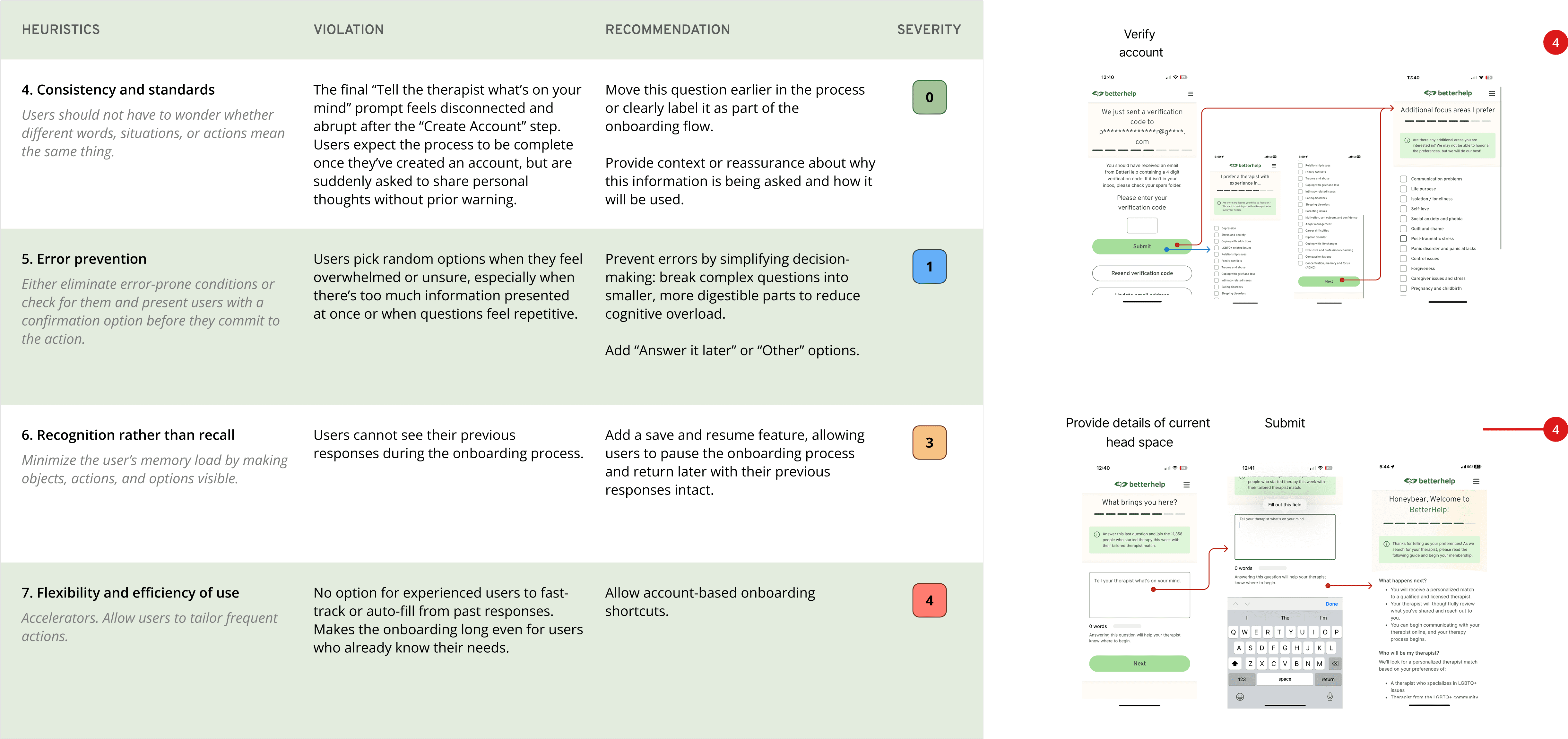
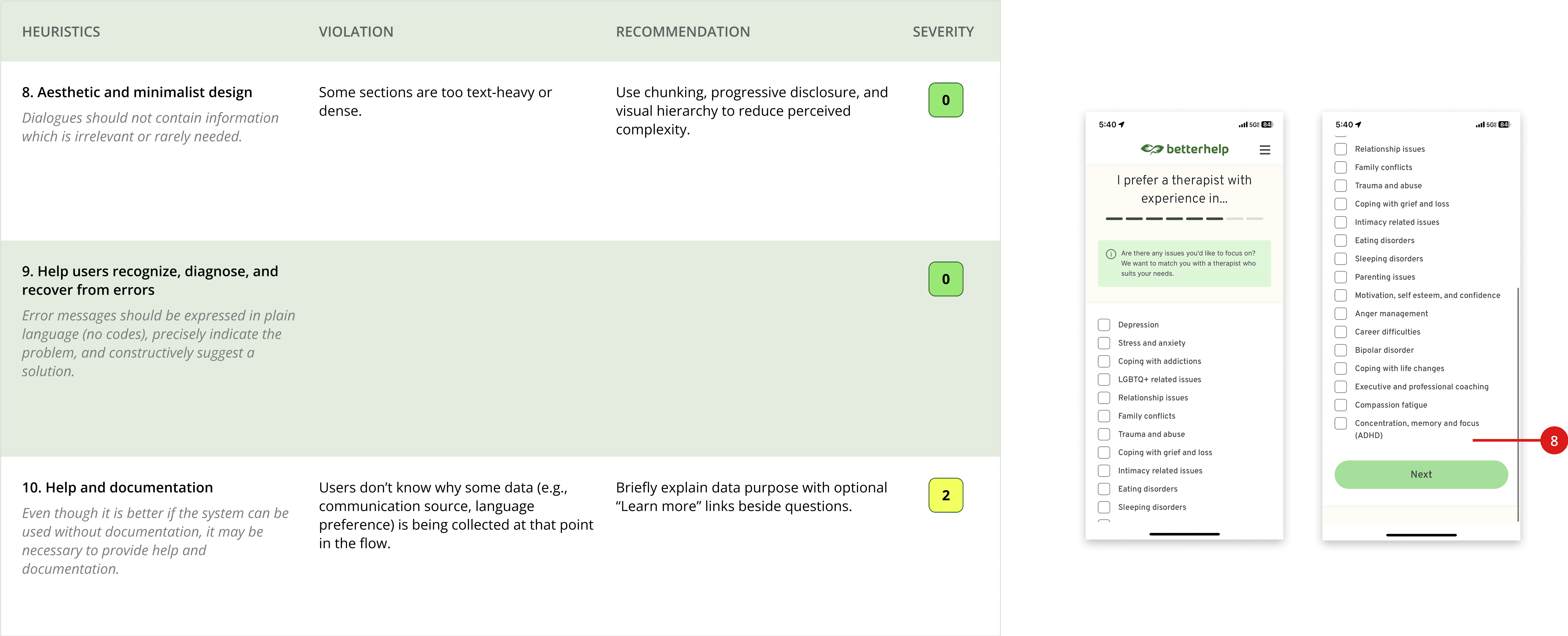
Key Observations
Unclear progress tracking: Progress bar didn’t reflect actual completion
Vague terminology: Unclear language like “gentleness” without explanation
Lack of flexibility: No ability to save and come back later
Competitors Analysis
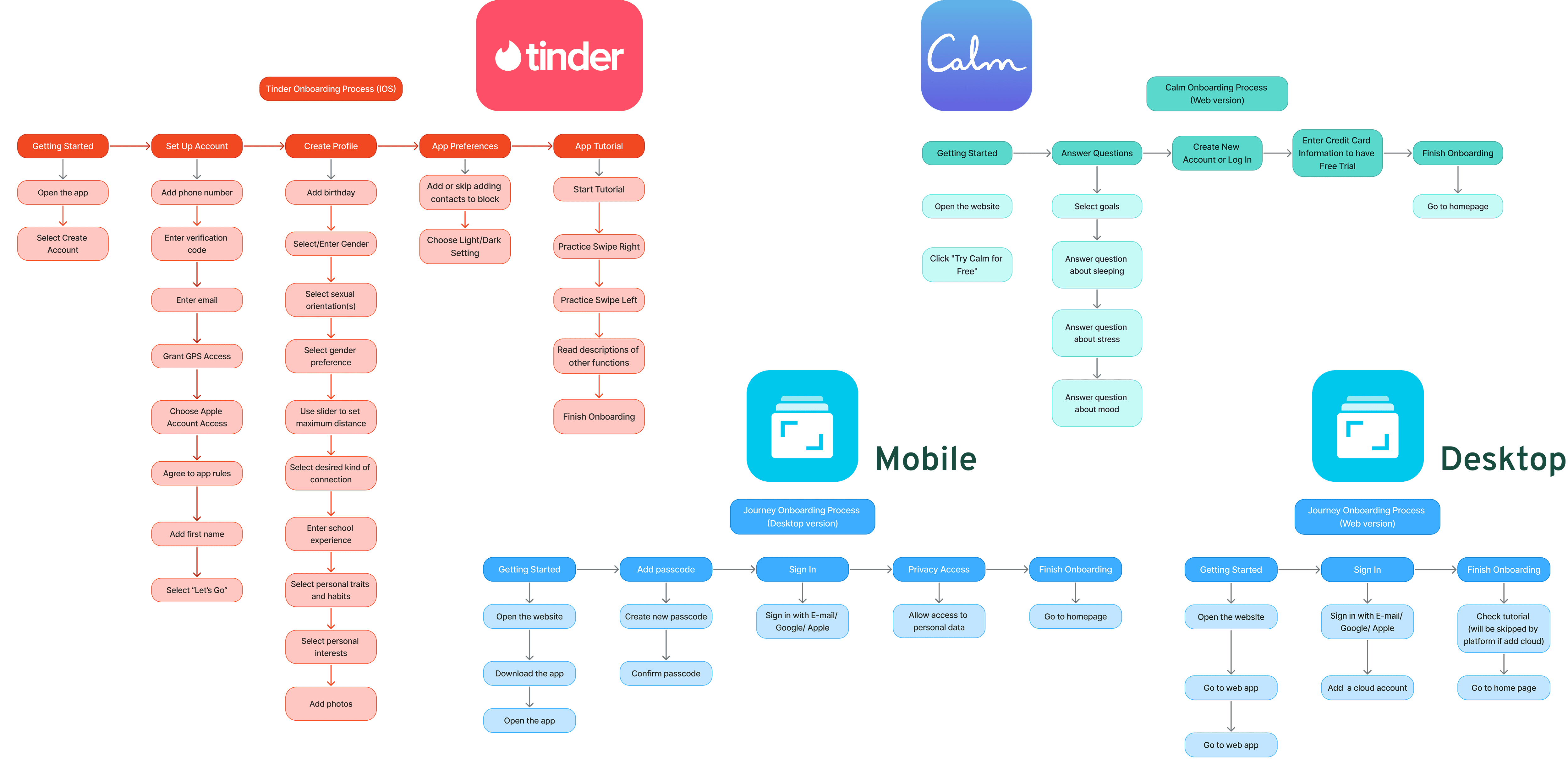
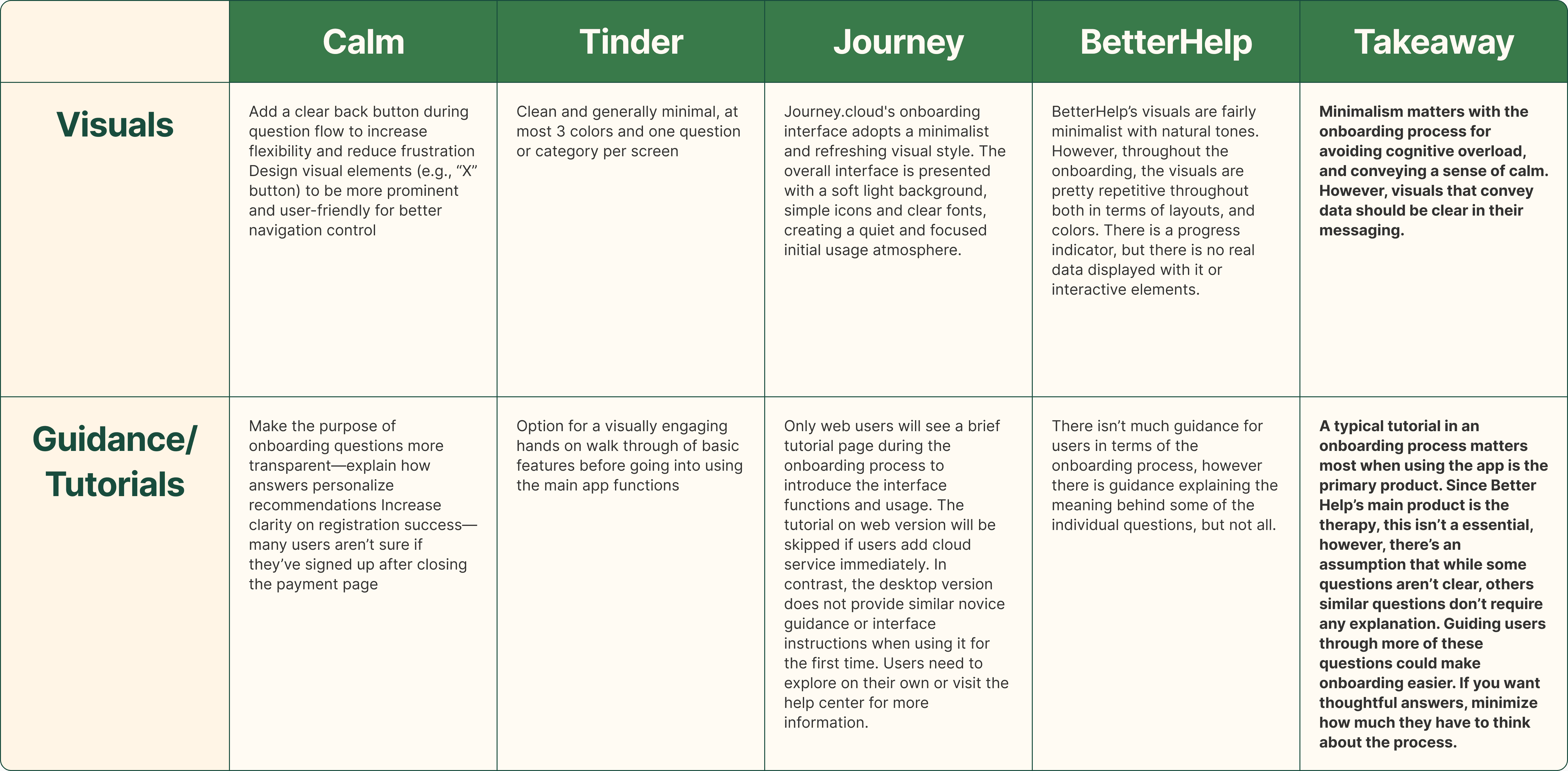
To broaden our understanding of effective onboarding, we conducted a competitive analysis across three different apps: Calm, Tinder, and Journey. While each serves a different purpose, they all guide users through sharing personal information or setting preferences.
Calm offered a closer comparison within the mental health space, using a minimal and calming interface to ease users into the experience.

Tinder took a more playful and lightweight approach, using progress cues and motivational language to keep users engaged through setup.
Journey, a journaling app, helped us explore how platforms that ask for personal insights build trust and onboard users gradually.
By looking beyond just mental health apps, we were able to gain a more well-rounded perspective on how different types of products approach onboarding, especially when asking users to be vulnerable or share sensitive information.
Through testing the apps with 15 different users, and following it with a competitor analysis, we gleaned insights on how we can craft a cleaner and clearer onboarding process, that’s also easier to navigate.
Task Flow
User Journey
Calm
Tinder
Journey
Competitor Analysis
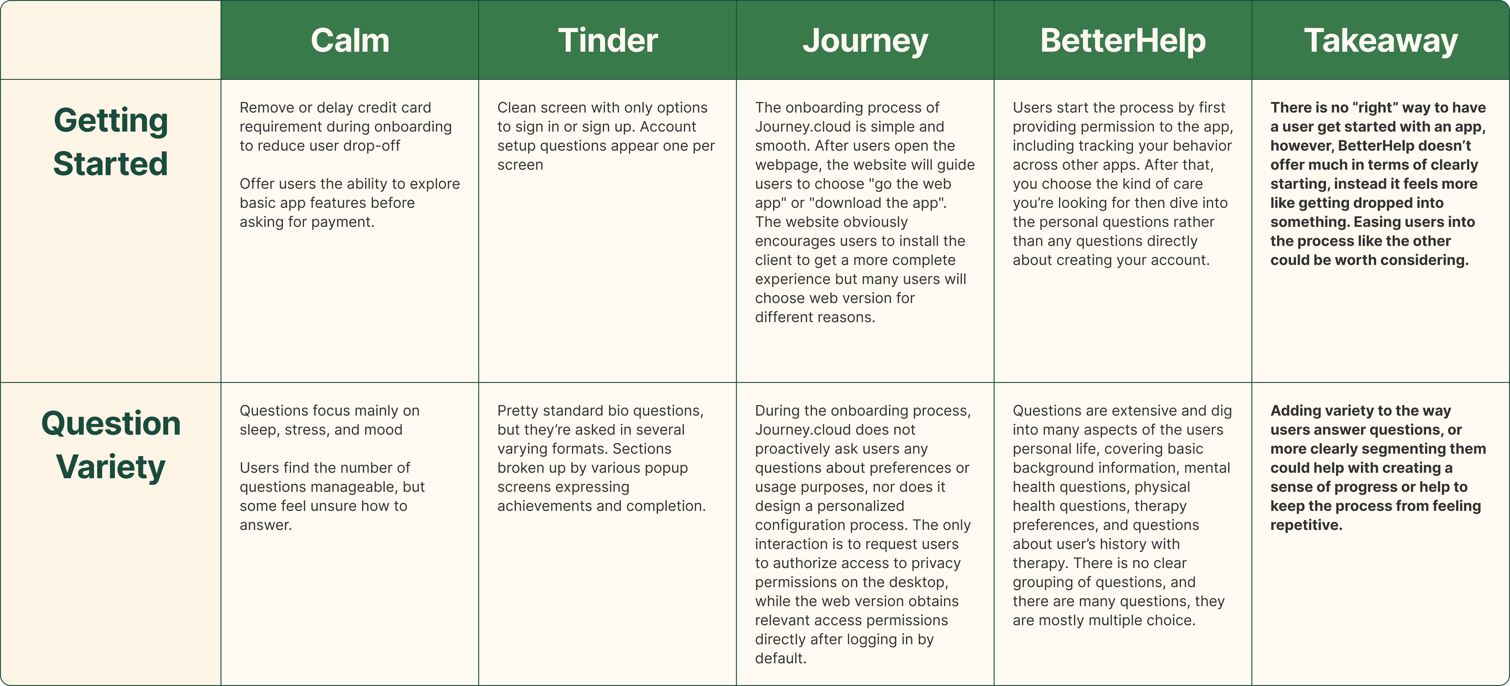
Takeaways
Brevity or segmentation
User ‘reward’
Progression clarity
Design Strategy
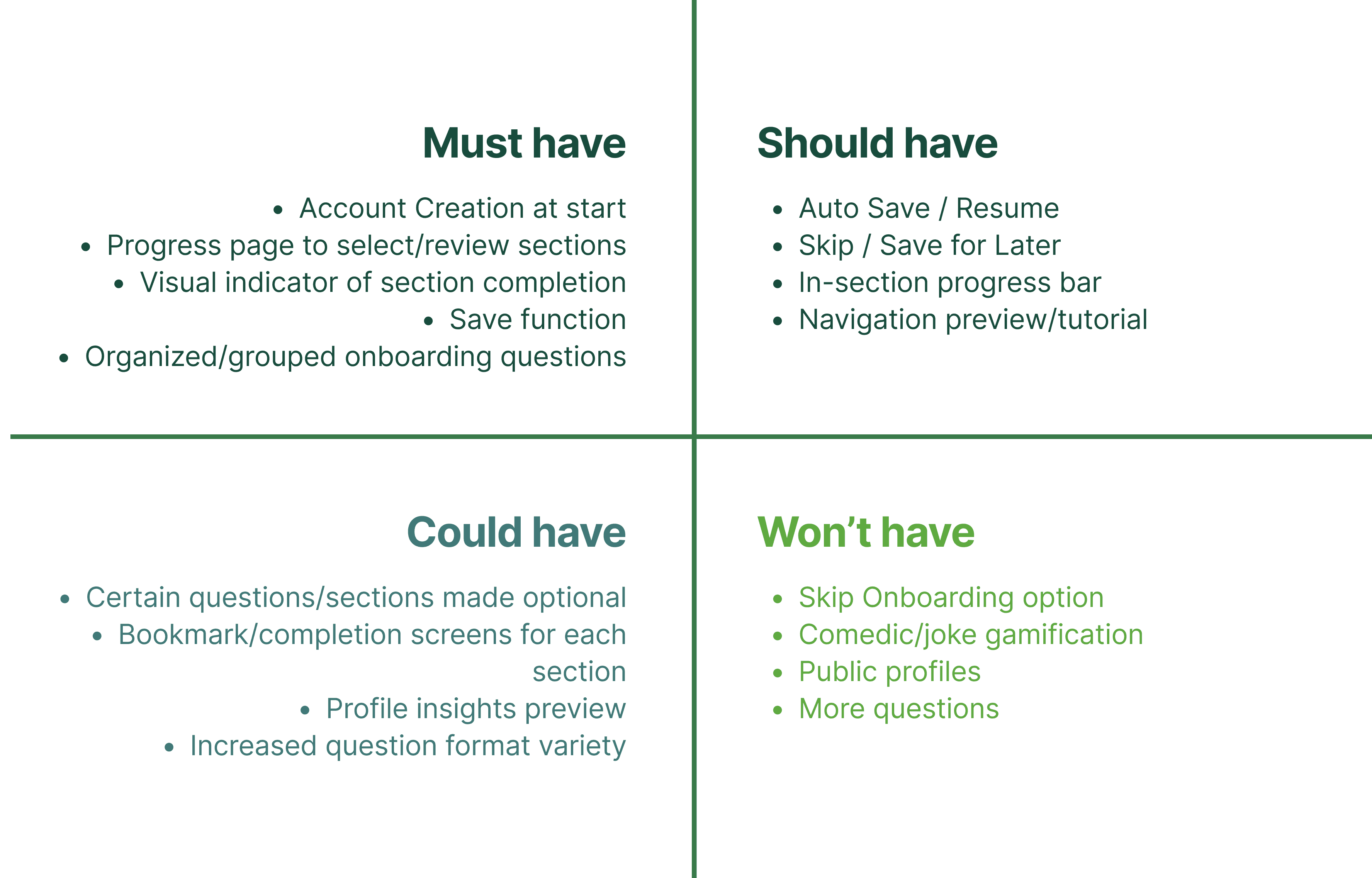
Feature Prioritization
After conducting user interviews, I found that users had a wide range of complaints and frustrations. It was overwhelming at first, so I learned to break down the large, complex problem into smaller, more focused issues. By addressing each smaller issue individually and then combining the solutions, I was able to approach the design in a more structured and effective way.
Process Rearranging
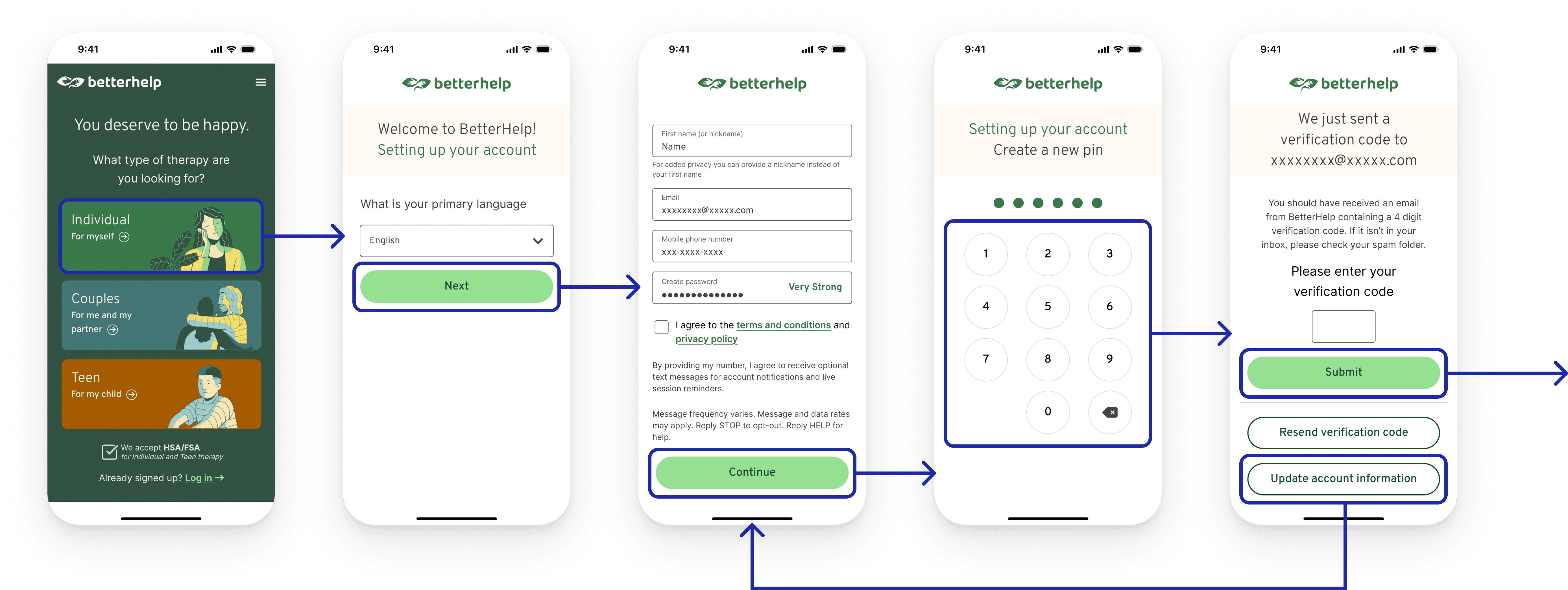
The only way a new central navigation screen would work for onboarding was if questions were categorized. This was our focus at the start of our re-design stage after our Feature Prioritization. We took the questions from the existing onboarding and broke them down into different stages, grouping questions that would feel connected for the user. Our re-organizing also meant moving the account setup stages to the start of the process to allow for the saving of progress for the user.
Design Exploration
Key Pain Points Recap
Users felt overwhelmed by the number of onboarding questions and the abrupt tonal shifts between administrative and emotional topics
Users were required to complete the entire onboarding flow in a single session, and exiting midway resulted in loss of progress and the need to restart.
The lack of structure in how questions were grouped made the process feel more cognitively demanding
Key Features Designed
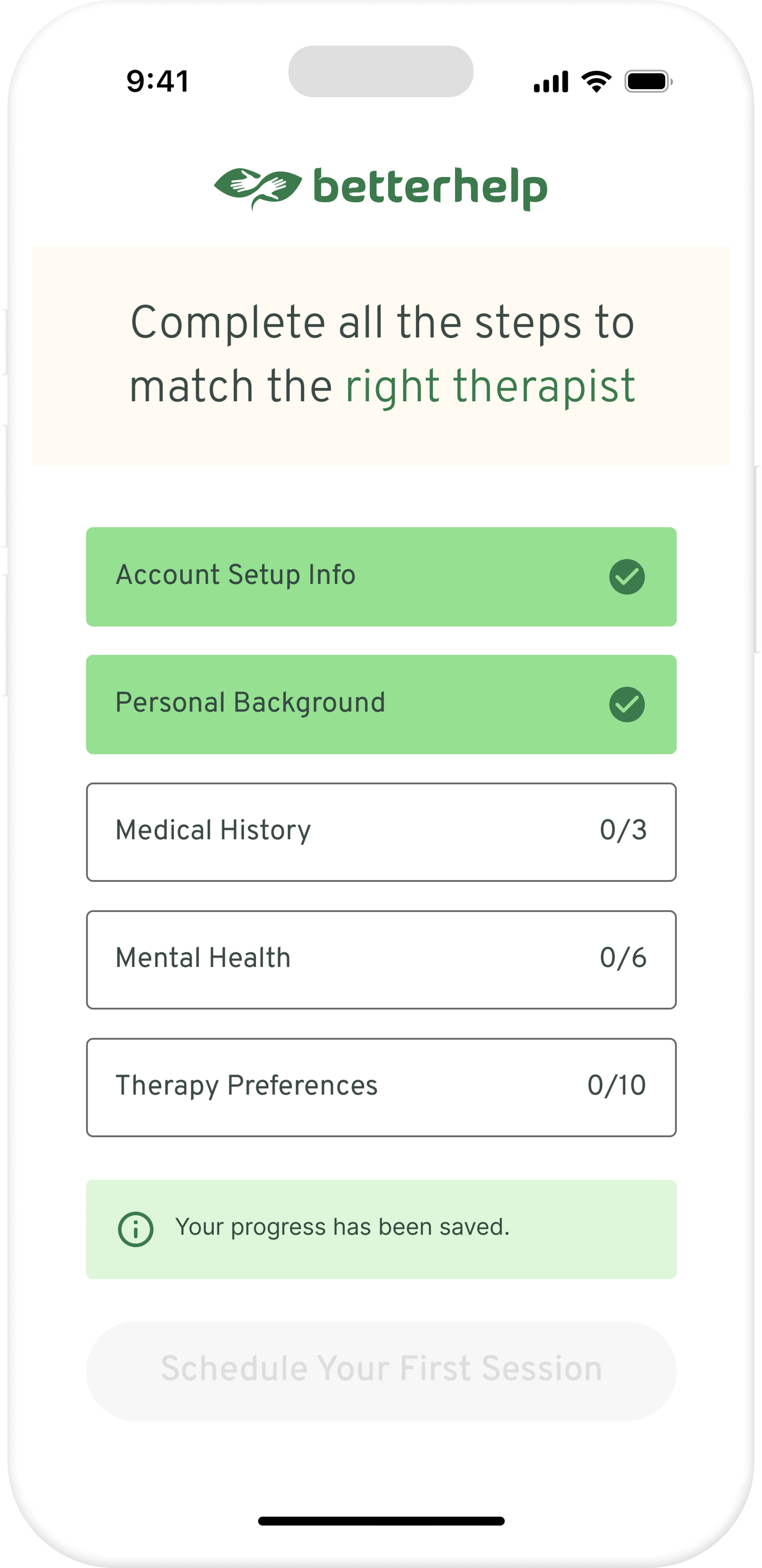
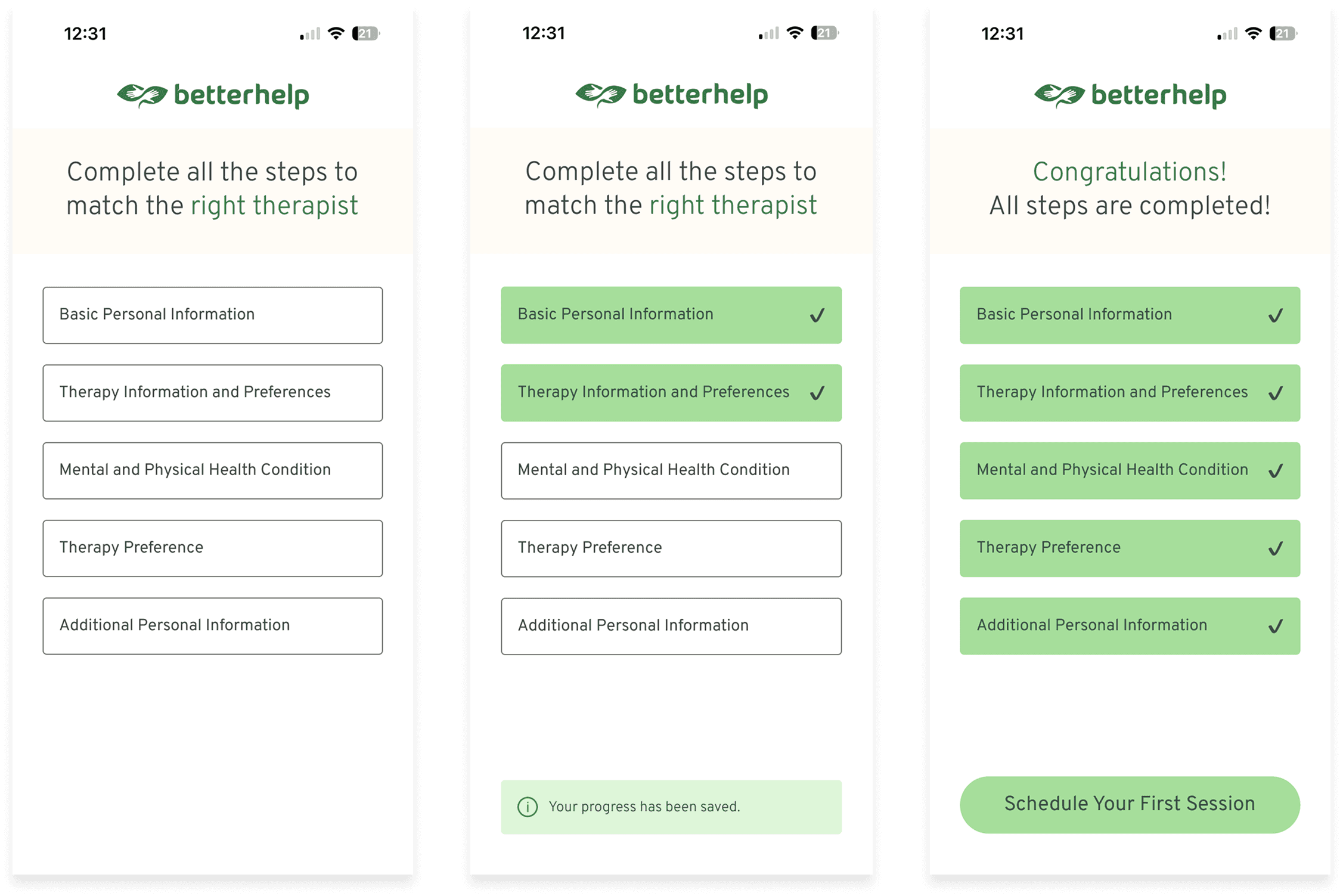
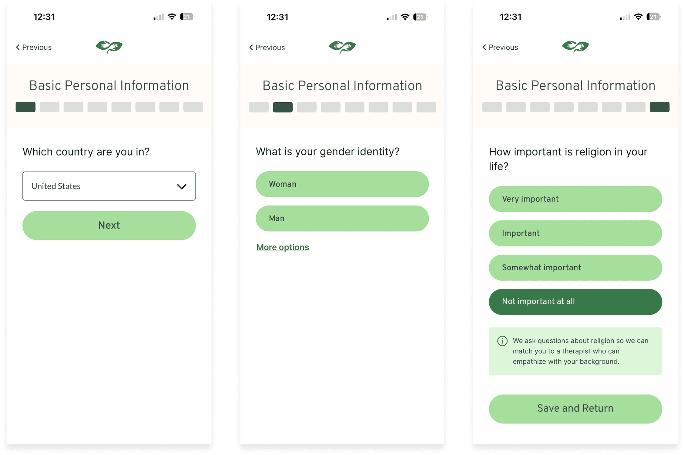
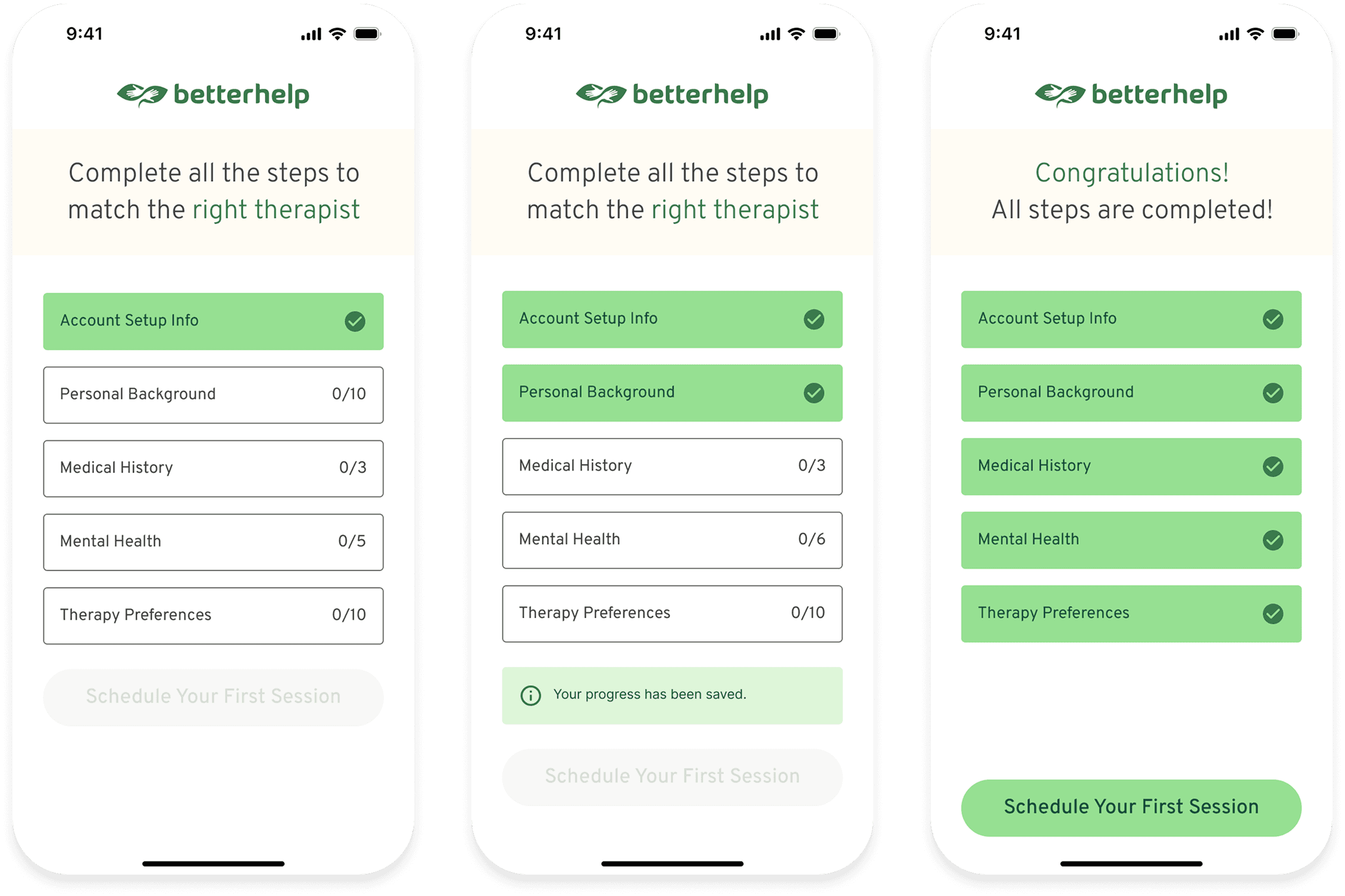
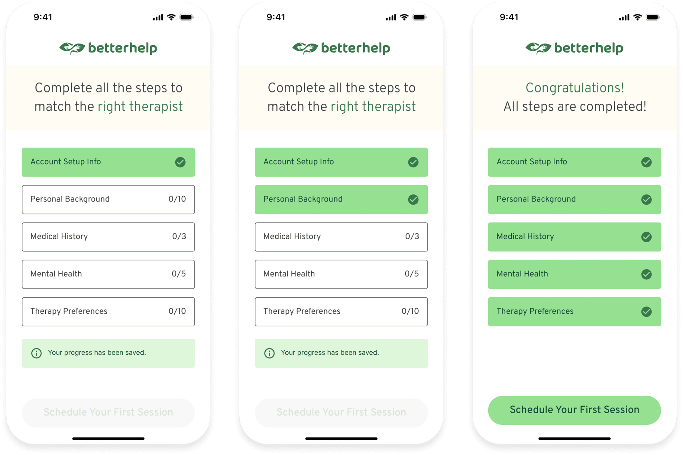
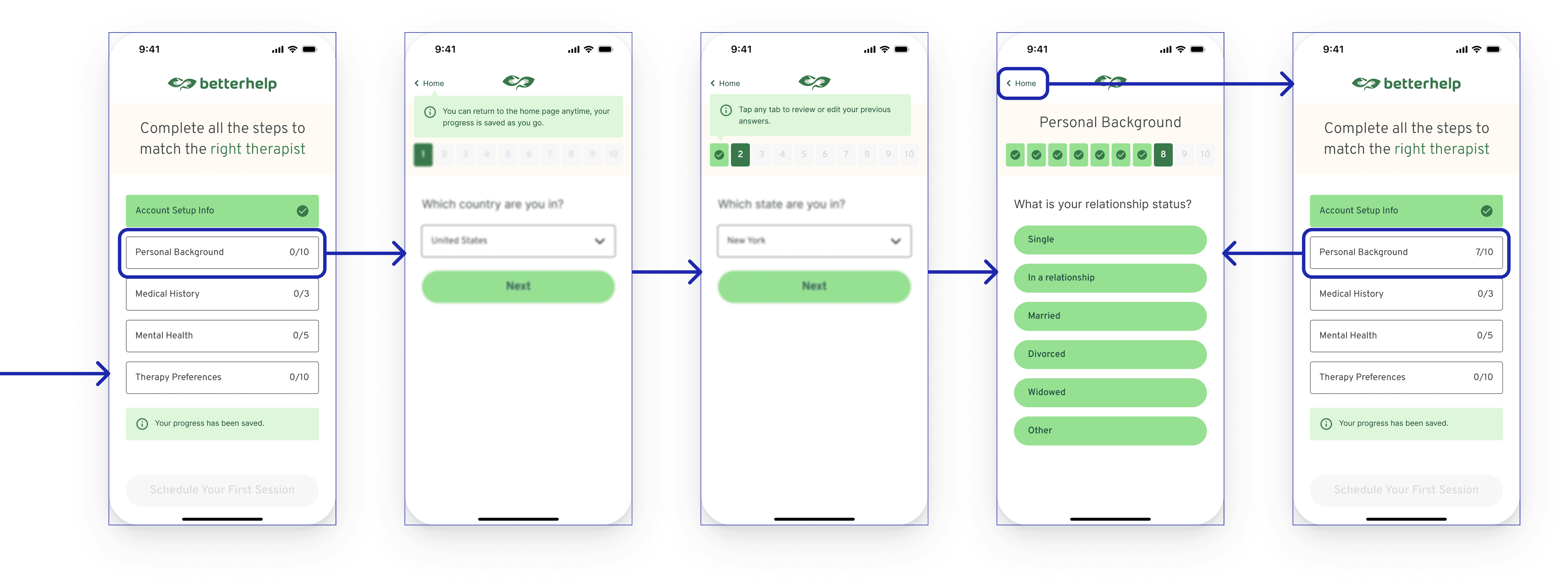
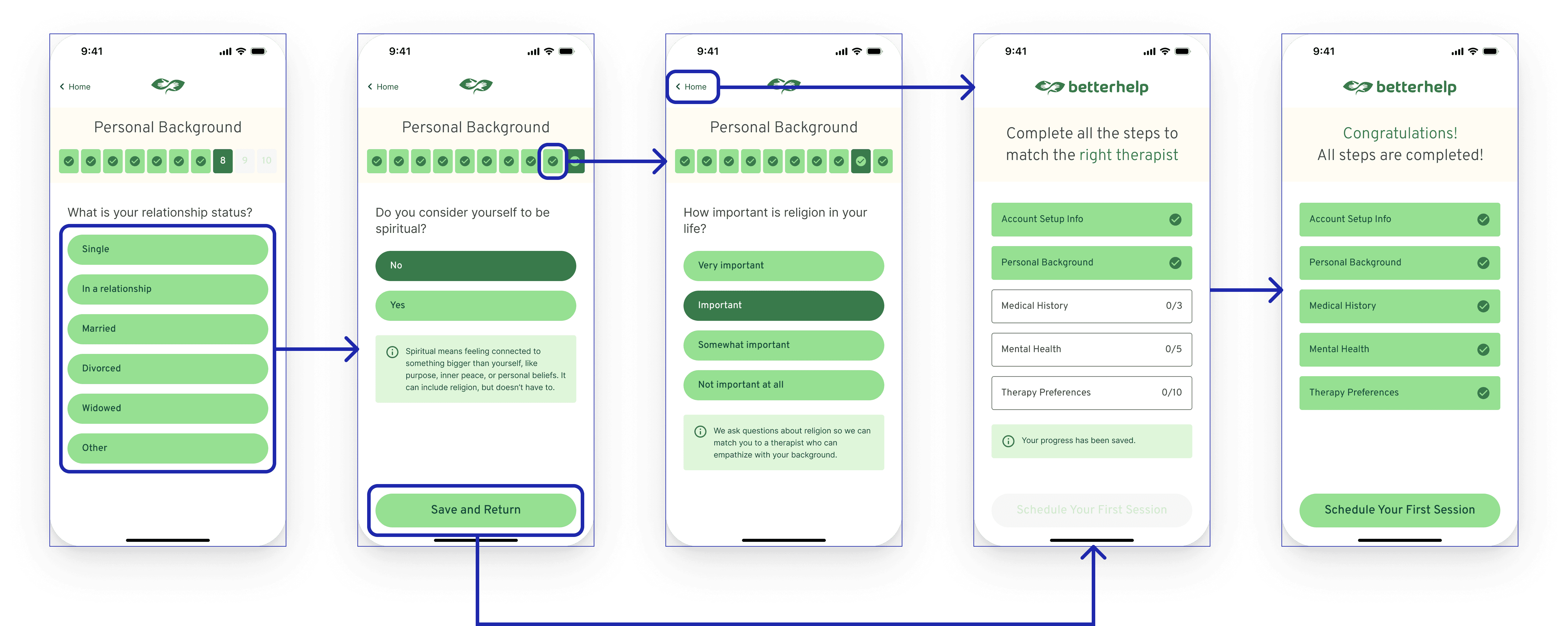
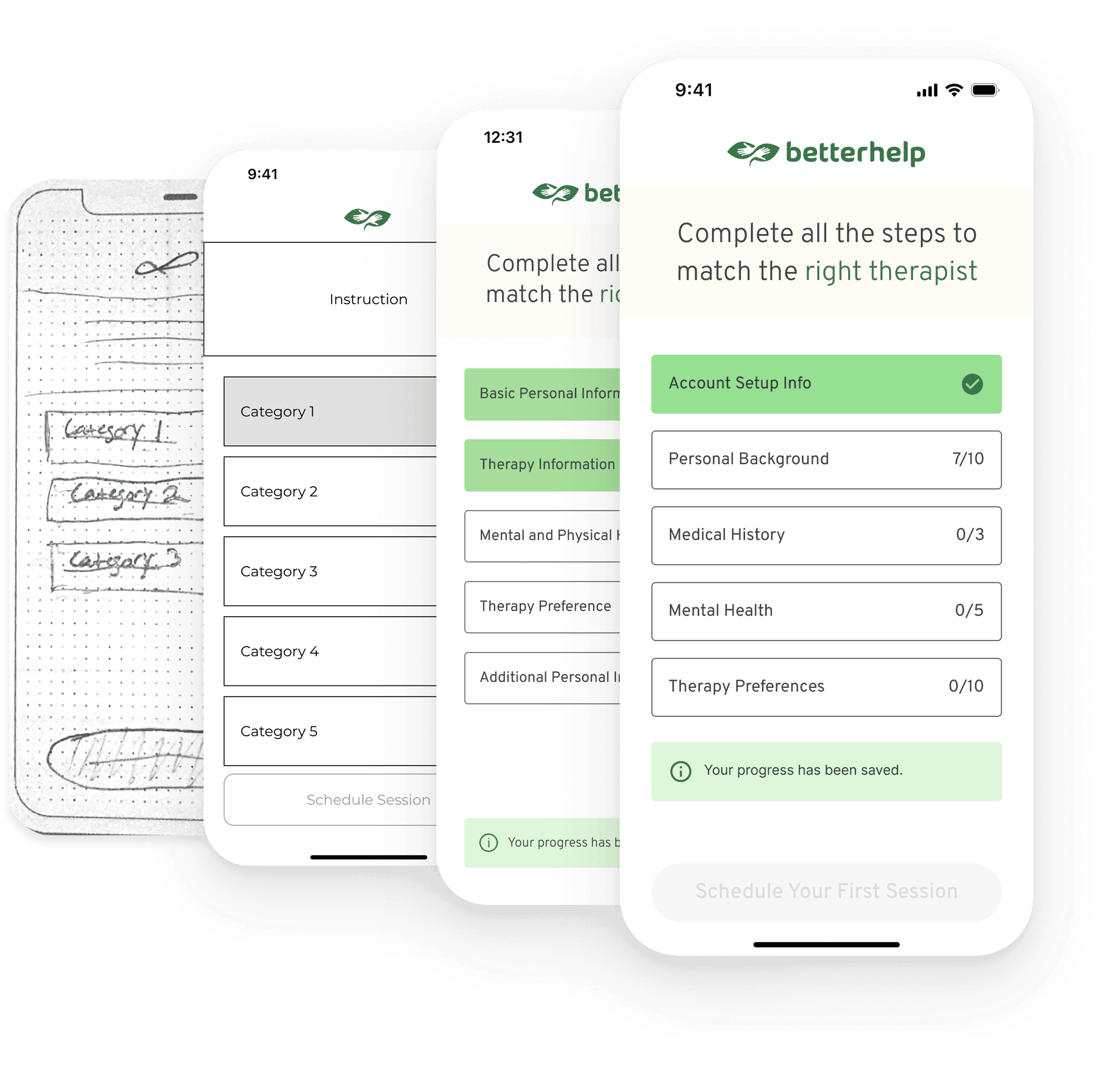
Home Screen Features
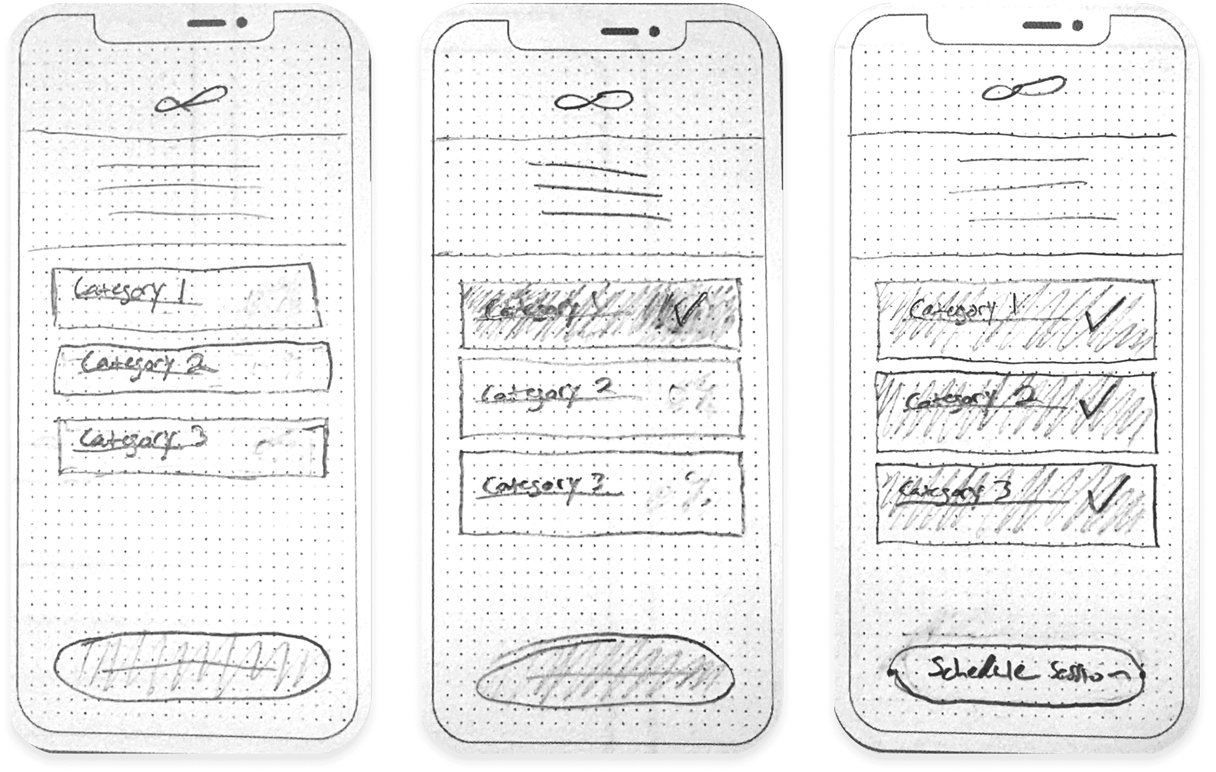
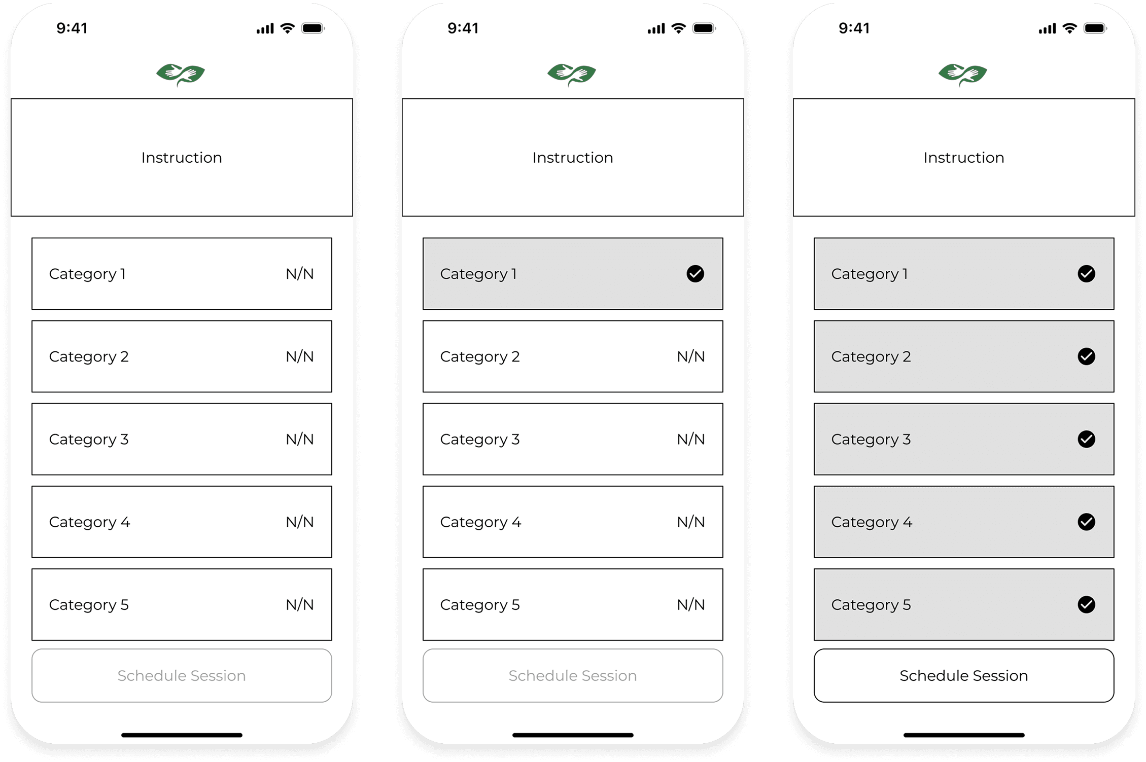
Grouped and organized questions to reduce mental fatigue
A progress page that allows users to select or revisit specific sections
Visual indicators showing which sections are complete
A disabled “Schedule” button until all required steps are finished
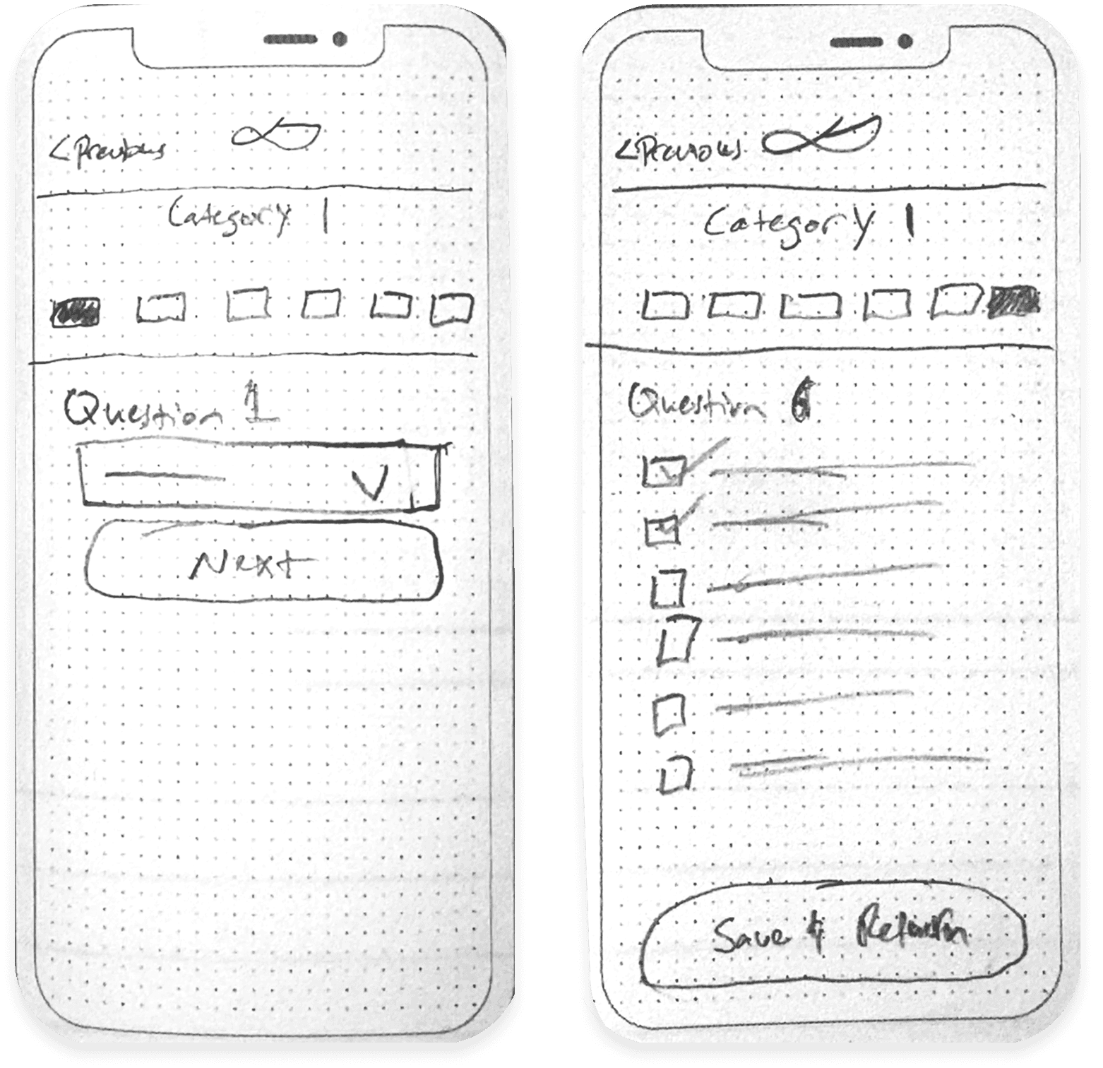
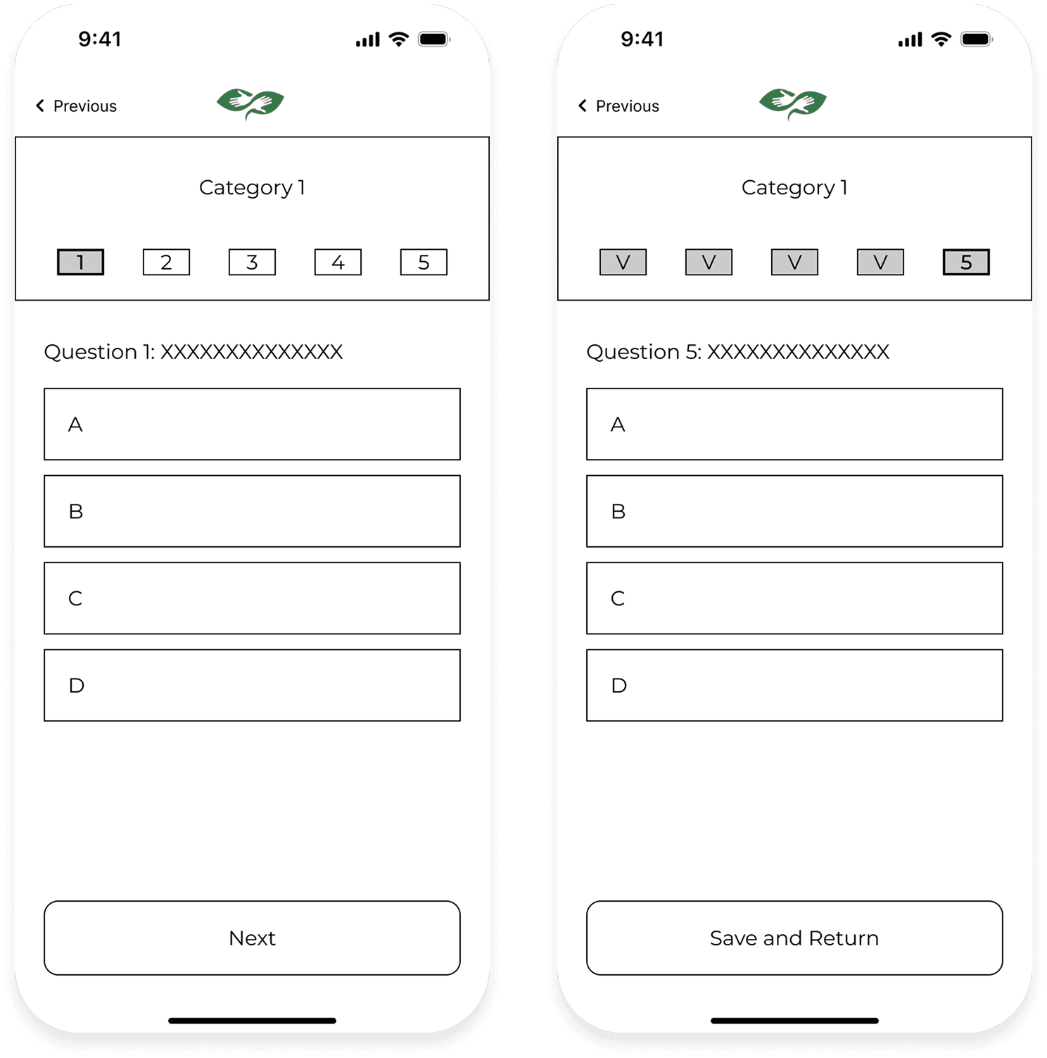
Sketches
Low-Fi Wireframe
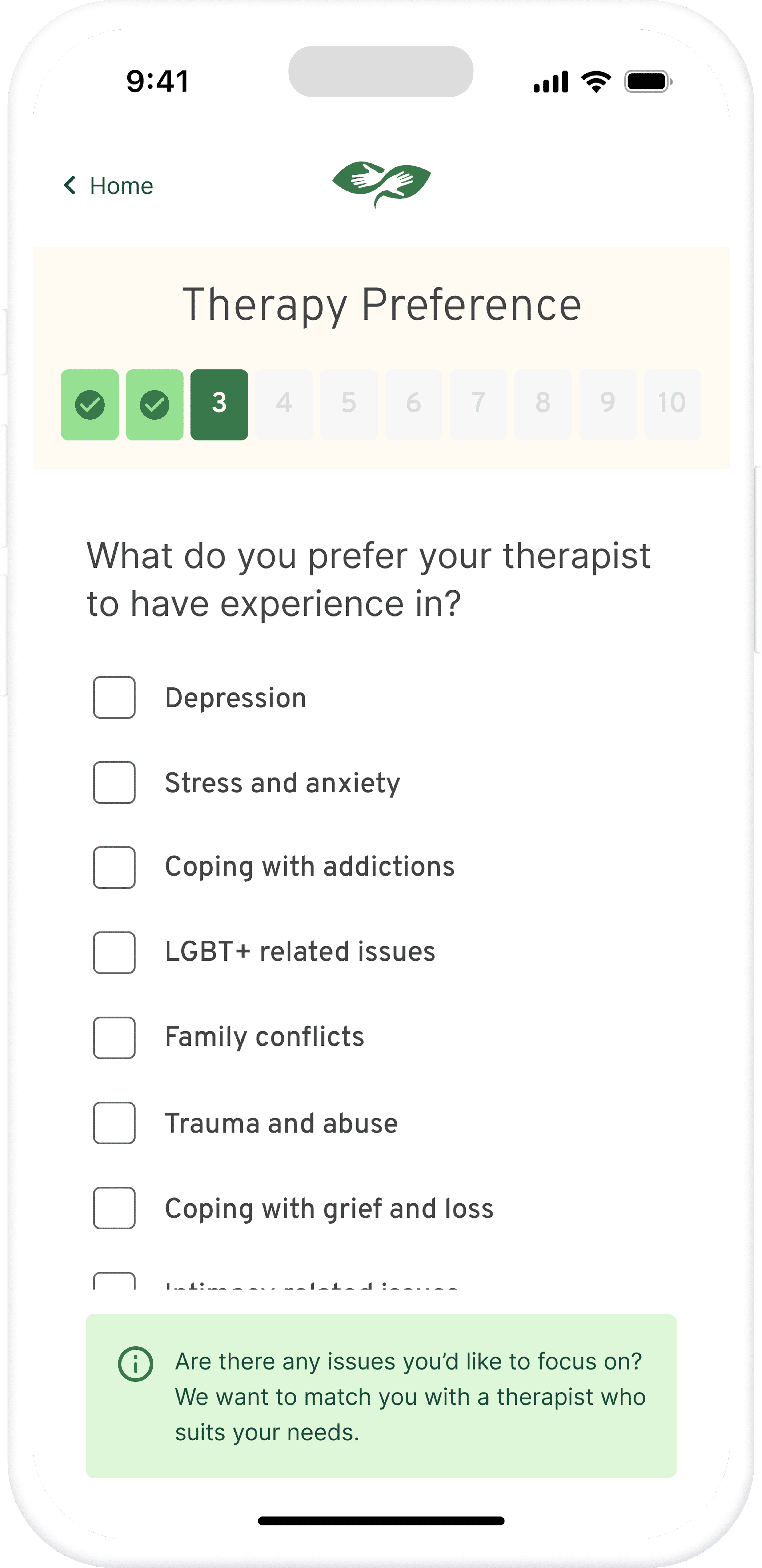
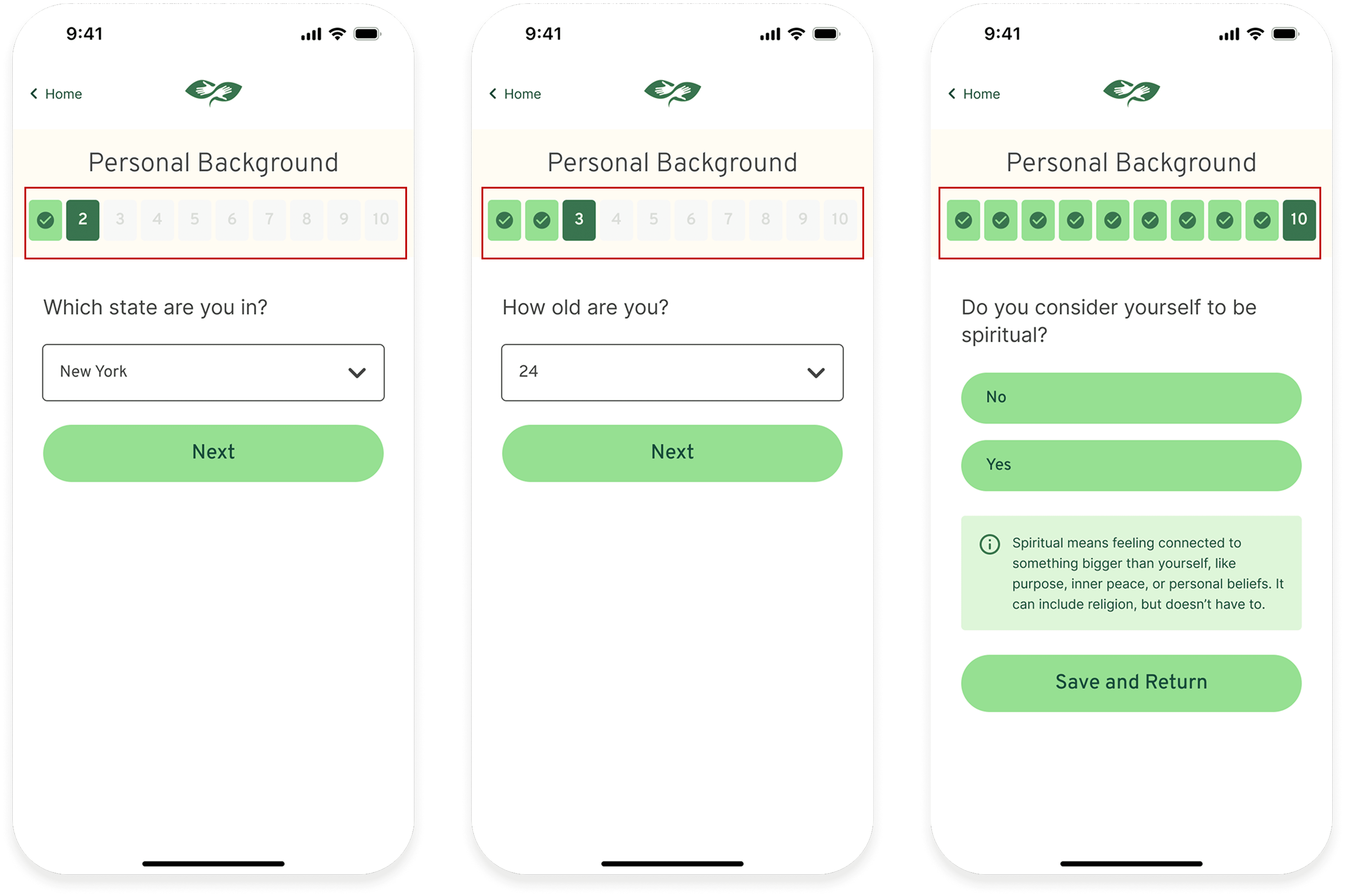
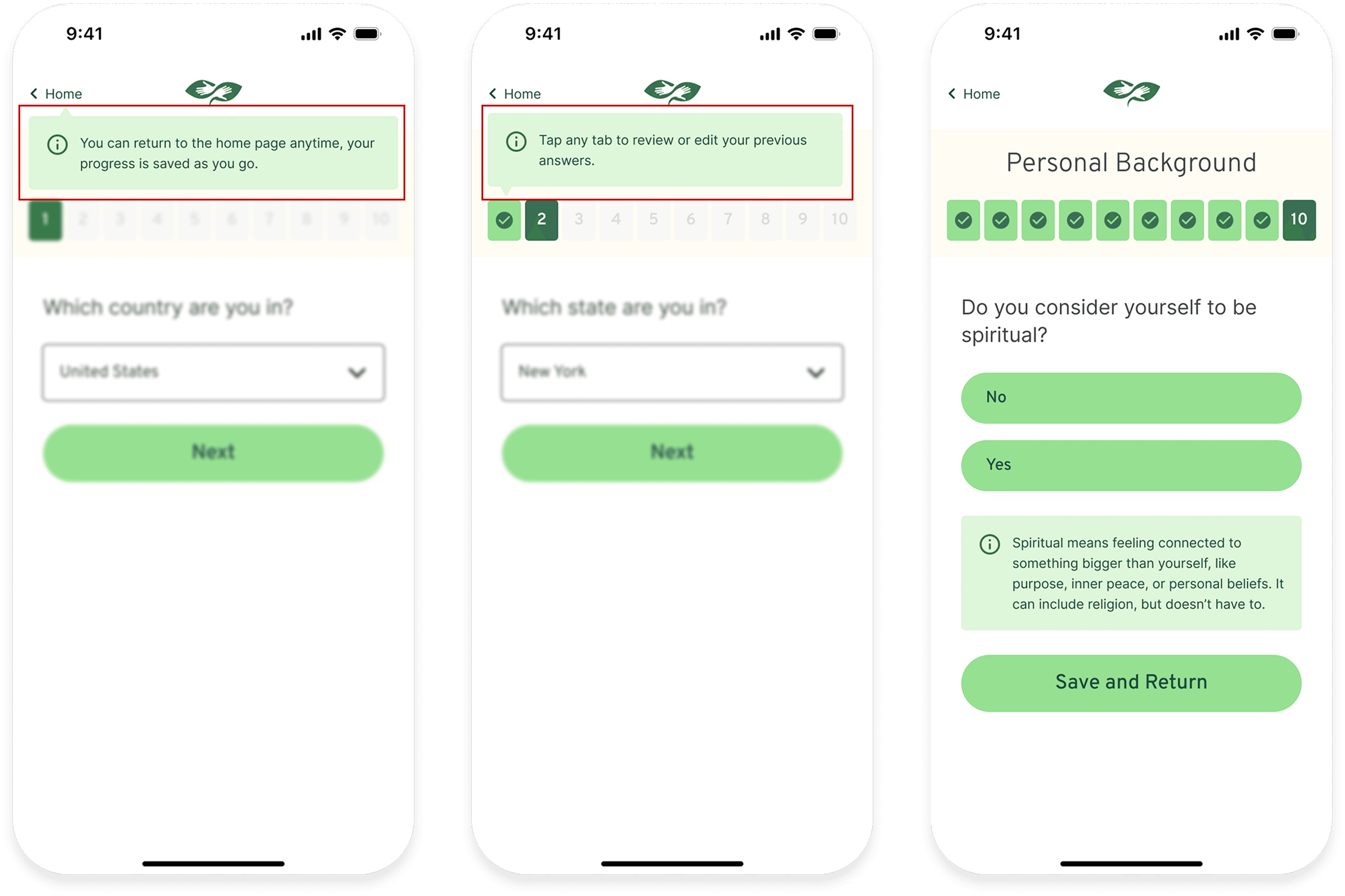
In-Section Features
Progress bars within each section to help users track their place
A “Save & Return” function so users can exit and resume the process with confidence
Sketches
Low-Fi Wireframe
User Testing & Iteration
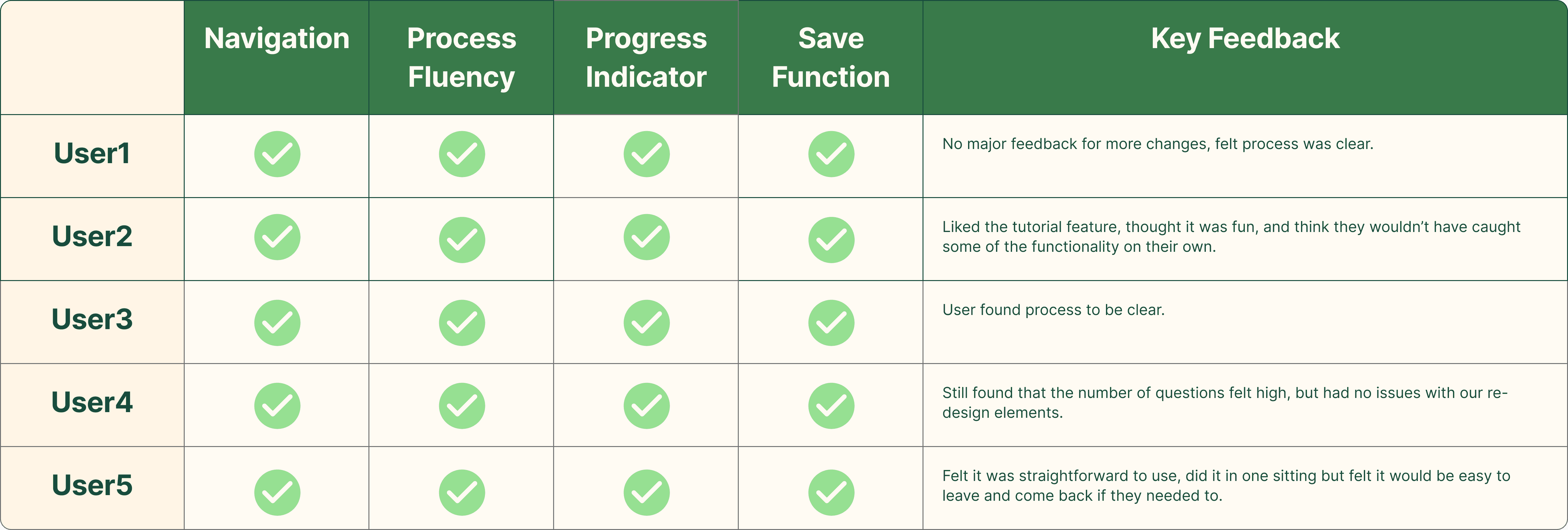
We iterated on the design three times, conducting two rounds of user testing—each with 5 participants—to evaluate usability, clarity, and perceived control within the onboarding experience. The feedback from each round directly informed the next iteration, leading to a more intuitive and supportive flow.
Version 1
User Testing on Final Iteration (5 participants)
Key Feedback
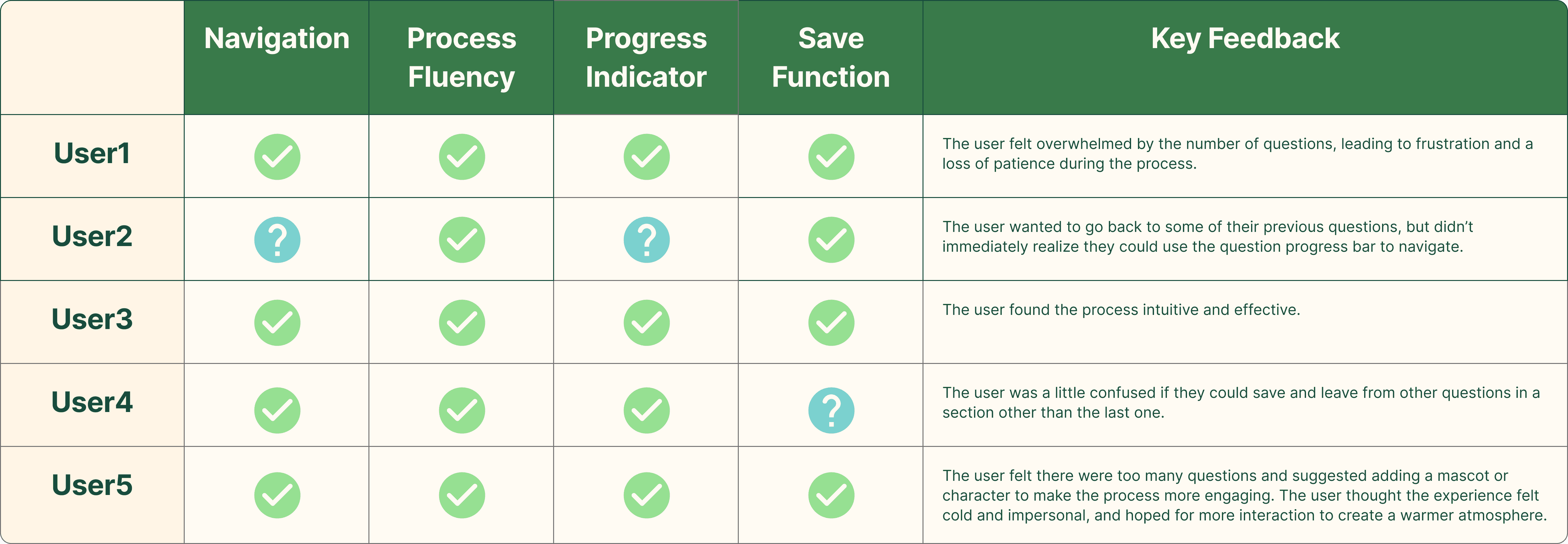
The tab navigation wasn’t intuitive—users didn’t realize it could be clicked or used to return to previous questions.
The progress bar in each section lacked question numbering, which made users feel uncertain about how much they had completed or how many questions remained.
Version 2
Design Improvements
Added question numbers to the in-section progress bars to give users a clearer sense of their progress within each section.
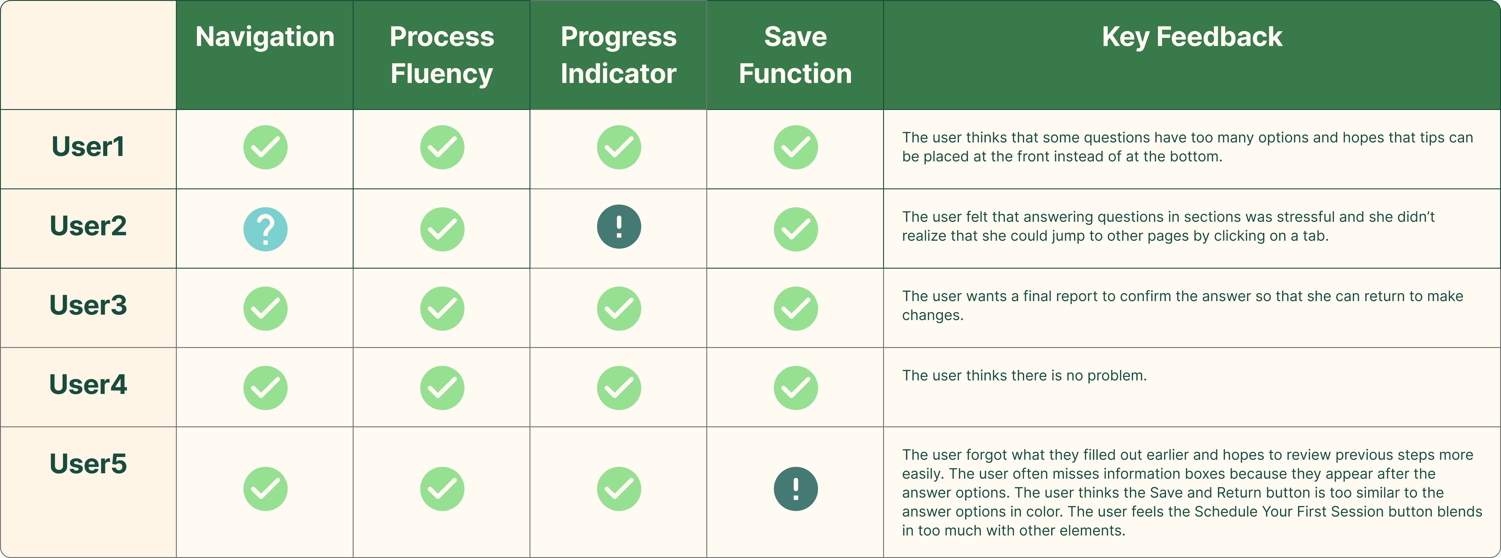
User Testing on Final Iteration (5 participants)
Key Feedback
Users still didn’t realize that the progress bar was clickable and could be used to navigate back to previous questions.
Users were unaware that they could return to the home screen and that their progress would be saved automatically.
Version 3
Design Improvements
Added a start-of-session guide pop-up to clarify that users can return to the home screen anytime (with auto-save) and tap tabs to review or edit previous answers.
User Testing on Final Iteration (5 participants)
Final Design
Key Screens
User Flow
Prototype
Style Tile
Result
All 5 participants clearly understood how to navigate between onboarding sections.
Every user successfully interpreted the updated progress indicators and completed onboarding without confusion.
Users appreciated the save-and-return function, which gave them a stronger sense of control and reduced the pressure to complete everything in one sitting.
Guided tutorials were well-received and helped users notice new features they might have otherwise overlooked.
Next Step
Reevaluating the tone and wording of onboarding questions based on user feedback
Testing motivational screens or micro-interactions to reward progress
Exploring adaptive onboarding flows tailored to each user’s context
Takeaway
Iterative design and testing helped us uncover usability issues we hadn’t initially anticipated. What seemed obvious to us as designers—such as clickable tabs or auto-saving progress—wasn’t always clear to users, reinforcing the value of continuous user feedback and evidence-based decision making.
Working as a team also taught me the importance of thoughtful division of labor. With three of us collaborating, we were able to move much faster and go deeper than any of us could have alone. For example, during competitor analysis, each teammate took on a different app and created five user journeys. What would have been a huge task for one person became manageable and insightful when split across the team.
I also learned how aligned ownership can increase efficiency. For parts of the project that everyone was excited to contribute to—like the final high-fidelity prototype—we first aligned on a shared visual direction, then assigned key screens to one person to establish the foundational layout, colors, and components. This allowed others to build out the remaining pages quickly while staying consistent.
Finally, in the process of preparing our final case presentation, I learned from Professor Kojo Boateng the value of directly connecting user stories to features. Mapping each user scenario to a specific design solution made it easier for our audience to follow the problem-solution logic.
Special thanks to Rujia, who designed the final presentation slides beautifully, and to Paul, who refined the wording throughout the report to ensure our message was clear and compelling.