


The Problem
Problem Statement
Most users use Google Maps for navigation, but since its timing isn’t accurate, they need to search for a specific train on Transit to check its schedule or arrival time before going to the station because they don’t want to waste time waiting on the platform. However, it's hard to search for a specific train on Transit, especially for trains that are only distinguished by color rather than letters.
Steps to Search for a Specific Train in Transit
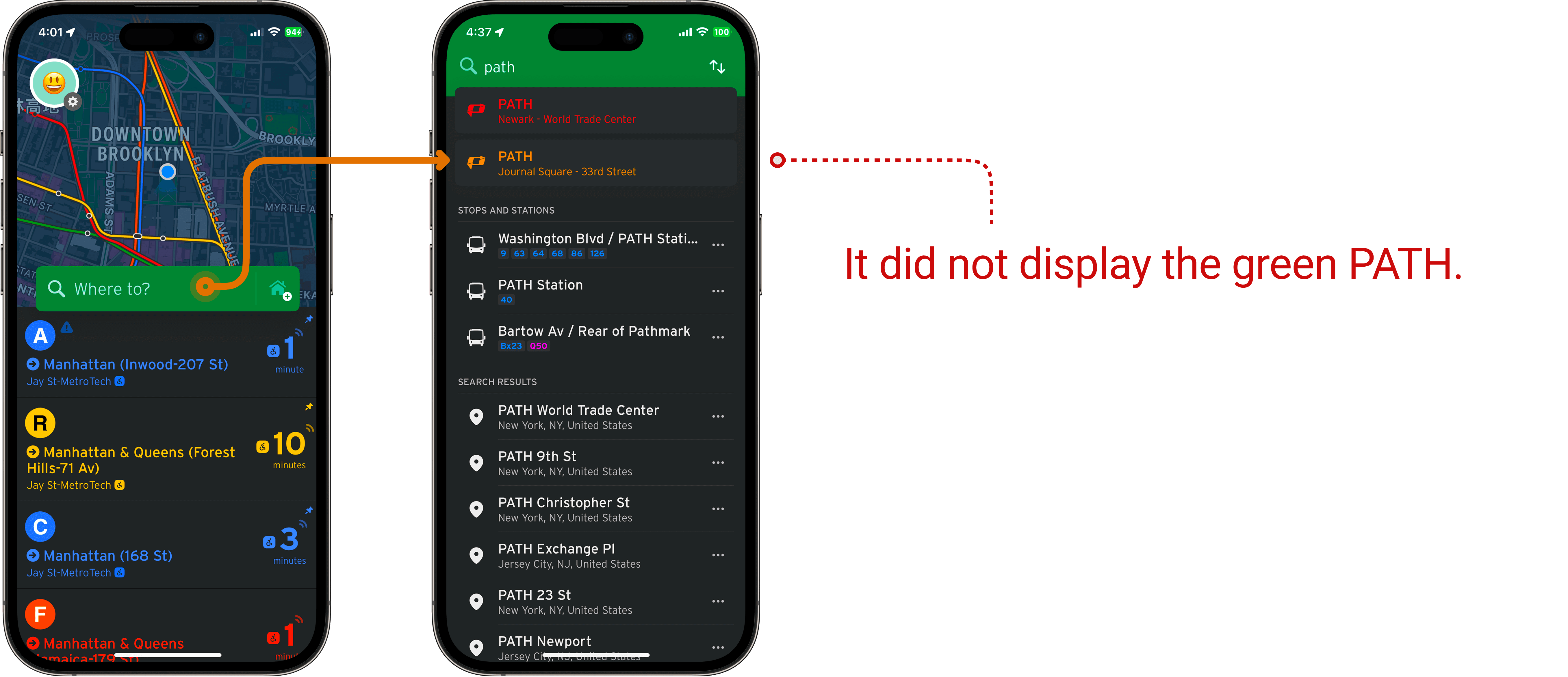
For example, if you want to find the green PATH train:
1. Since the green PATH does not have a specific name, users can only search for "PATH" to find relevant results.
2. The search must be performed in the "Where to?" search bar.
HMW Statement
How might we make searching for a specific route on Transit easier?
Hypothesis
We believe that making train search easier in Transit for users will help them know how early they need to go to the station and reduce the time wasted waiting on the platform.
We will know this to be true when we see a decrease in the time users spend searching for train schedules.
The Users
User Interview
Five people (four on Zoom, one face-to-face).
Each interview lasted 15-20 minutes.
Key Findings
Most users use Google Maps to navigate, but sometimes the information isn’t accurate, so they double-check with other apps.
All users said accurate timing is very important. They want to know if trains are late or cancelled.
Users said Google Maps shows wrong times at night, so they need other apps (like Transit app, MTA app, RidePATH app) to check train times.
Empathy Map

Personas
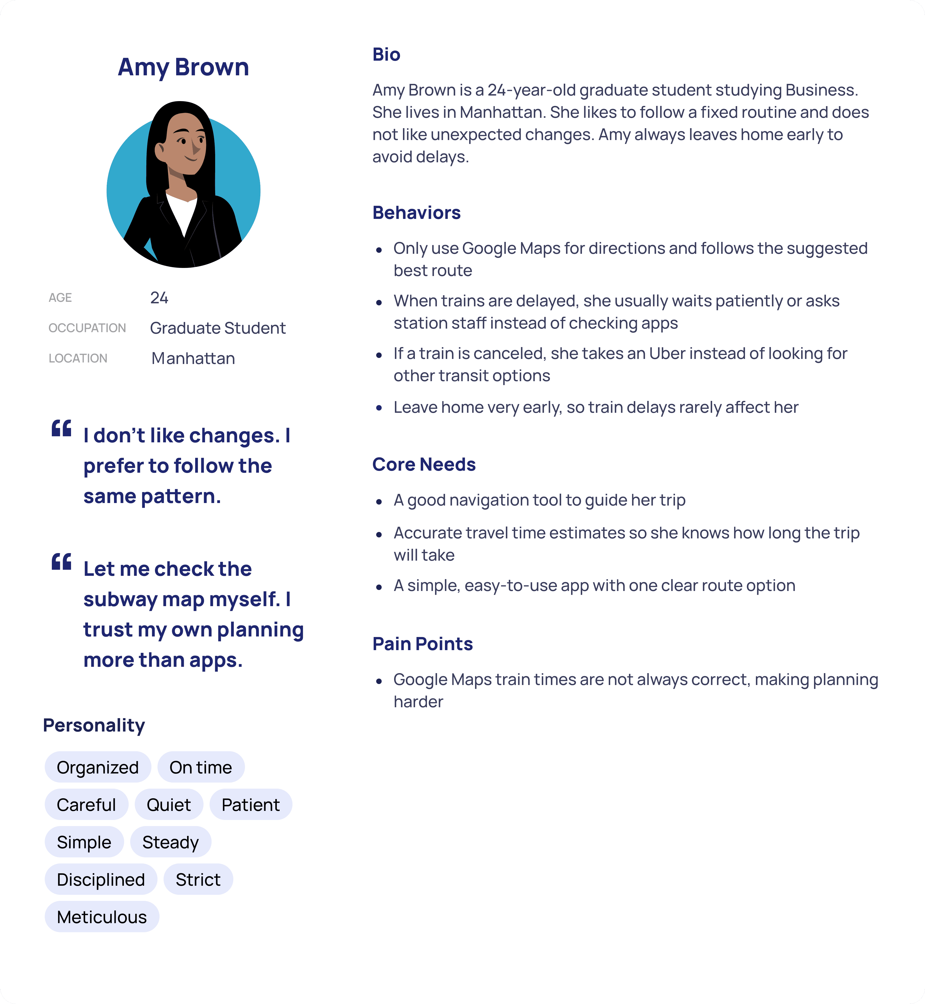
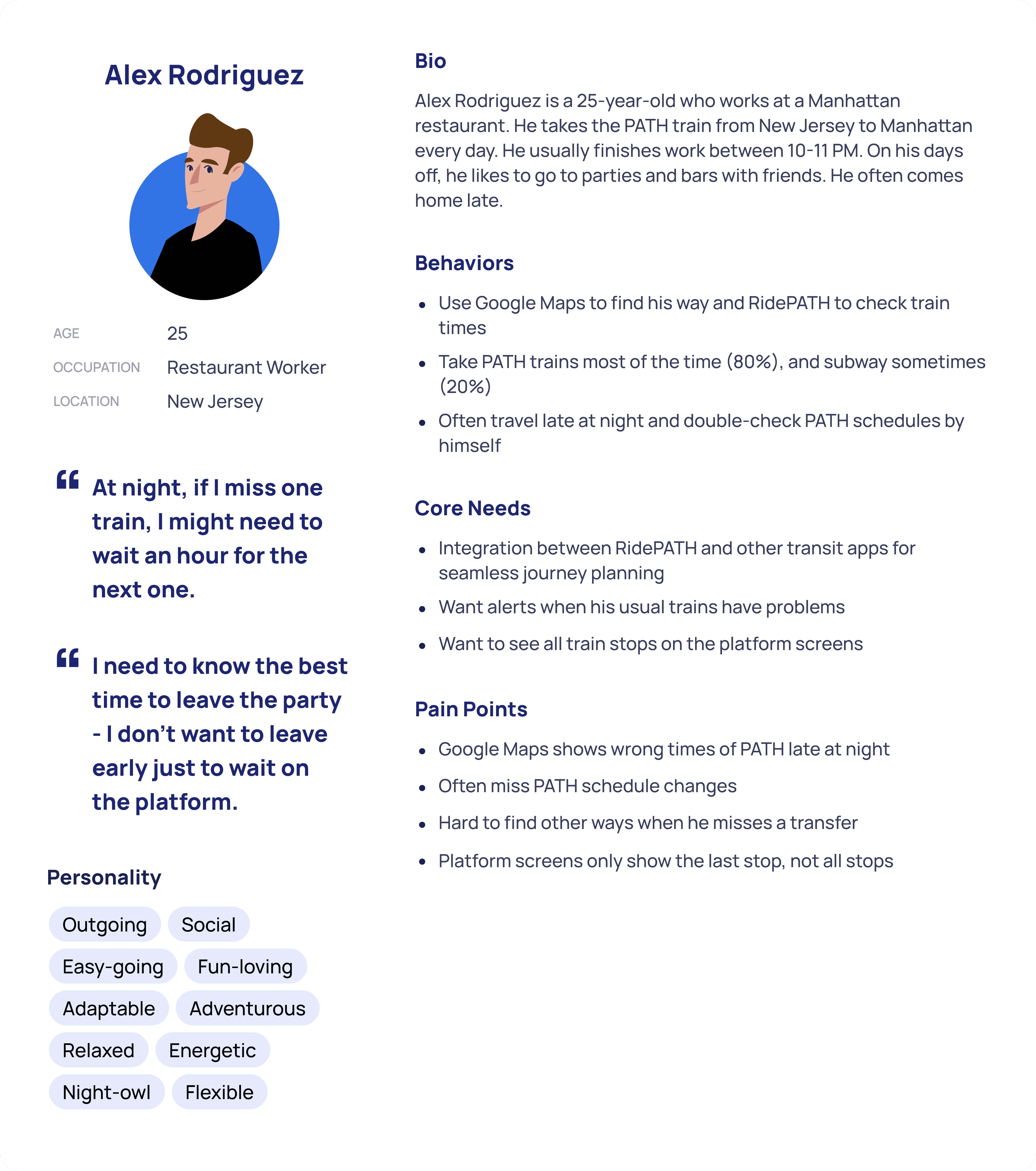
I created three personas based on the interviews:
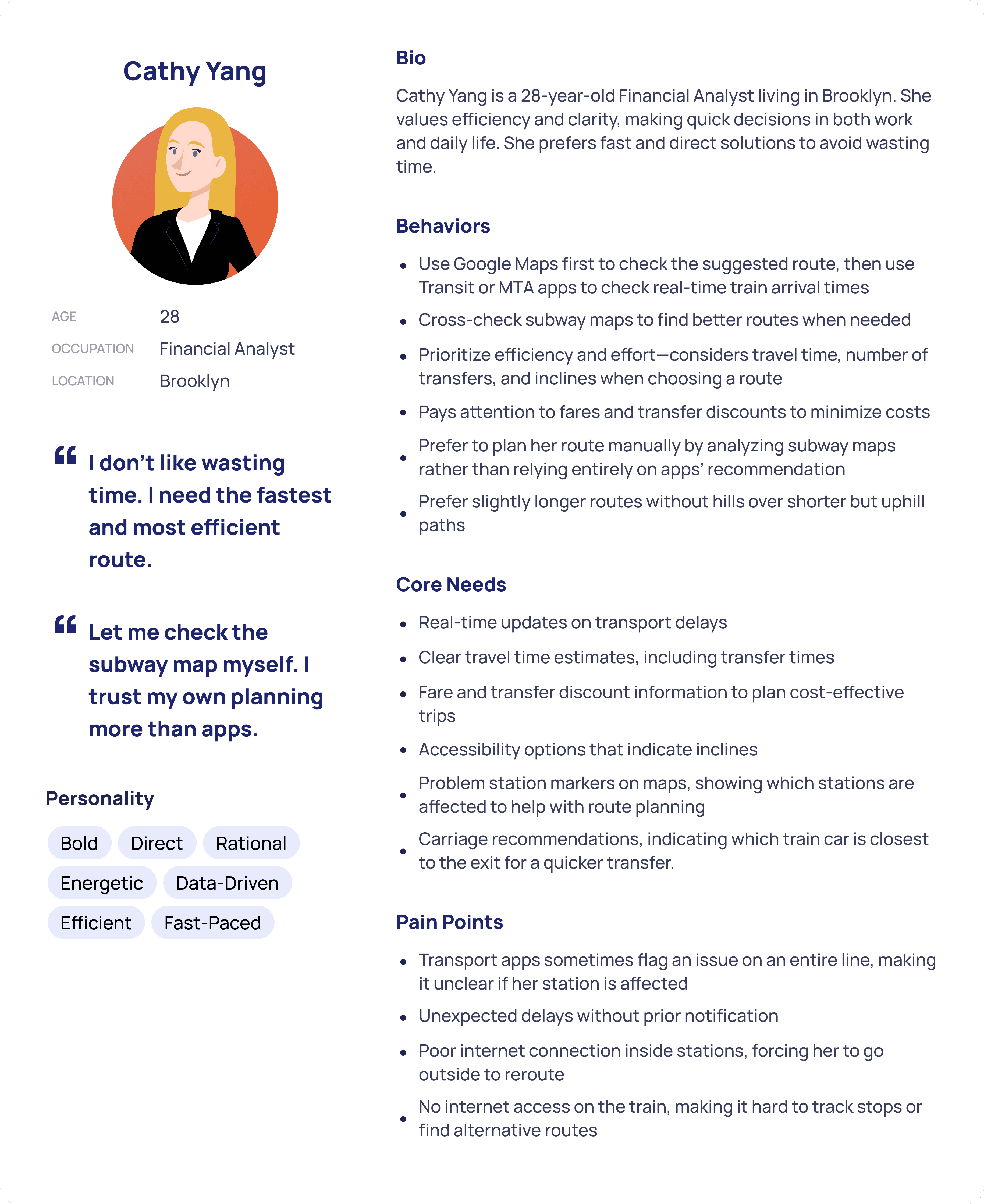
I focused on solving the problem of the first persona.
Task Analysis
I conducted task analysis with four people. Each task analysis took about 5-10 minutes.
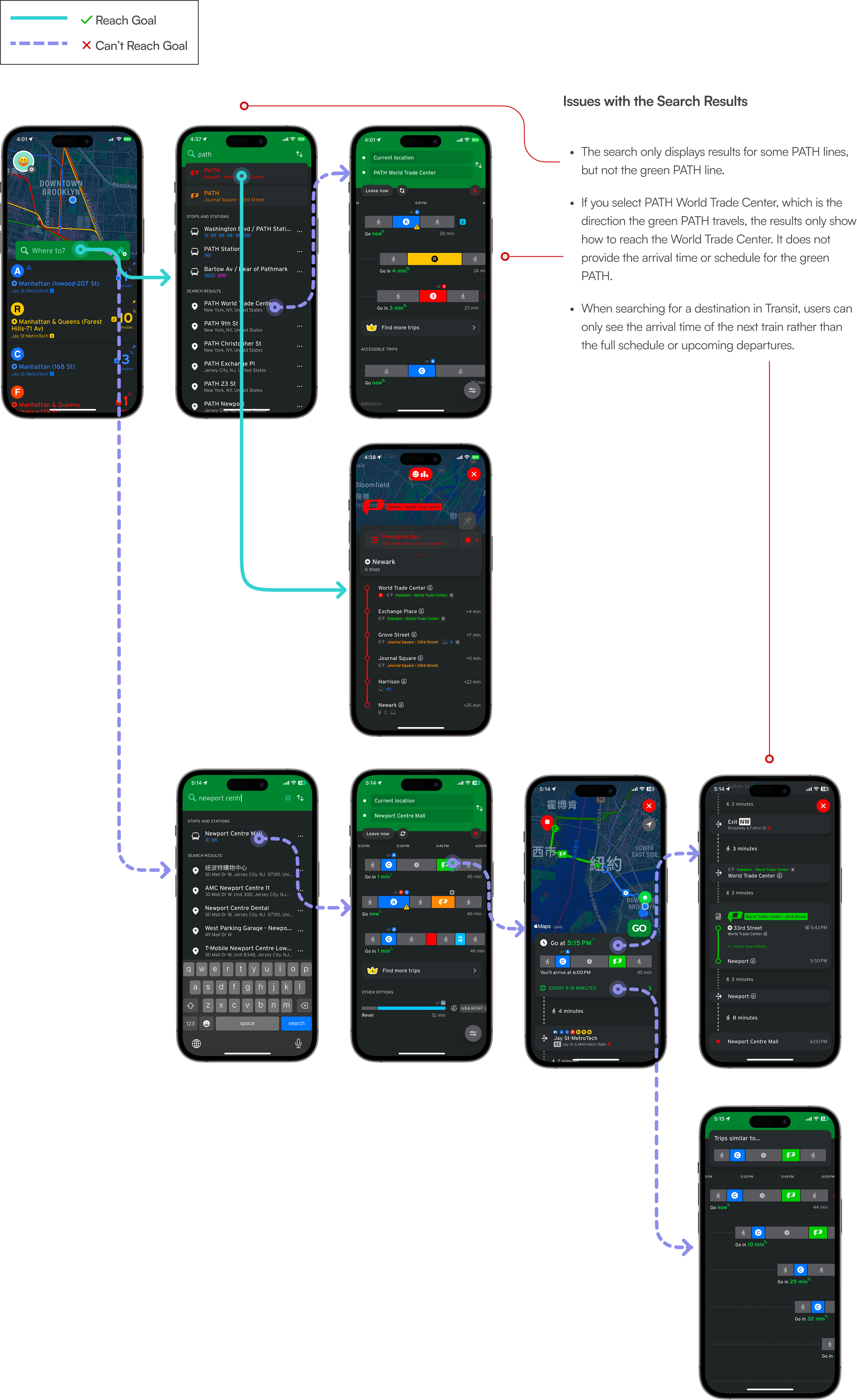
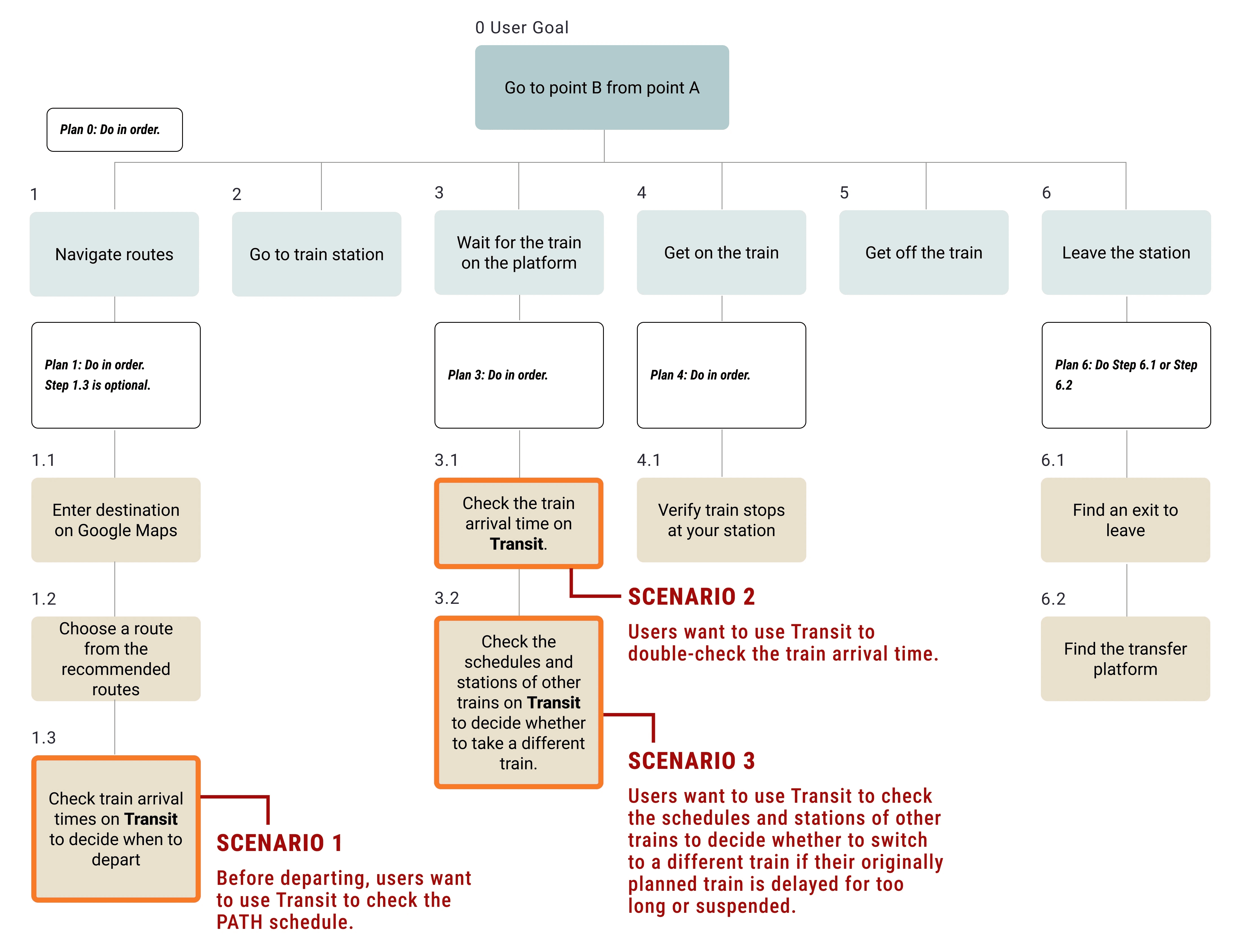
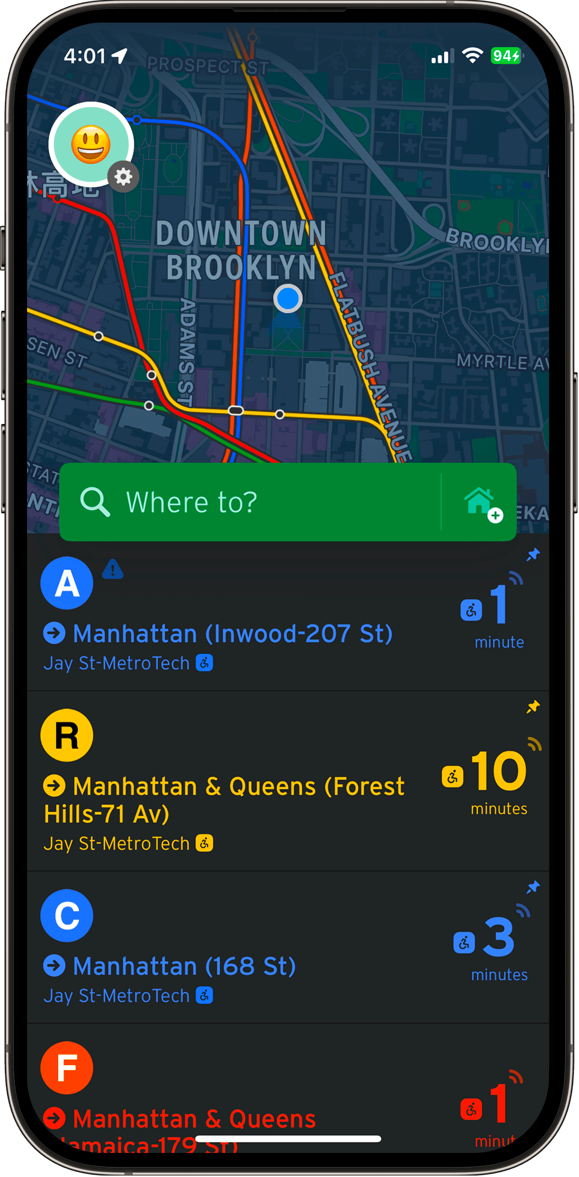
SCENARIO
"Users want to go from 5 MetroTech (in Brooklyn) to Newport Centre (in New Jersey)."
According to the user interview, this is a complete step-by-step diagram of how a user travels from point A to point B.
The sections highlighted in orange indicate the parts where Transit is involved. Scenario 1 will be the focus of the task analysis for the user.
TASK
"Use Transit to check the coming time and schedule of the green PATH train you are about to take."
Approach 1:
Replicating the steps in Google Maps – They enter their destination in the "Where to?" search bar, review the suggested routes, and then select the desired route to view the detailed train schedule.

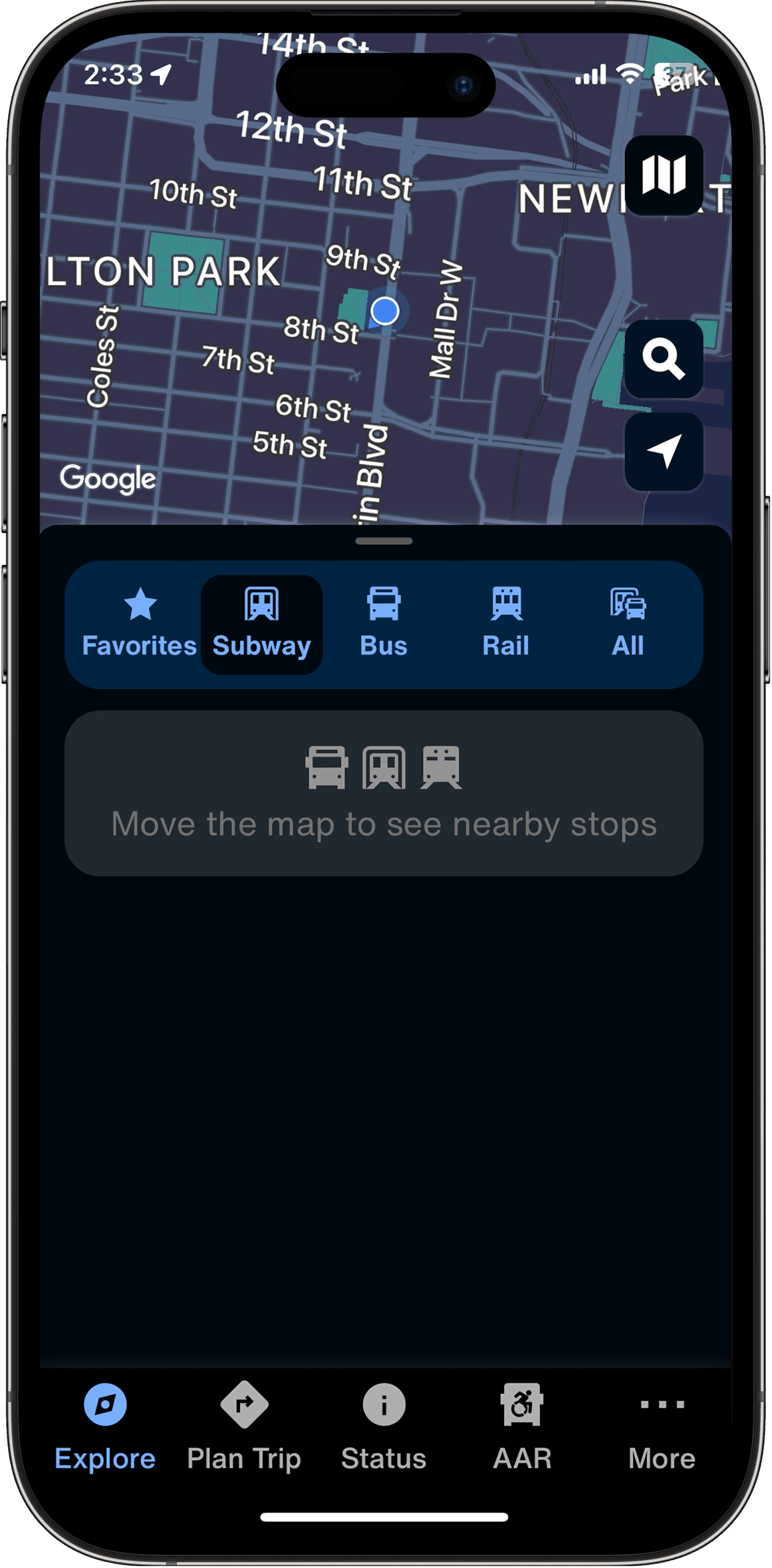
Approach 2:
Searching for "PATH" in the search bar – Since PATH trains are identified by color rather than unique names, users try searching for "PATH." However, not all PATH lines appear in the results, and the specific line they are looking for is missing.
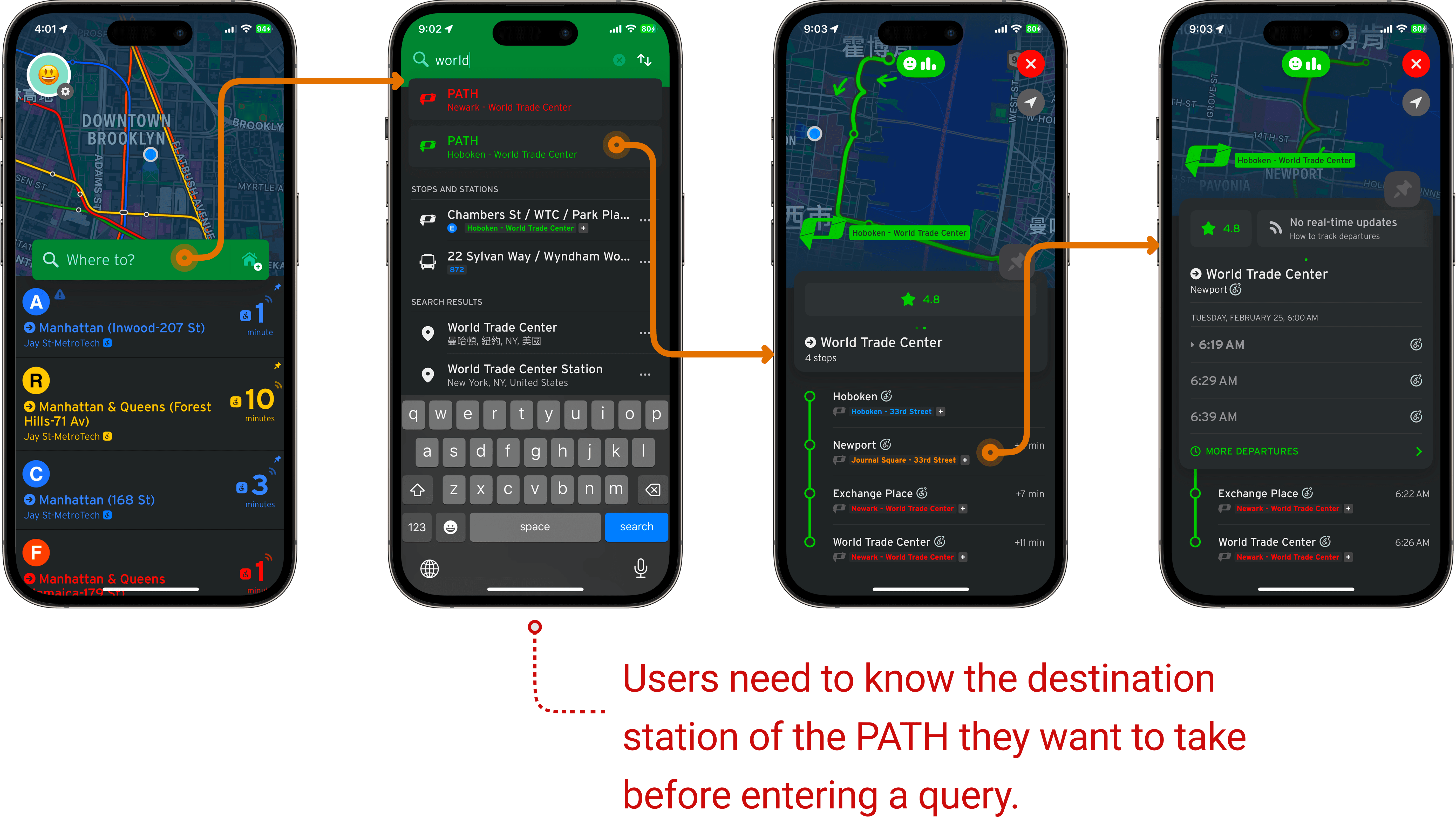
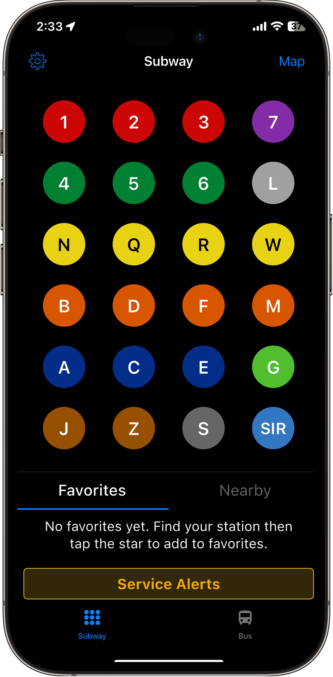
Approach 3:
Searching for the terminal station of the desired PATH line – Since the train cannot be searched by color, users enter the terminal station of the green PATH. This method successfully retrieves the train and its schedule.
User Journey Map
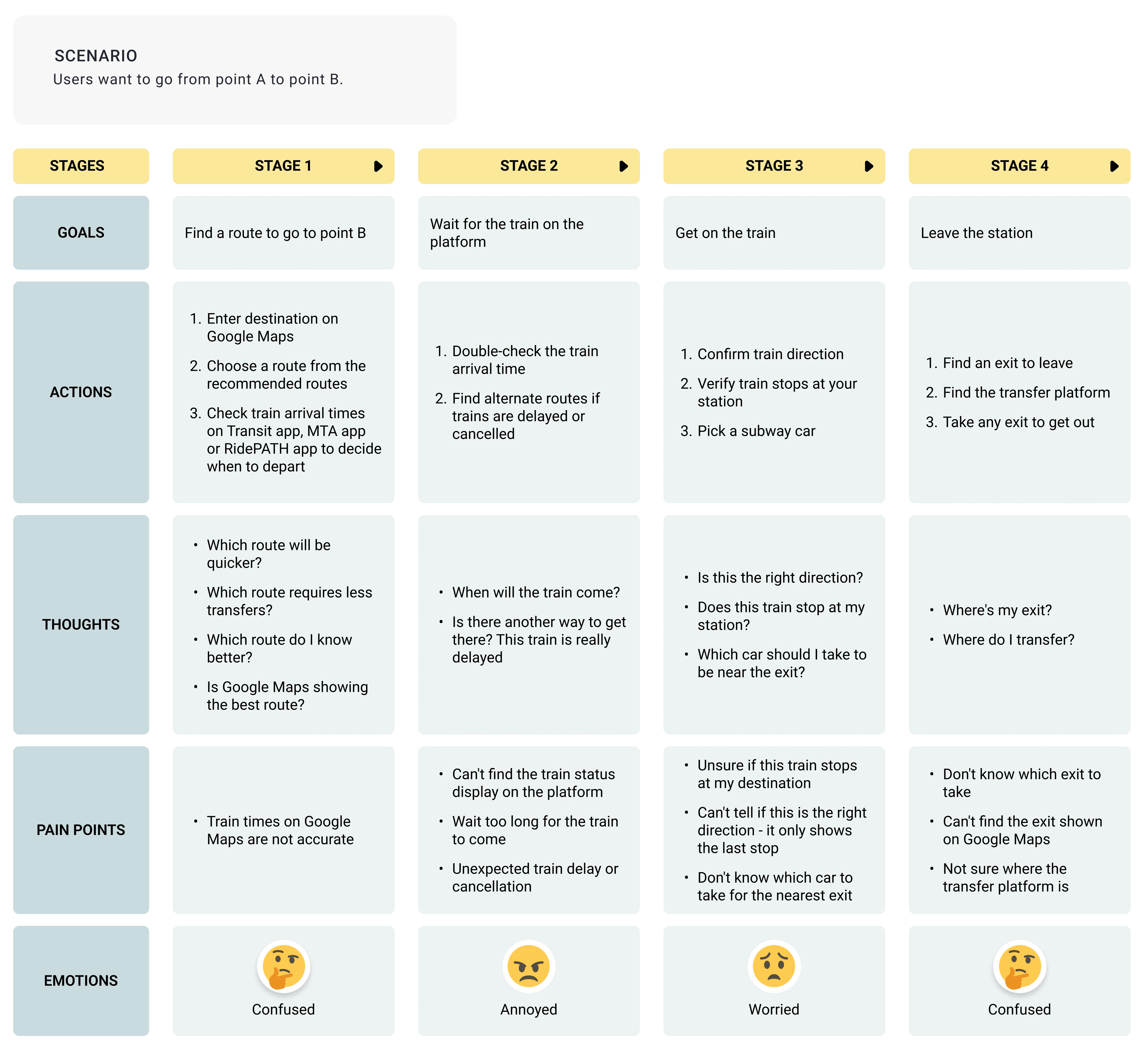
Looking at the user journey map, I focused on two key steps:
Searching for the train before leaving.
Checking the arrival time at the station.
Competitive Analysis
I looked into MTA, Subway Time, and Google Maps. MTA focuses on general navigation, and Subway Time allows users to check subway schedules but does not include PATH.


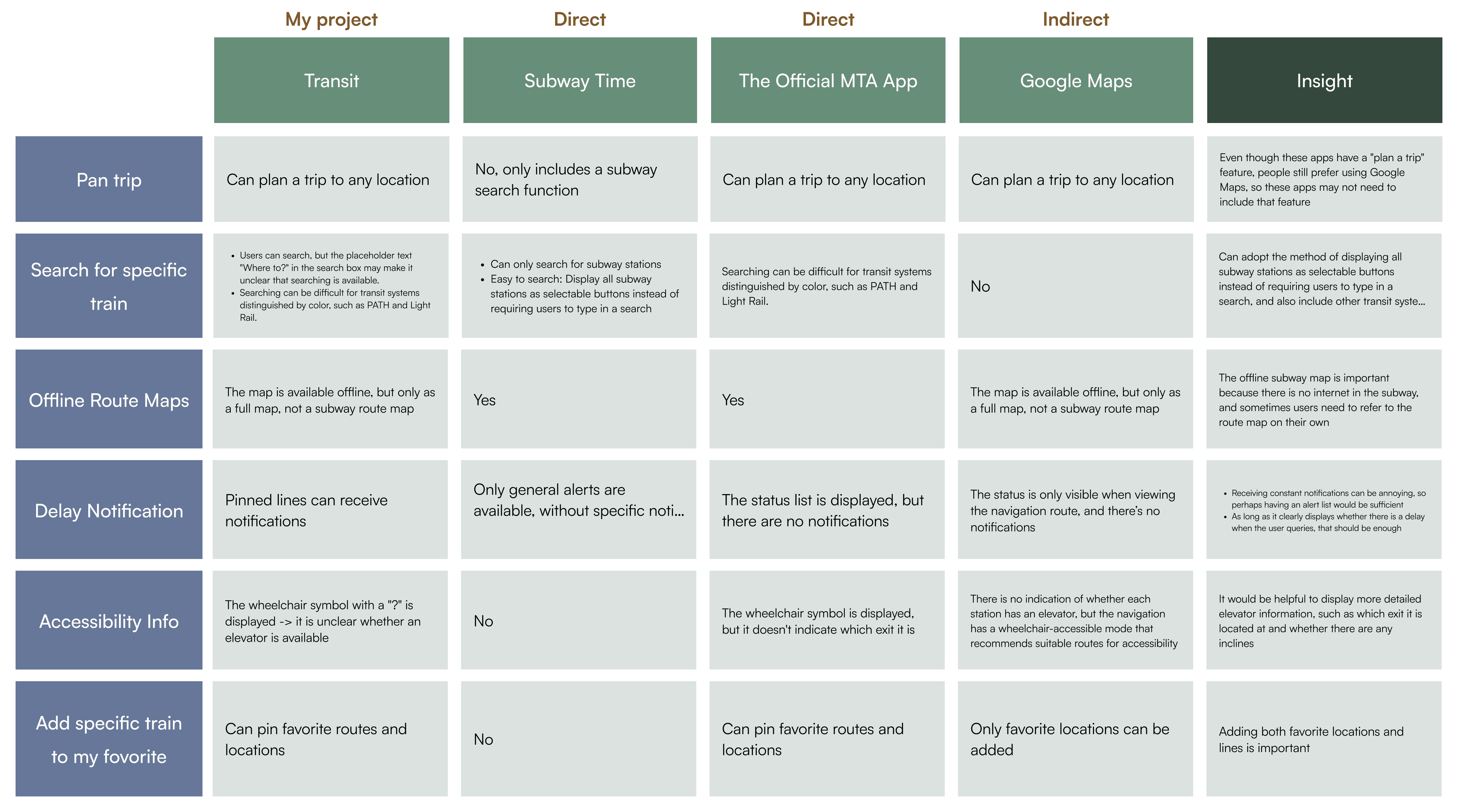
Insights
The MTA mainly focuses on navigation.
Subway Time helps users search for specific trains, but it doesn’t include PATH.
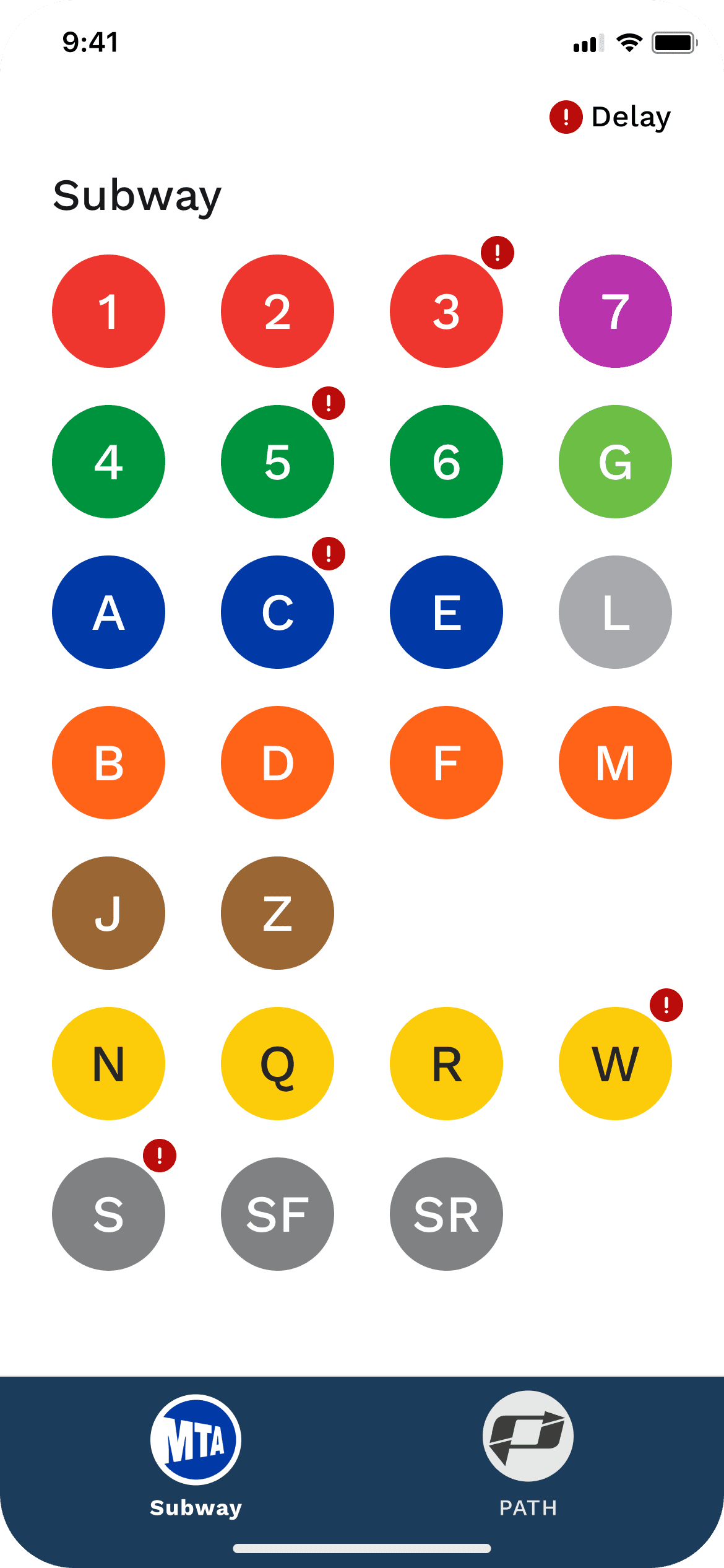
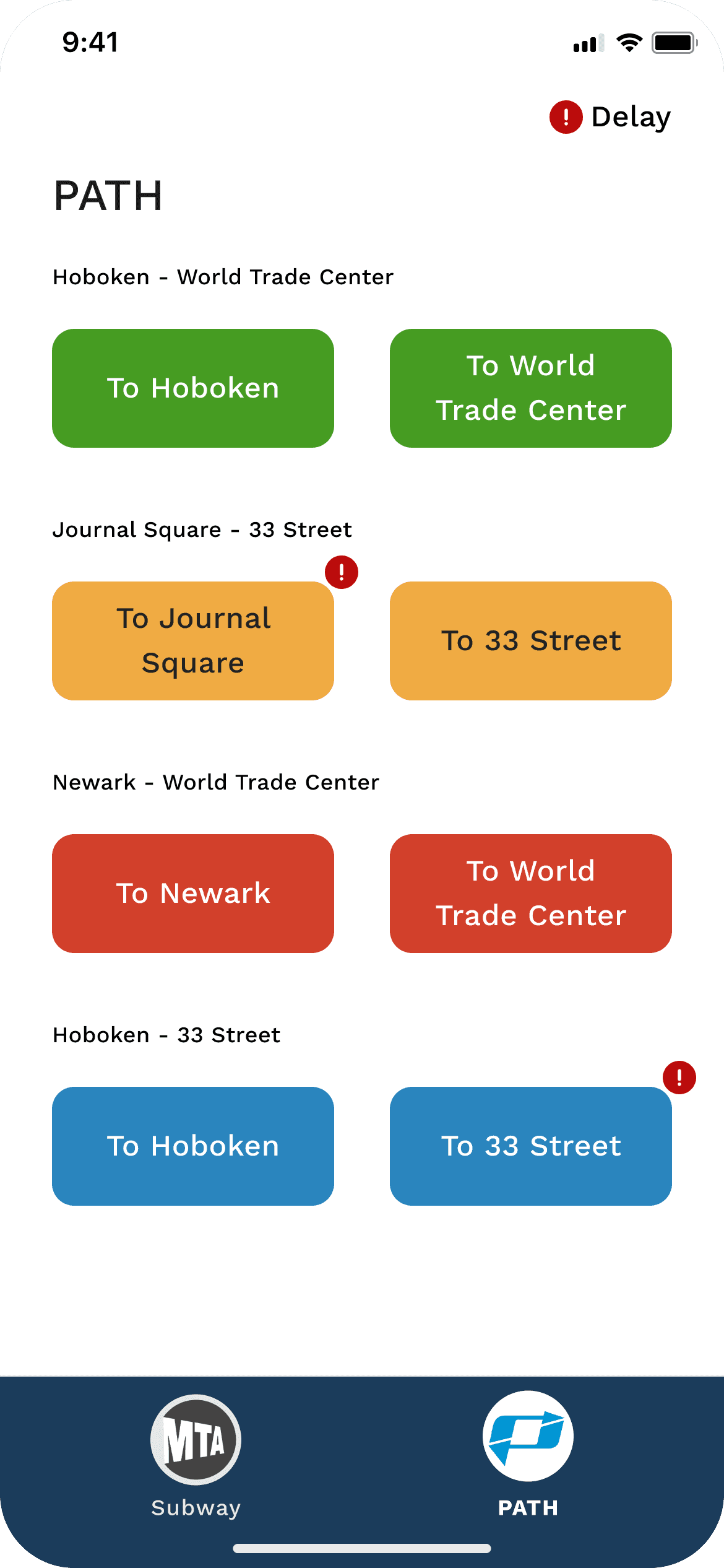
One key insight I got from Subway Time is that it’s better to show all train lines as buttons, instead of asking users to type and search, since there aren’t that many lines.
PATH lines don’t have clear names or numbers, which makes typing to search more difficult.
Features
Frature Prioritization
After prioritizing features, I plan to develop all Must-Have features and two Should-Have features because they improve visual clarity.
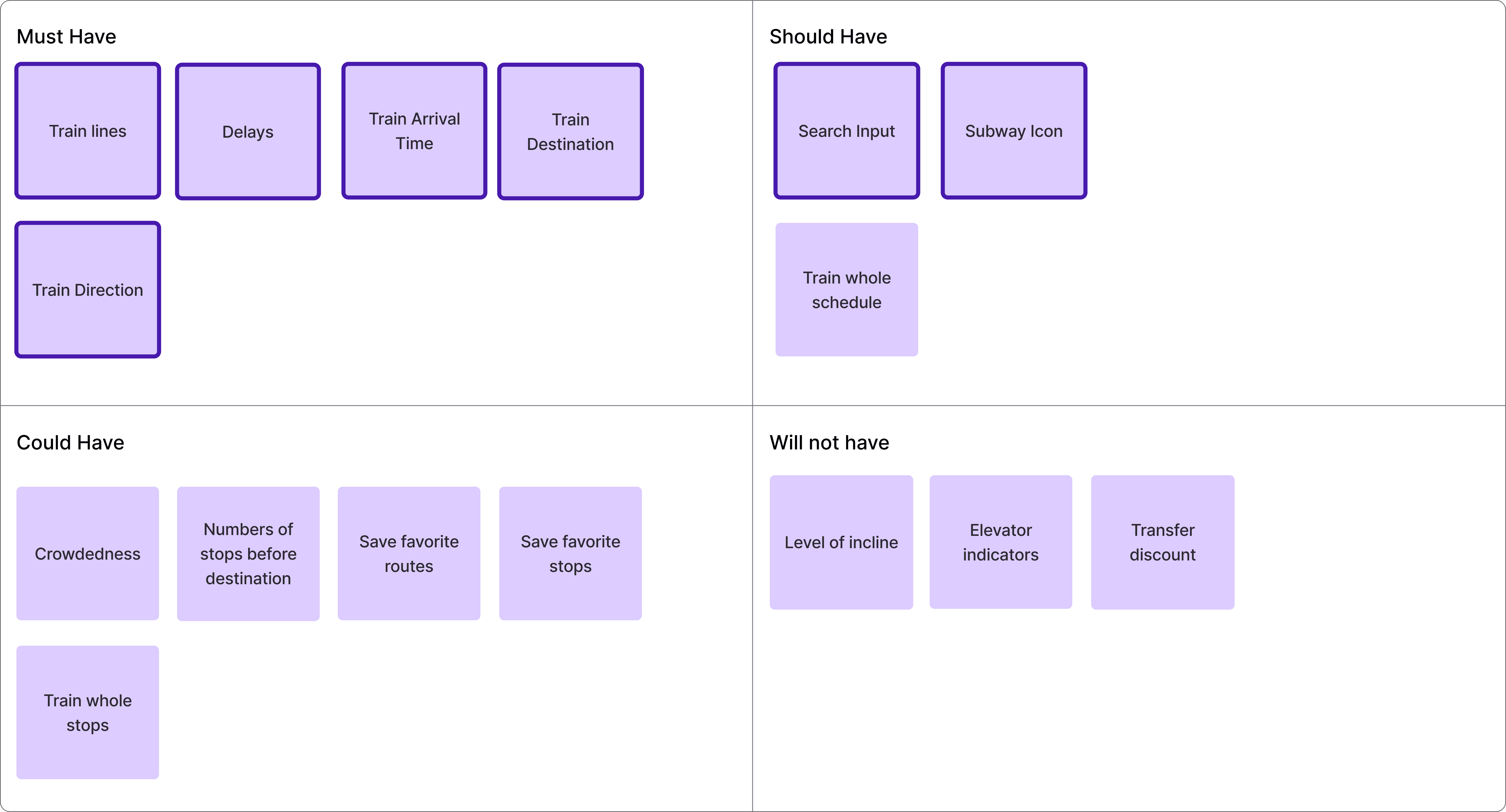
User Stories
As Cathy, I want to know which train arrives first so that I can choose the fastest one.
As Cathy, I want to know if my station is affected by incidents so that I can know whether I should transfer.
As Cathy, I want to know if my train is delay as early as possible so that I can find and plan with alternative transportation.
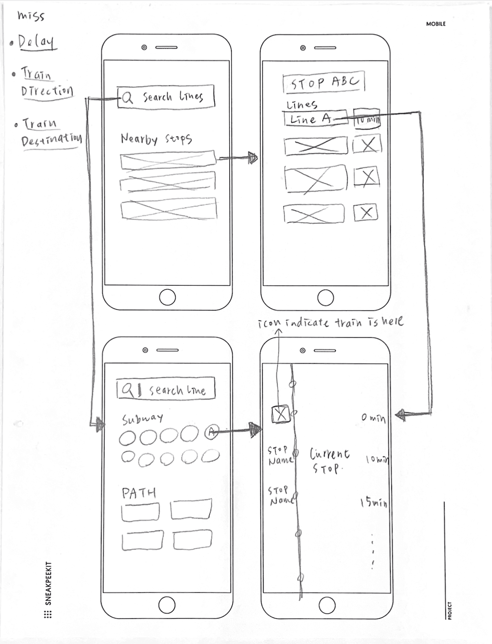
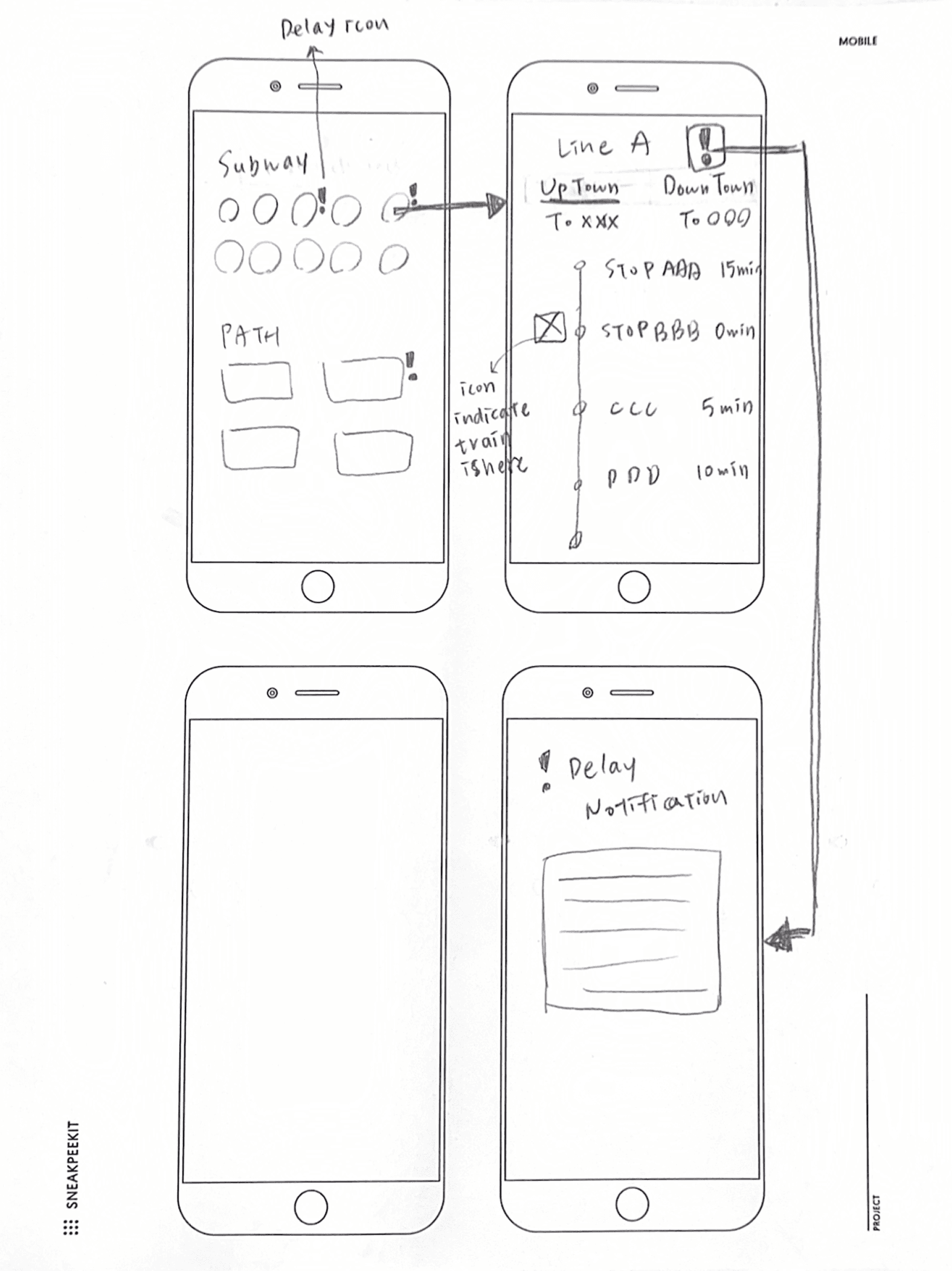
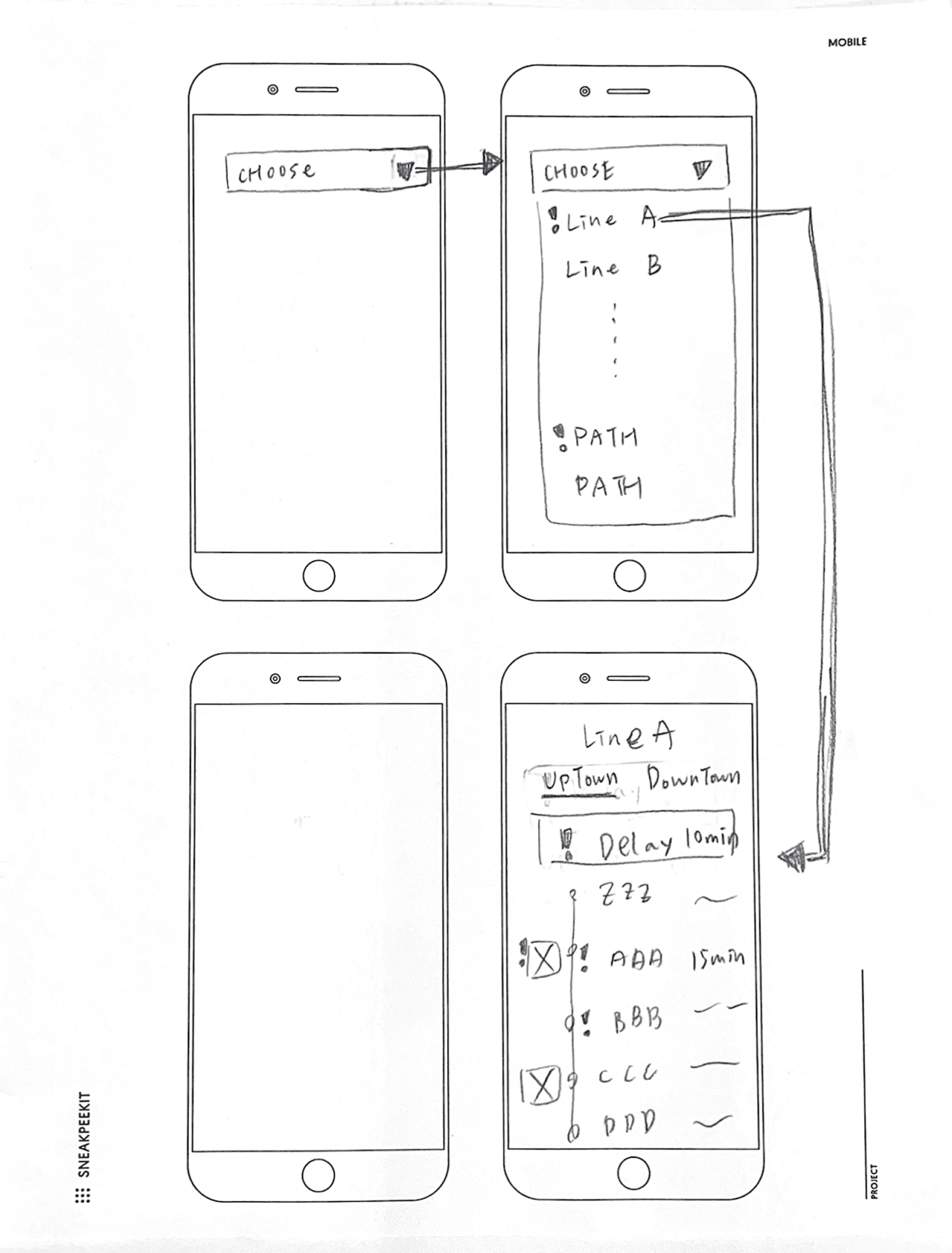
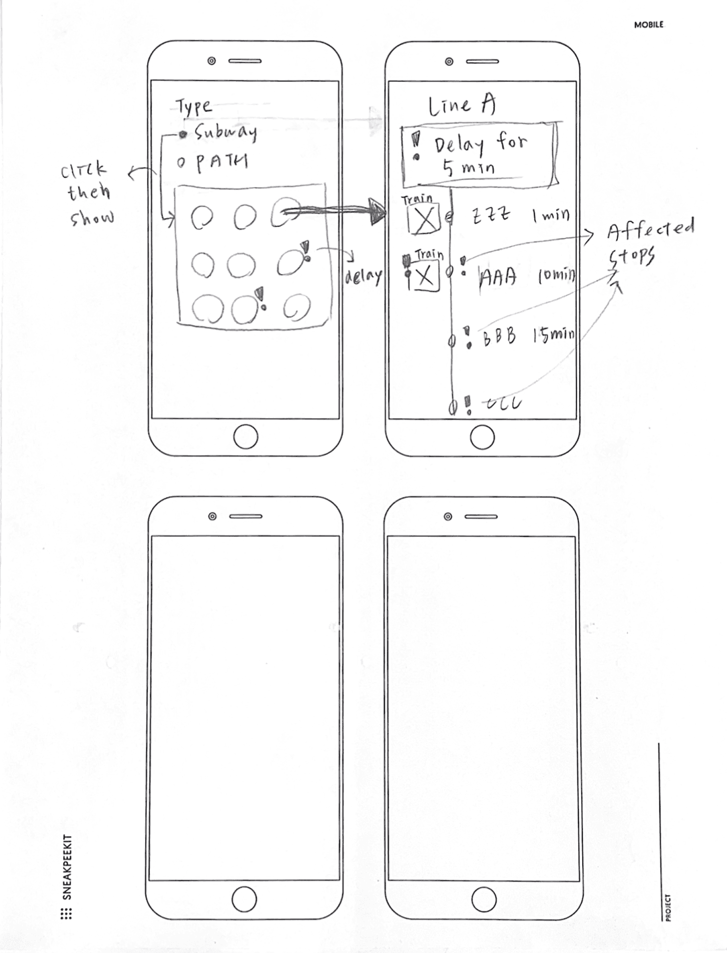
Initial Sketches
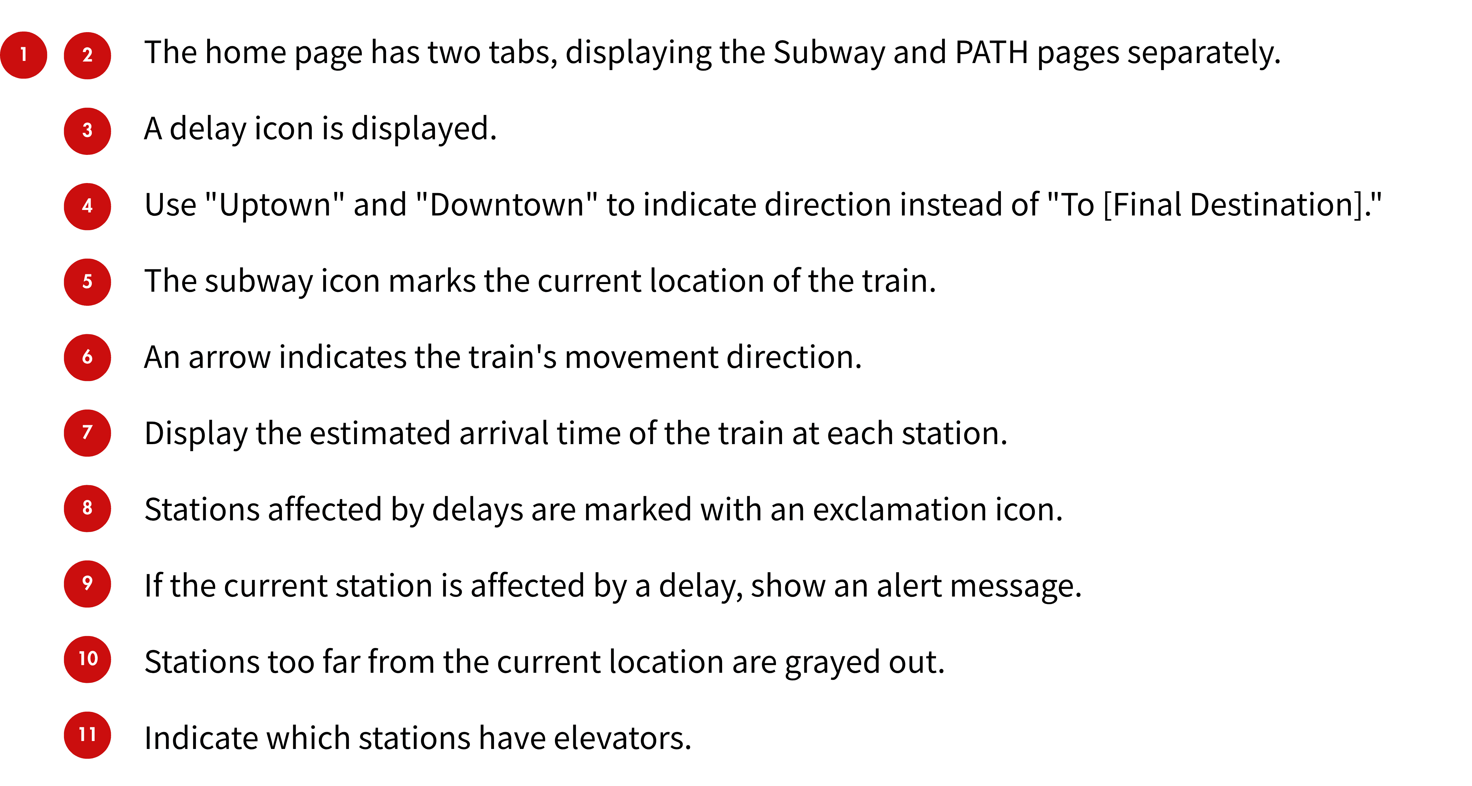
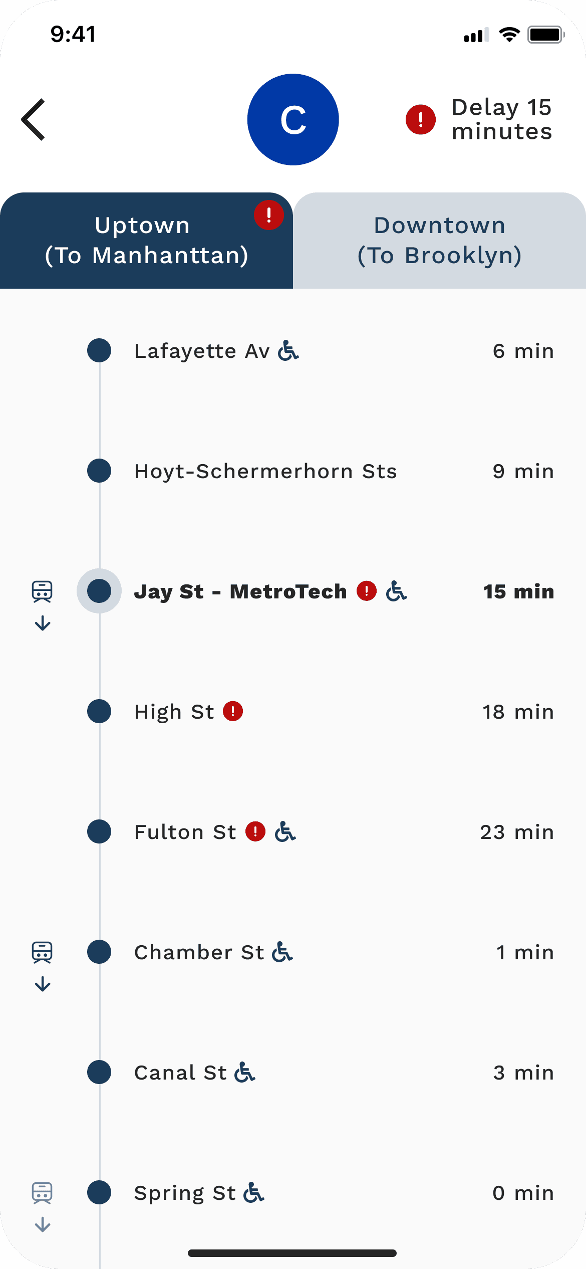
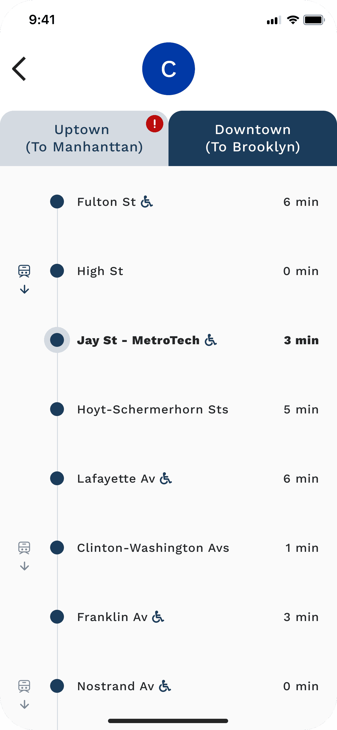
Use subway icons to indicate train movement
Use a small exclamation mark to indicate delays, with affected stations clearly marked
Display delay information directly on the page to reduce extra steps
Add 'Uptown' and 'Downtown' labels alongside the train’s destination for clearer direction
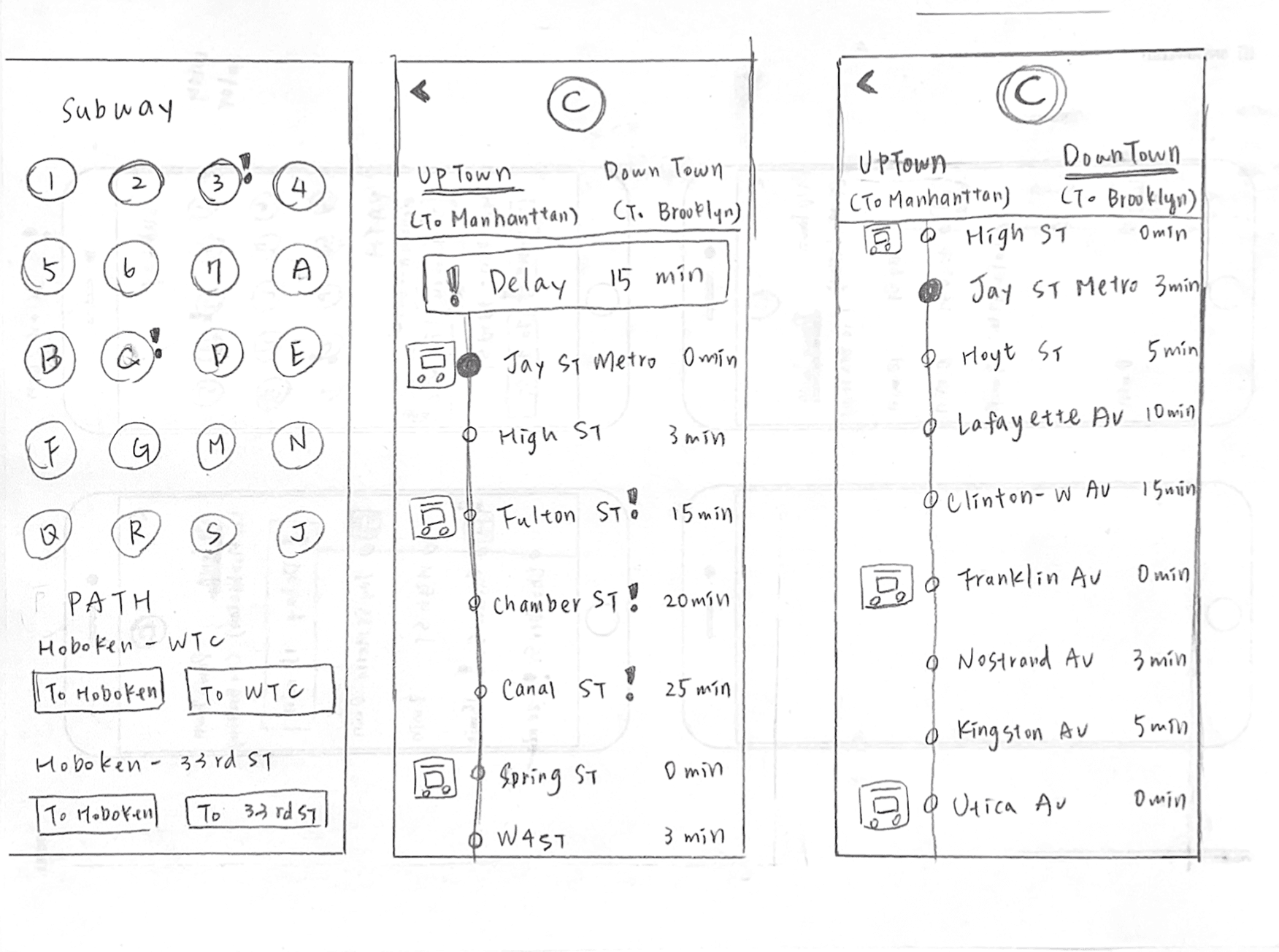
Wireframes
Design Iterations
For each iteration, I conducted user testing and improved the design based on feedback.
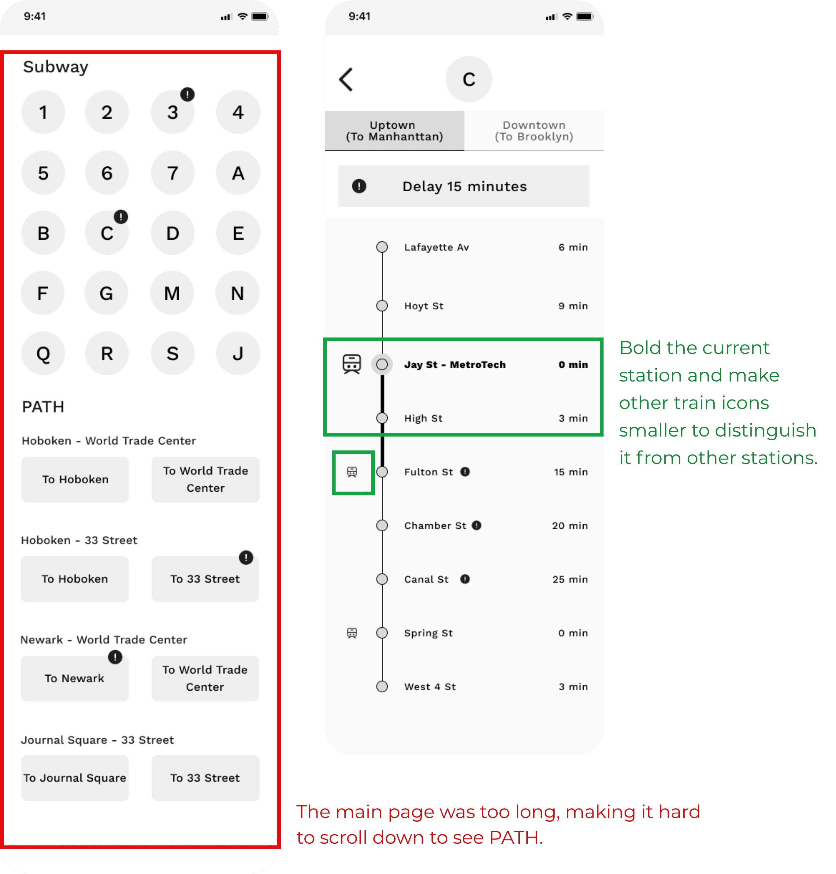
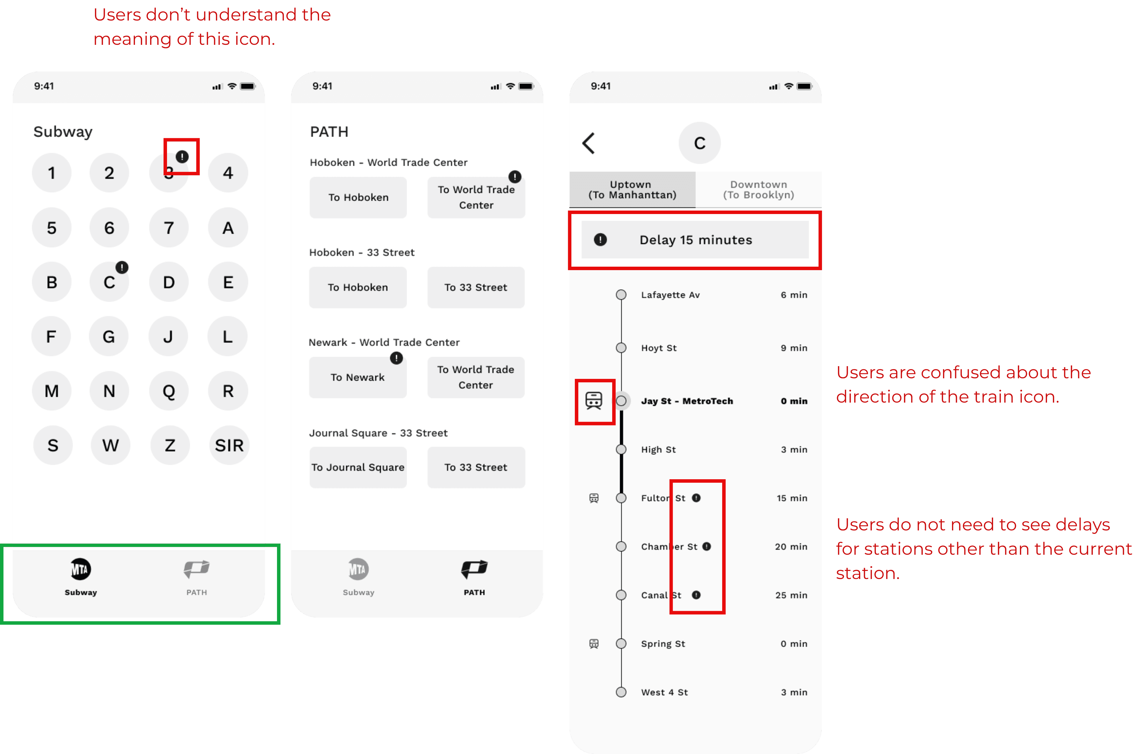
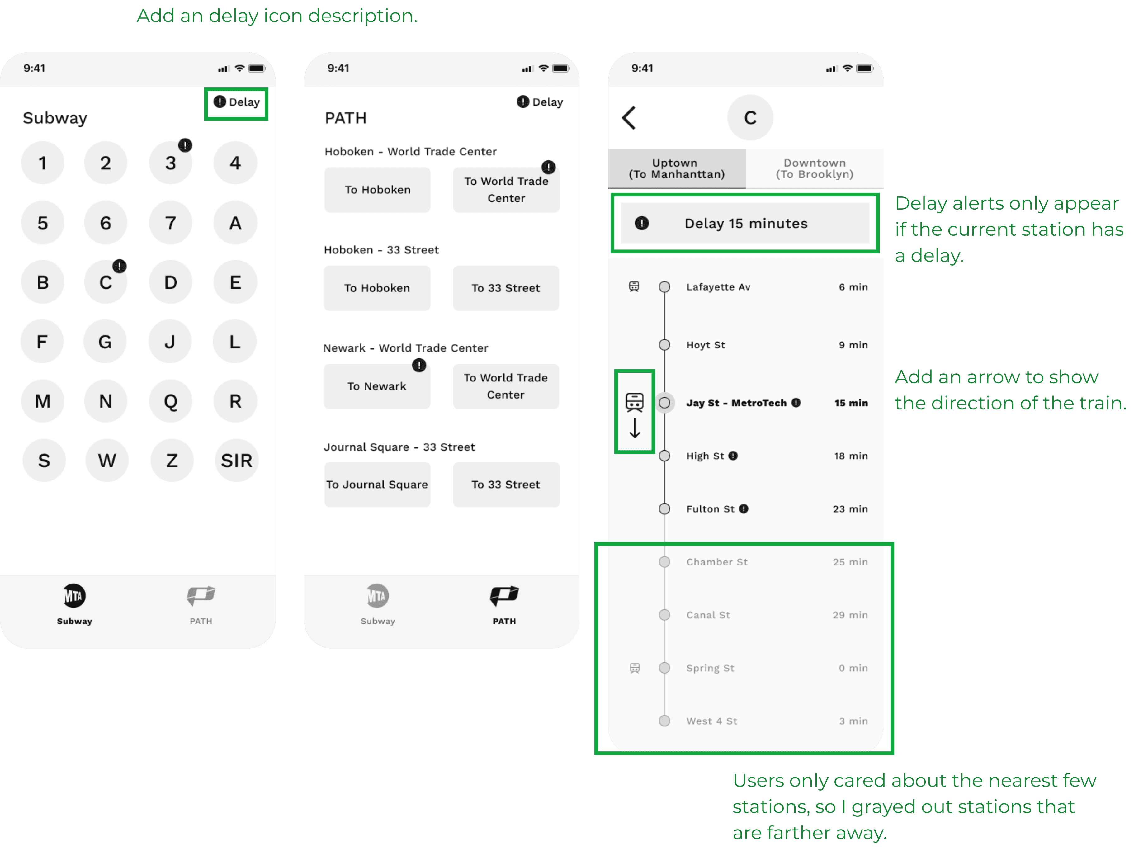
Red highlights show problems from users.
Green highlights show improvements.
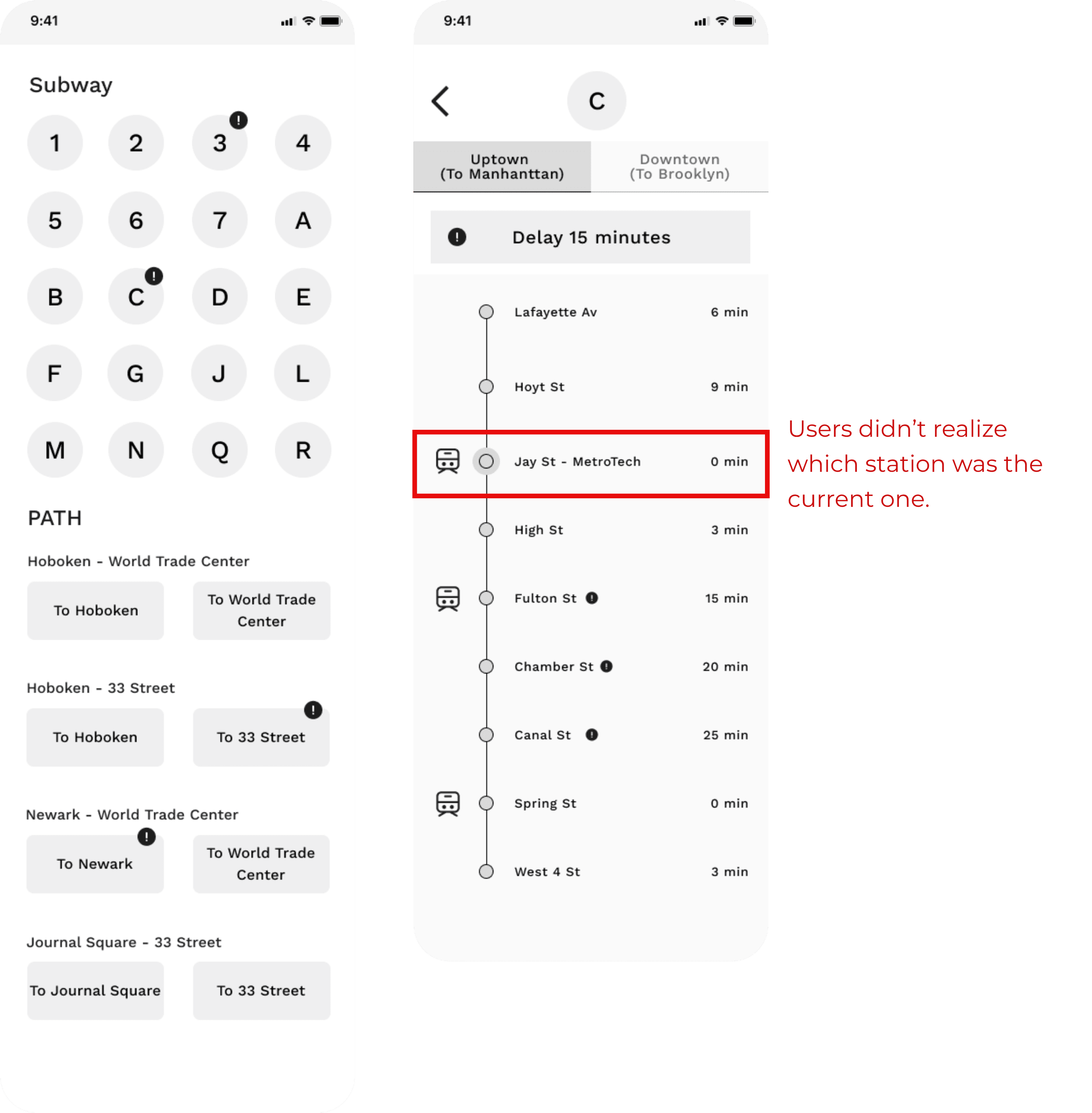
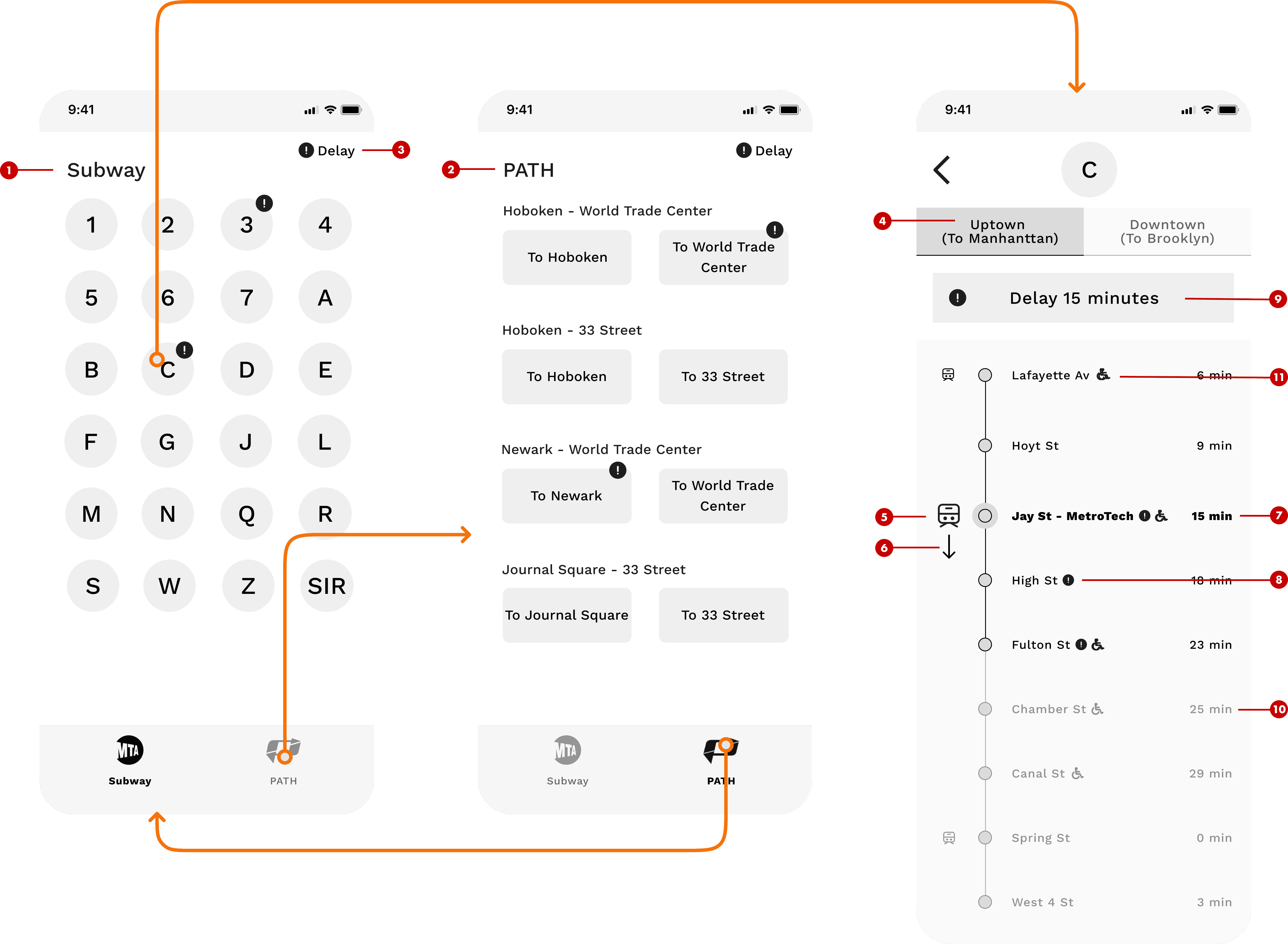
Final Wireframe
High-Fidelity Prototype
Result
Takeaway
Break down big problems into manageable ones
After conducting user interviews, I found that users had a wide range of complaints and frustrations. It was overwhelming at first, so I learned to break down the large, complex problem into smaller, more focused issues. By addressing each smaller issue individually and then combining the solutions, I was able to approach the design in a more structured and effective way.
Feature prioritization is key
There were many potential features to solve the identified problems, but it wasn’t realistic to implement everything at once. I prioritized features based on user needs and feasibility, focusing on must-have functions first. Other nice-to-have features were saved for future iterations.
Test early, iterate quickly
Instead of spending too much time on polished UI early on, I used wireframes for quick user testing. Testing at each iteration helped me gather feedback early, adjust layouts and flows, and refine the overall direction. Only after validating the structure and functionality did I move forward with UI design.